The iPhone of the Decade for me
I recently came across this 512pixels.net post about the iPhone of the decade. To my surprise, they selected the iPhone 6, 6 Plus. In summary: in 2016, Apple introduced two important things in the iPhone franchise: bigger screen iPhone and choice in screen size and features. Sure, the iPhone 6 prope
I recently came across this 512pixels.net post about the iPhone of the decade. To my surprise, they selected the iPhone 6, 6 Plus.
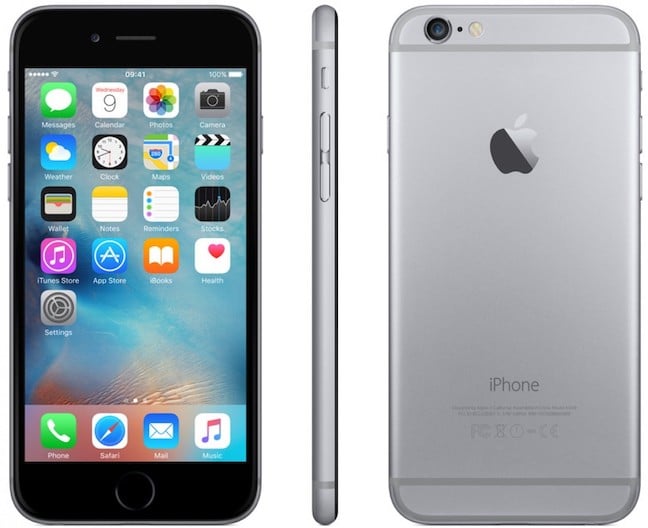
In summary: in 2016, Apple introduced two important things in the iPhone franchise: bigger screen iPhone and choice in screen size and features. Sure, the iPhone 6 propelled iPhone sales to a new high. I don’t think Apple ever did better than this since then. While I do agree on these, design-wise, the iPhone 6 was utterly ugly. Why you might ask? For a simple reason: antennas seams. Period.
The rest of the physical design wasn’t quite as nice. The antenna lines were really noticeable on most finishes, the camera bump made the phone rock awkwardly when on a flat surface and those smooth edges made the phone easy to drop. Thankfully, all of those issues were resolved by slapping the phone in a case500pixels.net
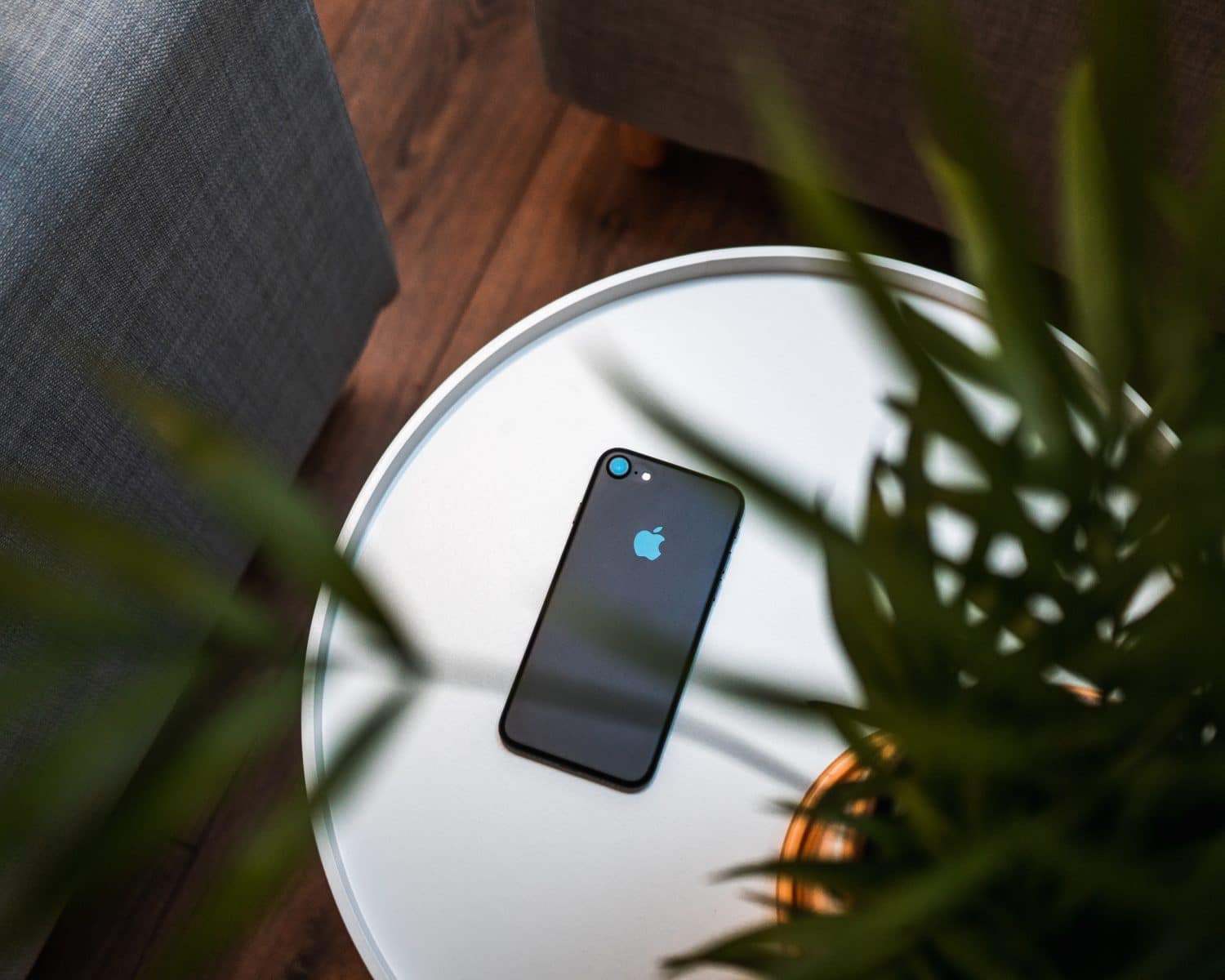
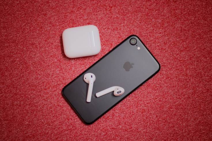
For me, the iPhone of the decade was the matte black iPhone 7. It removed my gripes from the previous versions. I love this single-piece design. The matte finish is reminiscent of the iPhone 5.
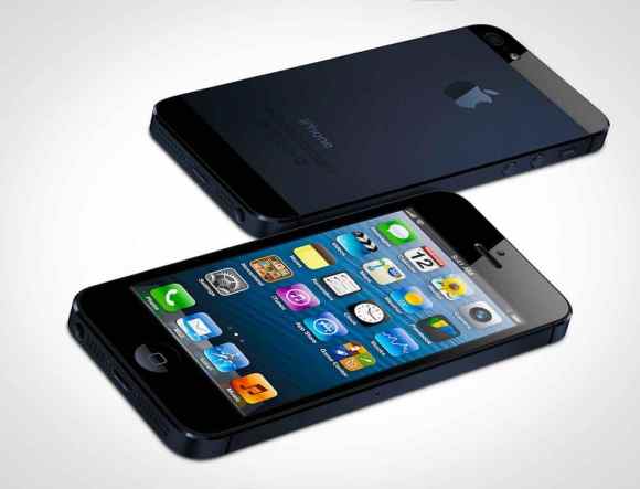
Next, and very close is the iPhone 5. I always liked the squarish contour of the device, more actually than what we currently have with the iPhone these days.
But, we just entered a new decade and I must say my iPhone 11 Pro will be hard to beat for Apple. We’ll see because there are still ten years in front of us of new iPhone designs.

