How iOS 13 Reminders app Killed Things app
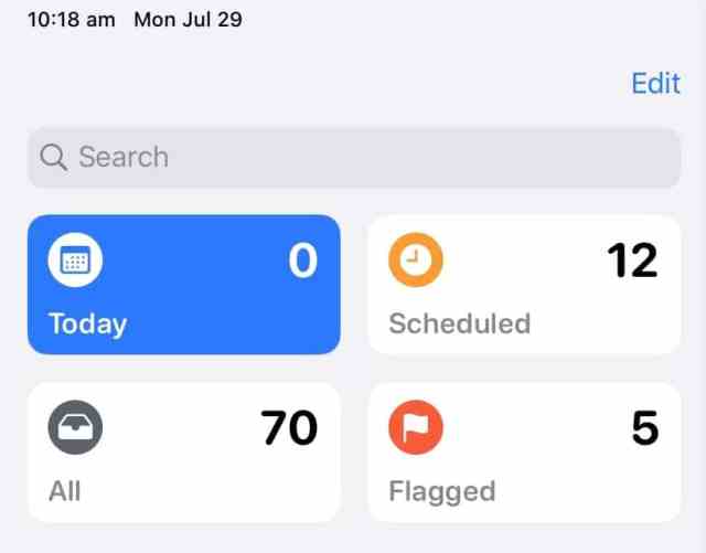
Things 3.0 was a wonderful release when it came out. It’s design simplicity and well thought out won me. Before that I was using Omnifocus but Things 3.0 made OmniFocus look complicated and over featured. But, frankly, iOS 13 is changing all that again: Apple entirely redesigned the Reminders app. T
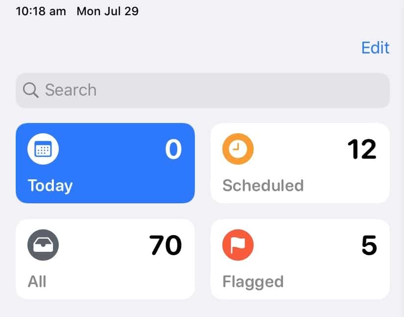
Things 3.0 was a wonderful release when it came out. It’s design simplicity and well thought out won me. Before that I was using Omnifocus but Things 3.0 made OmniFocus look complicated and over featured. But, frankly, iOS 13 is changing all that again: Apple entirely redesigned the Reminders app. The results are impressive. Reminders is now a powerful tool for all my needs.
Cool and nice things about Reminders are listed here (not an exhaustive list):
- The design is really nice
- Subtasks are now possible
- Links and pictures are allowed
- Flagging an item is also possible
- Fully integrated with services like Shortcuts and Siri and full support of the Apple Watch are a given
Many of those features are not possible with Things. So I had to wonder if I was using the right application for my to-do needs. Today, with iOS 13, even in beta form, it has become my go to app to help me manage all my to-do.
In recent weeks, I made a few important changes to the apps that I’m using on iOS and on macOS. First, I started to use Flighty instead of Flight+, see this recent blog post:. Second, I converted all my to do list from Things to Apple’s iOS 13 Reminders. These kind of changes happen once in a while when a game changer appears. Who knows what change comes next.
