Critical Thoughts on Apple Stage Manager
Now that macOS Ventura and iPadOS 16.1 are out, it is time to share my thoughts and experience with one of the tent pole features of these releases: Stage Manager, a new way to switch between running applications. How is the Stage Manager faring and influencing the user experience? Let’s find out.
First announced during the WWDC22 conference last June, I’ve used Stage Manager since macOS Ventura beta 8 and iPadOS 16.1 beta 4 when Stage Manager was made available to non-M1 iPad Pro. Stage Manager sparks controversy. Its value is not clear to me. It seems to make more sense on a Mac than on an iPad. Here’s a list of observations.
Stage Manager generalities
Before going into full details about Stage Manager implementation on the iPad and on the Mac, there are a few general observations that apply to both platforms.
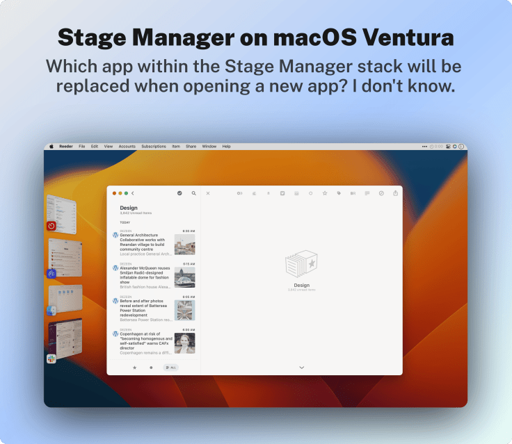
- Applications in the Stage Manager stack are “elected” when you open an application for the first time and cannot be “ejected” manually. Right-clicking on an application thumbnail doesn’t bring up any popup menu where we could close the application. In a way, Stage Manager stack content is hard to predict.
- On all platforms, clicking or tapping on the dark grey background outside a window won’t bring the finder or the home screen into view. This could dismiss the Stage Manager. It is strangely not the case.
- Because I use the same set of applications across different working contexts, I don’t use the ability to create a “workspace” of grouped applications. This is something that was at the center of the initial demo during the WWDC conference last June. It’s not at the center of my current workflow. Maybe there is something I don’t get.
- In some ways, Stage Manager brings the Mac closer to the iPad experience and vice versa. Was it the ultimate goal of Apple?
Ask yourself this question: if Apple is so proud and cool about Stage Manager, why does it provides a way to disable StageManager in Control Center on the iPad or on macOS?
Stage Manager on macOS Ventura
Let’s dive into it right now because there is so much to say.
- With each major release of macOS, Apple seems on the lookout to introduce a splashy and “in-your-face” feature. Stage Manager for macOS 13 seems to be that feature. What would be macOS Ventura without Stage manager?
- There are now four ways to switch between running applications: Exposé using a swipe-up gesture with three fingers, using the keyboard with the CTRL-TAB to bring the task switcher, using the dock by clicking on the application icon (recent applications is a variation of the static dock icons), and now using the Stage Manager.
- Stage Manage is limited to six slots on the left (except on my MacBook Air, only four slots are available, which must depend on the screen resolution).
- Stage Manager can be used in conjunction with macOS Spaces. In this context, when you turn on Stage Manager, it is on for all defined spaces, but each space gets its unique set of Stage Manager slots. One important note: as of October 24, the current release seems to break the use of Stage Manager on the non-primary space. It’s impossible to bring Stage Manager to display the slots on the left side beside the first space. Is it a new behaviour or simply a bug? After the release of the GM, the behaviour didn’t change.
- Quitting an application won’t return the user to the desktop but to an application in Stage Manager. Which one? It’s hard to tell. It’s quite different than what I’m used to. And it’s not always what I was expecting.
- After restarting a Mac where apps are left open, the desktop preparation will endure a series of application switching within Stage Manager. It feels weird.
- Stage Manager gets its own menu in the menu bar with a setting to disable or enable it. Why? Is it for debugging purposes? There’s already a tile in Control Center for this purpose. Using Command-Drag, I removed the menu from the menubar.
On macOS, Stage Manager makes the Mac a little bit more like an iPad. On the iPad, Stage Manager brings the iPad much closer to the Mac, albeit in a clumsy way. In a sense, Stage Manager serves as a common ground between the two platforms.
- At the beginning of testing Stage Manager, I couldn’t figure out how to create a “workspace-like” setup to mix two or three apps in the same group. I had to search the Internet to find instructions. When Stage Manager is active, you can bring one app into another to create a space by dragging its windows. I should have known better.
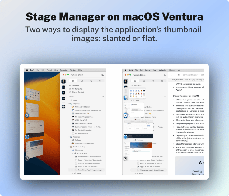
- Depending on the current window size, when bringing the mouse close to the left edge of the screen, the thumbnails displayed will be either flat (when they overlay the windows underneath) or slanted (when the current app window isn’t close to the screen edge).
- Stage Manager can interfere with third-party utilities like Magnet, a window management utility.
- With Stage Manager enabled, using Universal Control to control another Mac, when moving the mouse on the edge of the screen to cross the screen boundary and move to the other Mac, the Stage Manager thumbnails are displayed and stay there until a return of the mouse focus on the second Mac. Hard to explain, but it doesn’t feel right.
- Stage Manager content is on a per-desktop basis instead of being global. Selecting an app from the Stage Manager won’t make you switch to another desktop.
- With two spaces on more non-primary space, it’s impossible to have Stage Manager display its vertical stack. It’s probably a bug.
My overall score for Stage Manager on macOS is 3.5 out of 5. Stage Manager is a somewhat useful addition to help users switch among running applications, but it is far from perfect.
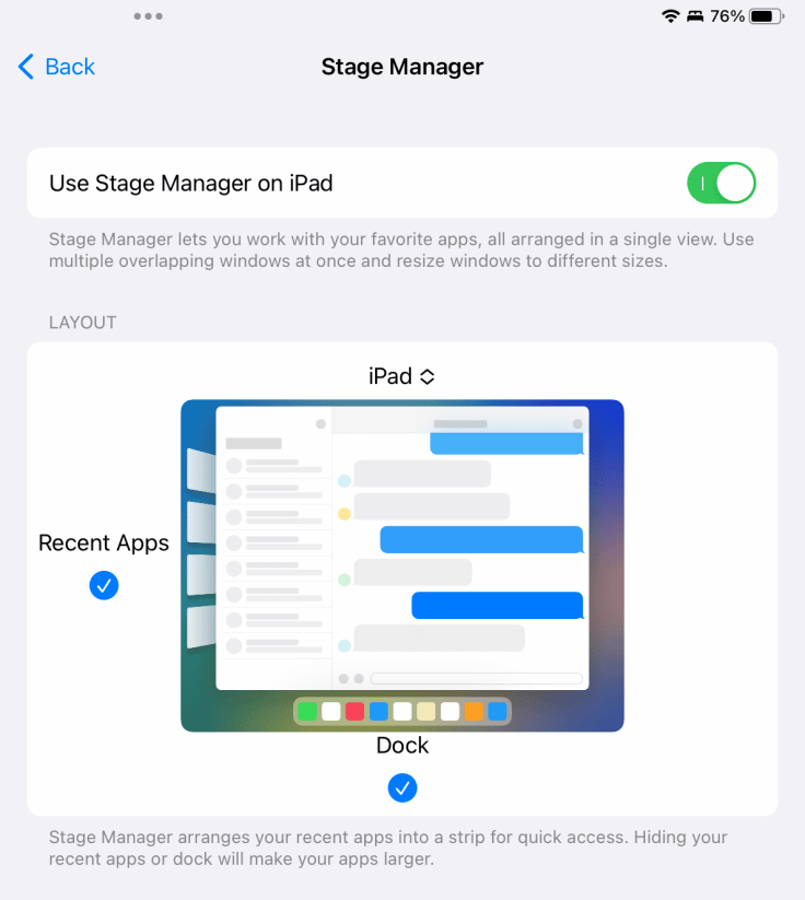
Stage Manager on iPadOS
Here are my observations gathered during multi-week experimentation of Apple’s iPadOS 16 with Stage Manager enabled. Observations are in no particular order.
- Never before a new feature has transformed the iPad experience that much. The mouse and keyboard support introduction didn’t break the iPad experience as much. In fact, it was pretty much transparent to the user. For example, with Stage Manager, tapping a window top edge to return the scroll position at the beginning no longer works while an app is displayed as a window. This is something I experienced in Tweetbot and Twitter. Grabbing the scrollbar on the right edge of the floating window seems harder than ever. These are examples where Stage Manager breaks a well-known behaviour of the basic iPad experience.
- Some apps react badly when resized with the curved handle on the bottom right corner.
- When Stage Manager is enabled, slide-over and split-view are no longer possible. The only thing possible is to add another window, which could come from another app sitting in the applications switcher or from the dock or from the Home Screen.
- When launching an app, it’s no longer possible to predict if it will open in full screen or in a zoomed-out view. If you prefer to use an iPad app in full screen like before, you’ll need to resize the application’s window quite often or turn off Stage Manager.
- Why is the curved handle sometimes located on the bottom right or bottom left of the application’s window? In what context does this change?
Stage Manager on the iPad is unpredictable and unsettling. Sometimes it makes a positive difference in my efficiency, but most of the time it breaks everything I expect about the iPad experience.
- Dragging the app window from the top can trigger the three-dots popup menu, which can be annoying.
- Swiping from left to right on the left of an application window to back up in a hierarchical view no longer works in most situations. Apps will need to be updated to address this issue. News Explorer, a lesser-known RSS reader, is affected by this.
- The Stage Manager feature is a resources hog on older non-M1 iPad Pro. Scrolling in the app switcher view was hampered by stuttering animations. It’s the one feature that could make me consider upgrading my 2018 11-inches iPad Pro. It got better with each beta, though.
- The higher-density resolution comes on the older iPad Pro, and I like this a lot. Stage Manager can be used with or without it, but I prefer high information density. Stage Manager can be used in normal resolution too.
- Turning off Stage Manager and back turning it back on will reset previous apps and windows grouping and arrangements. Could Apple designers and engineers preserve them instead? Would that even make sense?
My overall score for Stage Manager on iPadOS is 1 out of 5. I’m a bit harsh here, but until Apple revises Stage Manager as they did for Mission Control and Spaces, I’m being honest about my feelings here.
Conclusion
I think Apple wanted a user-facing and notable addition to its macOS iteration this year, which comes in Stage Manager’s name. Another tasks and windows management option comes on top of Spaces and Mission Control. Overall, I would argue that Stage Manager on macOS makes sense to a certain degree. On iPadOS, Stage Manager is a highly questionable addition that breaks the iPad experience in too many ways. I’m still undecided. Even after all the tests that were needed to write this article, I still don’t know if I’ll keep Stage Manager active on my iPad Pro. One thing is that I’m keeping the display zoom to get higher information density. All is not lost.
Will we have to wait for iPadOS 16.2 or iPadOS 17 next year to see improvements to Stage Manager? I’m certainly hoping for the former.