What Widgets on macOS Big Sur Should Have Been
Widgets in MacOS Tiger and macOS Big are two worlds apart. Which version provides the best experience?
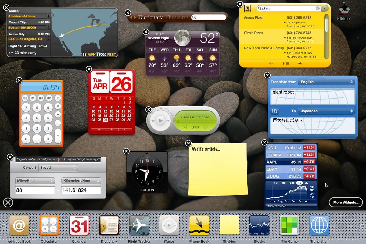

Remember the Dashboard in MacOS Tiger? It was a separate and hidden place to put small widgets on a freeform canvas. Dropping widgets on it produced a ripple effect that was cool to look at. It was easy to manage, easy to invoke and dismiss. Widgets were easy to build and distribute. Did Apple kill them for the sake of… simplicity? I don’t have a good explanation. I’m not even sure Apple’s employees know why, either.
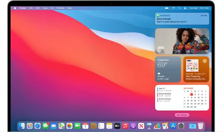
Now, enter macOS Big Sur. Widgets are back, and Apple made a big fuss about them. This is what we get: a small, vertical, cramped band of widgets. The interface is complex, slow even of fast Macs. I don’t know why Apple is confining them in this small and constrained space, maybe for the sake of some sort of cohesive visual experience to Apple’s other hardware platforms. This design is based on arbitrary rules that we, the users, cannot be related to anything as we have the big screen has a reference. I don’t think Apple had to create such an experience just to make it easy to select a widget and its size. I find it surprising that nobody thought of mocking up a better way of managing widgets in the modern era.
Are there any designers or engineers left at Apple who worked on MacOS Tiger? What were their thoughts on this design and experience? When Apple makes a change for the sake of making a change, it generally leads to the worst experience. Think about Safari 15 in macOS Monterey and on the iPhone.