My Thoughts on HEY and Why I’m Paying for Emails
We rarely get to see initiatives trying to reinvent basic services like email. The recently introduced HEY email service from Basecamp is trying to do just that. Here are my thoughts and why I’m going to pay for emails in 2020.

[Early 2021 Update: this article has been updated to reflect my six months experience with HEY and a streak of application updates.]
Let me tell you something: I’m paying to get my emails, even in 2020 (still in 2021 after six months with HEY). In fact, I’m willing to pay for something that tries to reinvent a user experience and succeeds at doing it yet fitting with my desired workflow. It is astonishing to see how little has changed in the last four decades about reading, writing and managing emails. I don’t remember seeing a company that tried as hard as Basecamp’s owners. Their new email service called “HEY” launched recently. Here are my thoughts on this controversial service and why I’m paying for it.
Re-imagining email

HEY is trying to rethink everything about emails. From getting new emails to reading newsletters or looking at attachments, HEY is unlike anything else. It can be disorienting sometimes. Don’t look for folders to organize your emails because there is none. Trying HEY is accepting the possibility of being outside your comfort zone more than once. Old habits die hard.
If I could summarize what HEY is trying to do to email, it would be something like this: HEY wants to reframe how we approach email; instead of focusing and helping you manage tons of emails, it tries to remove the management part of the experience. It doesn’t mean there is nothing to manage while using HEY, quite the contrary. In fact, in the first few days of HEY usage, HEY looks like a demanding friend. You have to feed The Screener, the part of HEY that lets you decide which email should be allowed in. After a while, The Screener starts to do his work silently, in the background and helps you see what is worth it and what is not. You have to be patient here.
[Early 2021 Update: The screener is quiet after a while and you rarely have to pay attention.]
With HEY, I’m currently consolidating five different email accounts that I have accumulated over the years. The more accounts, the more useful HEY has become for me. HEY is now an email portal. Once emails are allowed in, what’s next? Well, that’s the other interesting part of HEY.

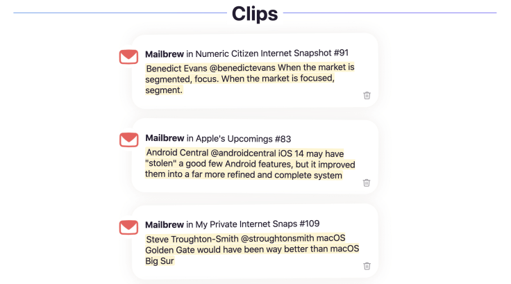
I get many newsletters from different sources, and they get put away in The Feed. That’s the other area where HEY is trying to be different: the email reading experience. Every day, I sit down with my iPad and look at my feed to read my newsletters. From there, I can select pieces of information that I put aside; HEY calls them Clips. It is super cool and it is one of the reasons I love HEY so much.

[Early 2021 Update: I use Clips in my monthly Numeric Citizen Introspection newsletter a lot to gather notable thoughts from many sources.]
There is another feature that I like about HEY: the ability to write notes attached to emails called Stickies. If I want to do something about an email and I don’t want to forget about it, I can write a small sticky note attached to it. They look like small post-it stickers. Both Clips and Stickies are not game-changers, but they certainly add value to the service.
Both Clips and Stickies are two features I had no idea I wanted. They’re not specifically designed for workflows like mine, nor are they perhaps the best feature for what I’m using them for. But they’ve quickly supplanted anything I’ve previously used and have helped clear out my Imbox and eliminate mental overhead of a long, pending email inbox. — Josh Ginter writing on The Sweet Setup

Finally, in the department of small niceties, you can have HEY automatically assign one or more tags to each incoming email. It’s up to you to decide their name. One thing I’d like to see in a future update is the ability to assign a colour to tags.
[Early 2021 Update: After many updates, I’m still waiting for those coloured tags. That being said, with so many emails, tags are useful in searching for a bunch of similar emails.]
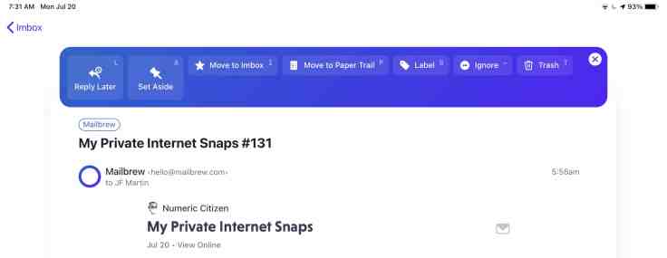
The other part of HEY that I love is the Paper Trail. That’s the space where emails like invoices, purchase confirmations, package delivery confirmations are grouped together. It is up to you to decide what goes into the Paper Trail. There is no AI or other sneaky algorithm working behind your back. Very straight forward.

I used to get newsletters in different accounts requiring manual action to classify them. It’s no longer the case. HEY is doing all this for me, in the background. That’s important, I get some time back. Somehow, HEY makes me think of another excellent web service: Mailbrew which gathers information from different sources and sends me newsletters based on them (read my review of Mailbrew). How cool is that? HEY and Mailbrew are both powerful tools when used together.
What happened since I began using HEY?
Since using HEY, I’ve turned off notifications from Mail.app on all my devices. But, In HEY, by default, there are no notifications. Silence. We get to choose which senders will trigger a notification. There are no unread items counter on the application’s icon either. This is intentional. I open HEY a few times a day to see what’s new. This is my choice, not HEY’s. It makes a big difference. Really.
Lastly, I found out that I rarely write emails. I would say that 99% of my usage of HEY is for reading. So, I didn’t test the writing experience as much as I would have liked. From what I’m seeing, it does the job well.
But HEY is not using open standards! So, what?
I read many comments on Twitter from people who refuse to use HEY because it is not using open standards (Exhibit A for the front end, Exhibit B for the backend). HEY doesn’t use IMAP as the “client-server” transport. HEY is not trying to reinvent email transport protocols like SMTP. It’s true they don’t use IMAP but the reality is I couldn’t care less. The whole idea is to re-invent the end-user experience with emails, and for this to happen, I guess IMAP doesn’t do the job.
Compare this to Micro.blog which is also based on open standards and tries to re-invent Twitter. Micro.blog doesn’t really re-invent the end-user experience as it is pretty close to what Twitter is. I do care in that case because it’s all about content durability. How about Google’s AMP web page format? Who’s playing evil here? What HEY is doing is offering an email platform open enough to be a convergence service but proprietary enough to provide a different end-user experience. That’s not playing evil in my opinion.
HEY is far from perfect

HEY is not perfect; it’s a version 1.0 product1. There are many things that I’d like to see improved in the future. Here is a rundown for you in case you find a deal-breaker.
- HEY should automatically pull the icon for generic and well-known contacts like Pinterest, PayPal, Office 365, Dropbox, etc. [Early 2021 Update: still not the case].
- Popup menus look is consistent within each app and across platforms. I find this irritating as I don’t always see why they are different and in different places. [Early 2021 Update: still messy]
- I wish I could collapse The Feed view to quickly glance at the list of newsletters. [Early 2021 Update: still not the case]
- There is no “read status”. It is hard to remember where I left off in the previous read session. [[Early 2021 Update: again, still no sign of reading status]
- If I want to reply to an email from one of my forwarded accounts, the outgoing response will be from HEY.com. It can be confusing for people to get responses from a different sender. To circumvent this, I have to return to my old email client and respond from there which will break the message thread in HEY. That one was close to a deal-breaker for me. The reason I decided to go ahead with HEY is simply since I’m not writing many emails anyway. So, beware.
- While viewing my attachments, I’d like to be able to select a few then hit delete. Clicking an attachment currently triggers the attachment download. [Early 2021 Update: still the same behaviour]
If you are still on the fence with HEY and want to know other weak points of the service, you could also read this excellent blog post from Matt Birchler about feature requests and things to improve. For another take on HEY, read the excellent article by M.G. Siegler: “Some Thoughts on Hey”. Finally, a well-balanced view of HEY from Mike Lapidakis brings another point of view.
[Update #1: Please, if you want to get a real sense of HEY, be sure to look at their visual tour available here.]
Concluding words
HEY’s design intention is to re-imagine how we interact with emails, from the writing experience to the consuming experience. HEY started in controversy and got attention because of Apple’s App Store’s strict rules. This is behind us now and I’m a proud paying user of this nascent web service. The convergence of all my non-business email accounts in itself has value for me, and the new way of reading my newsletters or managing my email fits me well. I can’t wait to see where HEY is going to evolve.
Now that HEY is re-inventing the email experience, I hope that they tackle the calendar applications space eventually.
[Early 2021 Update: as I’m updating this article, we’re currently at version 1.1.5 of HEY’s mail client. Slowly but surely, HEY got new features and a few tweaks. The most interesting addition is support for iOS 14 widgets. They are one of the best use cases for widgets. External monitoring support and Siri Shortcuts are also supported. Overall, the experience is still the same. On the Mac, the app is based on the Electron development framework and this means it isn’t optimized for M1-powered Macs.]
- As of this writing, version 1.0.6 is the current version of the application on iOS. ↩


