Getting Ready for the new iOS 14 Home Screen Experience
With iOS 14, Apple introduced a refreshing iPhone experience with support of widgets and the new App Library. Here is how I will tackle this new level of complexity.
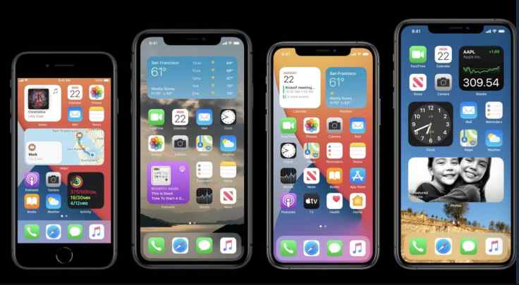
With iOS 14, Apple is accepting the fact that the iPhone experience needed some kind of modernization. Apple’s answer to this is widgets and the App Library introduction in iOS 14 home screen. Two simple things on the surface but that will transform my use of the iPhone. Let’s see how I’m going to get myself ready for this change.
Cleaning up unused apps
First, you have to understand that I’m the type of guy who likes to have an organized home screen. With more than 330 hundred applications on my iPhone, folders are playing a big role to organize my home screen. I decided to reconsider every single app presence on my iPhone as I’m probably using only 10% of them. By removing unused apps, my folder usage will decrease. With iOS 14, I expect my home screen pages to move from “full of icons and folders” to a balanced use of widgets at the top and icons in the bottom part.
Only for iPhone
Second, this reconsideration of my home screen design only applies to the iPhone. The reason for this is simple: the iPad home screen experience didn’t receive much love with iPadOS 141. As you probably know by now, widgets on the iPad are limited to the left portion of the home screen in landscape view and are not shown in portrait view. Hence, the status quo for my iPad home screen organization rules.
Less cross-platforms apps
Third, many cross-platforms apps didn’t really make sense on my iPhone, and in that case, didn’t need to be installed. I’m thinking of apps like GarageBand, MindNotes and iMovie, just to name a few. For these apps, I decided to remove them from my iPhone and keep them only on my iPad.
Use of dynamic content
Fourth, I plan to carefully consider the use of dynamic content like Siri Suggestions widget and widget stacks. Example of people exclusively basing their home screen design on dynamic content can be found on Twitter, like Morten Just. I’ll decide after spending some time with iOS 14 to see if Siri Suggestions is better than in iOS 13 at suggesting applications.
New organization rules
Many people are moving away from the hyper-organized home screen in favour of relying on the new App Library. Here is an example from Ian Robinson on Twitter (@ianrobinson).
Personally, with the new iOS 14 iPhone experience, new rules for organizing my applications are needed. First, I’ll use theme-based home screen pages. Second, the first screen will be for critical apps and must-have widgets. Third, the first screen will need to strike a balance between applications and widgets usage. Fourth, my use of the pre-iOS 14 widgets page on the Siri search screen will probably evolve as I get a stable home screen pages organization. I think many updated widgets will be promoted to one of my home screen pages. Speaking of updated widgets, here is a short rundown of application updates I’ll be anxiously waiting to be updated to support the new widgets.
- Deliveries
- WordPress
- Buffer
- Moon
- Klok
- Sky Guide
- Streaks
- WaterMinder
- Currency
- Unifi Network
- Unsplash
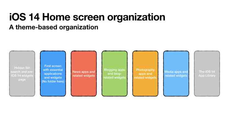
A theme-based approach
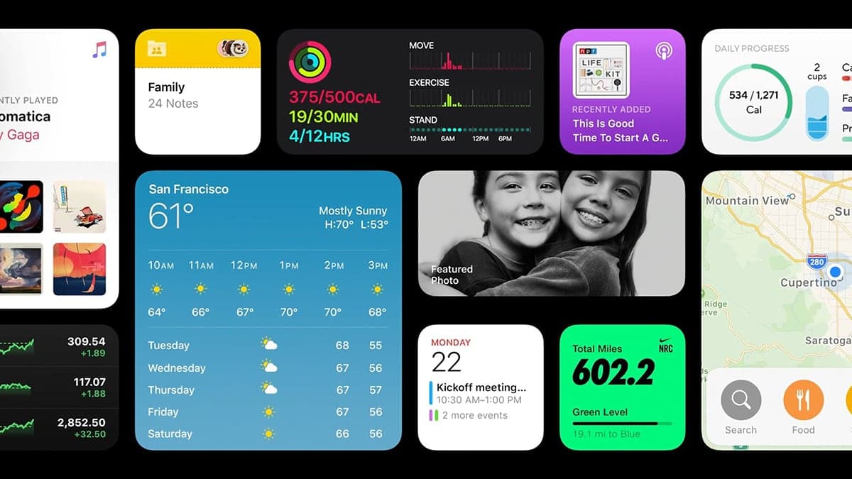
As for the home screen themes (page 2 and beyond), I will use these themes: blogging, photography, news, media and weather. With iOS 14, quickly moving from one page to another is easy, so I’m not afraid of having too many pages. Each of these home screen pages will be fitted with relevant widgets to the page theme. The unclassified applications will be removed and put away in the App Library. Finally, depending on the release of third-party widgets, I’ll probably use a few “widgets-only” home screens. The following diagram shows an example of my future home screen organization.
In summary, here are the steps I went through to get my iPhone ready for iOS 14:
- Removed unused apps once and for all. I deleted dozens of apps that I never or barely use.
- Considered leaving behind the folder-based organization in favour of a flat layout coupled with App Library.
- Reconsidered the use of widgets in the pre-iOS 14 world.
- After upgrading to iOS 14, review each app and decide if I want to simply remove it from the home screen and let it go to the App Library. Many apps that I want to keep but rarely use will go in the App Library this way.
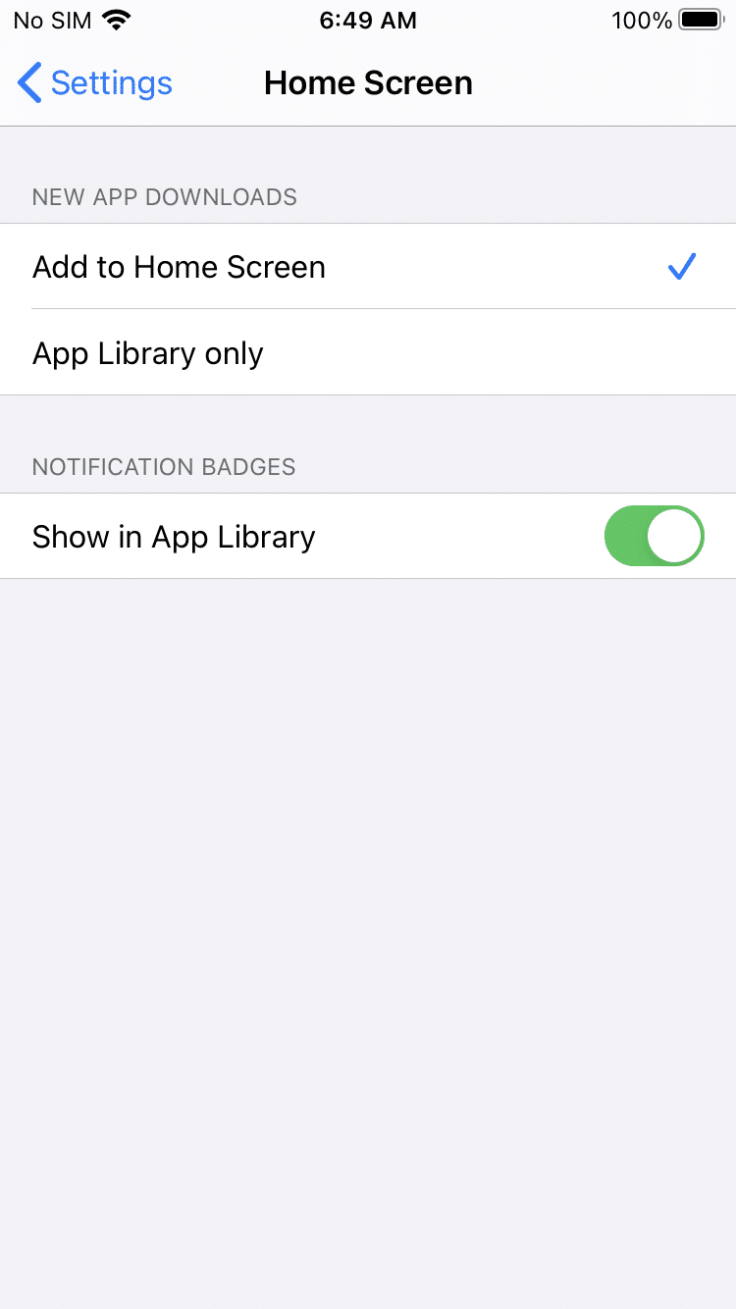
My Home screen settings are shown in the following screenshot. Newly downloaded apps will first go to the home screen. I prefer to decide later if I want to keep it there or simply let it go to the App Library.
As The Verge puts it in their first look at iOS 14, Apple introduced a welcomed complexity to the iPhone experience. Complexity requires management. Is this a step back for the iPhone? I don’t think so. But, as exposed in this blog post, it requires careful thinking for an organization freak like me. I can’t wait for iOS 14 later this summer. Meanwhile, you can get a peek at my possible home screen designs. Oh, and don’t miss my WWDC 2020 week observations!
Disclaimer: even if this first beta of iOS 14 is rock solid, no production devices have been harmed while experimenting with widgets and the App Library. A second-hand iPhone 8 was used for testing purposes.
- Again, Apple is holding the iPad back. ↩