Upgrading from the iPhone 13 Pro to the iPhone 15 Pro Max — Bigger, Faster, Even More Possibilities
The iPhone 15 Pro Max is not a revolution but a meaningful step forward—a simple and lucid review from a previous owner of an iPhone 13 Pro.
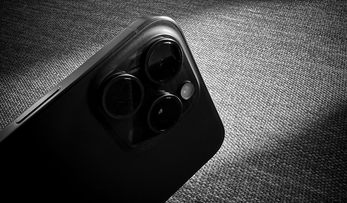
Here’s another iPhone 15 review, an iPhone 15 Pro Max review, to be more specific. I should rather say: a commentary article about the iPhone 15 Pro Max from an ex-owner of the iPhone 13 Pro. Plus, as a bonus, a surprising revelation about using ProRAW. Let’s start.
I’m coming from an iPhone 13 Pro. This is my baseline. Most reviews compare this year’s iPhone with last year’s models. This is not what the review is all about. While many people upgrade their phones every year, I suspect that a majority aren’t doing that. These people are the perfect target for this article. My intention with this review is not to provide a detailed review of image capabilities. I’m not good at this; others are much better than me. This review aims to provide the best description of the newfound photo opportunities that this new iPhone gives me and the most discerning differences.
Why upgrade?
My iPhone 13 Pro screen was lightly scratched in three different places. The battery health was at 86%, barely holding a charge after half a day of work. I wanted to get a bigger phone. Thanks to a softer contour design, I was looking to the camera’s improvements and a better in-hand experience. None of these reasons, taken individually, justified upgrading, but taken together, it was a good decision. And I have no regrets. I enjoy the bigger screen, which shows a little more information. Battery life is enough to last comfortably all day with the Always On display enabled. The screen quality is gorgeous; it is the best camera viewfinder you can buy. And finally, the cameras produce solid results when used in the right conditions, like any camera. Finally, regarding the device speed, the iPhone 13 Pro always felt like a fast device, but we always like to get faster, especially if it enables new photographic possibilities.
The iPhone is clearly on a multi-decade trajectory toward becoming a thin, featureless slab of glass. — Jason Snell
Compared to the iPhone 13 Pro — what are the most notable (and less notable) improvements?
We rarely see comments or review pointing to improvements from older generations devices. I wish there was more of that. In that spirit, I try to fill this void here. Upgrading from the iPhone 13 Pro brings this list of changes by order of importance of significance (many items on the list are confirmed by this 9to5Mac article):
- 48 Megapixels main camera, which brings better image resolution and a 2x zoom;
- A17 Pro is a powerful CPU (link);
- The improved photographic engine make the iPhone 15 Pro Max a worthy upgrade;
- Better FaceTime front camera;
- The system RAM going is going from 6GB GB to 8 GB;
- Dynamic Island is a novel addition;
- The screen is brighter screen outside, best screen overall on the market (link, link);
- The iPhone 15 Pro and Pro Max are 19 grams lighter than their predecessors;
- Up to 38% faster 5G speeds (link, link, link);
- USB-C connector with support for USB 3 standard (20x faster than before at 10Gbps);
- Bluetooth 5.3 (Link);
- Better GPS accuracy (link);
- Support Wi-Fi 6E;
- The iPhone can connect to an external display without any dongle, just with the right capable (UBC-C to USB-C). It works great as one would expect;
- Better speaker quality (louder) and better microphone quality, too.
Am I missing something? Probably. Here’s a nice summary put together by Matt Birchler in his review:
- Zoom levels 1-1.9x are 24MP
- Zoom levels 2-2.9x are 12MP
- 1x portraits are 24MP
- 2x and 3x portraits are 12MP
- Night mode photos are 12 MP
- Panoramas as 12MP
- HEIF Max are 48MP
- ProRAW are your choice, 12MP or 48MP
To complement his summary, here is one of mine.

“Due to the scale and breadth of these improvements, most iPhone 13 Pro will be able to justify upgrading to the iPhone 15 Pro, especially if they value the new design, USB-C port, Action button, and camera improvements.” — Hartley Charlton
Here is a Q&A following my experience with the iPhone 15 Pro Max
- Is it noticeably faster? Absolutely.
- What are my thoughts about Dynamic Island? Are my favourite apps taking advantage of it? Yes, it’s a genuinely joyful and useful addition to the base iPhone experience.
- This is my first time with the Max, how is it like using it with one hand? At first, yes, it felt big, but after a few days, I wouldn’t go back. I recently looked at a dead iPhone 5, this phone was so small.
- Am I using the always-on display? Yes.
- Does USB-C make a difference in my workflows? Yes. I had to replace my Finch Lavalier microphone with one with a USB-C plug.
- What is battery life like? It’s good but it not a two-day battery life.
- How do I like the fit and finish of the titanium material? Probably the best iPhone yet.
- How is the 5G speed compared to my iPhone 13 Pro? Hard to tell for my use cases.
- What is it like to use the 5x / 120mm lens? Very stable, I’m mind blown. I must be honest, quality is good but in best conditions (lots of light).
- Are the photo improvements significant? Yes, when using the 24MP images of the 1x lens, when closing up. Colours feel more natural and post-processing feel less harsh.
- Why did I decide to go with the Max this time? Bigger screen. Longer battery life. Telephoto lens.
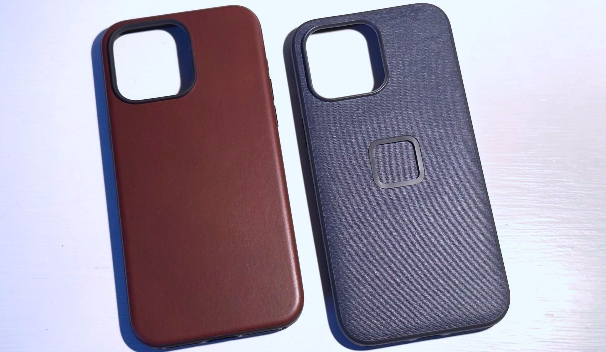
- Which case did I buy? How about doing a mini review of the Peak Design Case? I bought the Peak Design one with a bar mount for my ebike. I also bought a mount for the car. I also bought a Nomad leather case.
- Does the iPhone 15 Pro Max finally kills my Nikon D750? It too early to tell. The type of trip will also be a factor in the decision. Photos with the Nikon are probably better, when I can bring the camera with me!
- Am I content with my choice of colour? How does the black compares to the iPhone 11 Pro, which was black too? I love the dark, black matte finish. I prefer the black finish; the lenses better fit with a dark finish instead of having three big black circles on a light finish. My wife has a black iPhone 14 Pro, and the colour is very close to the iPhone 15 Pro Max.
(...) what Apple really succeeds in with this major camera update is to bring much-needed depth to the photographic experience for average users — not just pros." — Sebastiaan de With

Notes, comments and observations
And now, more or less random comments and observations. I’m sharing my observations as someone who needed an upgrade, and in that context, the iPhone 13 Pro is my reference against which I’ll look at the iPhone 15 Pro Max—coming from the iPhone 13 Pro with a scratch screen and battery health at 86%.
- I prefer the Dynamic Island over the Notch. I feel it’s more organic visually. It’s really useful, especially with Flightry and Timery.
- The most useful Dynamic Island usage is with the excellent Timery application. It’s hard to forget about a running timer when it is displayed in the Dynamic Island.
- Dynamic island: it’s a stupid name only Apple can come up with, but it’s a brilliantly executed idea.
- The battery provides a full day of autonomy but not two or three days when the iPhone 12 Max came out. The Always On display might be one of the causes. The A17 processor is the other one.
- In the pocket, I do feel a difference in size. In my hand, I’m still able to do most of the navigation with one hand, but I do hold the phone with my two hands more than before. I do have big hands with relatively long fingers. That helps.
- The rounded contours make the device much more comfortable to hold or slide into a pocket. I love this! I do use my iPhone without a case quite often.
- The slightly curved glass where it meets the phone’s edge reminds me of the infamous iPhone 6. Even if it was one of the worst devices Apple ever designed, the curved glass was a great design aspect. I’m happy to see it come back, albeit not as pronounced as before.
- After four weeks with it, I no longer feel the iPhone as being “big”. It’s the new normal to me, and anything else feels small. I made the right choice by going with the Max.
- I cannot use the Action button easily with my Peak Design case on my iPhone. The case contour thickness makes the button harder to reach and push. The company runs a program for those who want this issue resolved.
- The action button location is problematic for me. I wish it were lower, more centrally located. I understand that since I’m not using it as a camera shutter, it doesn’t matter. But for those who do, this could be problematic. Many reviews mention this issue, too.
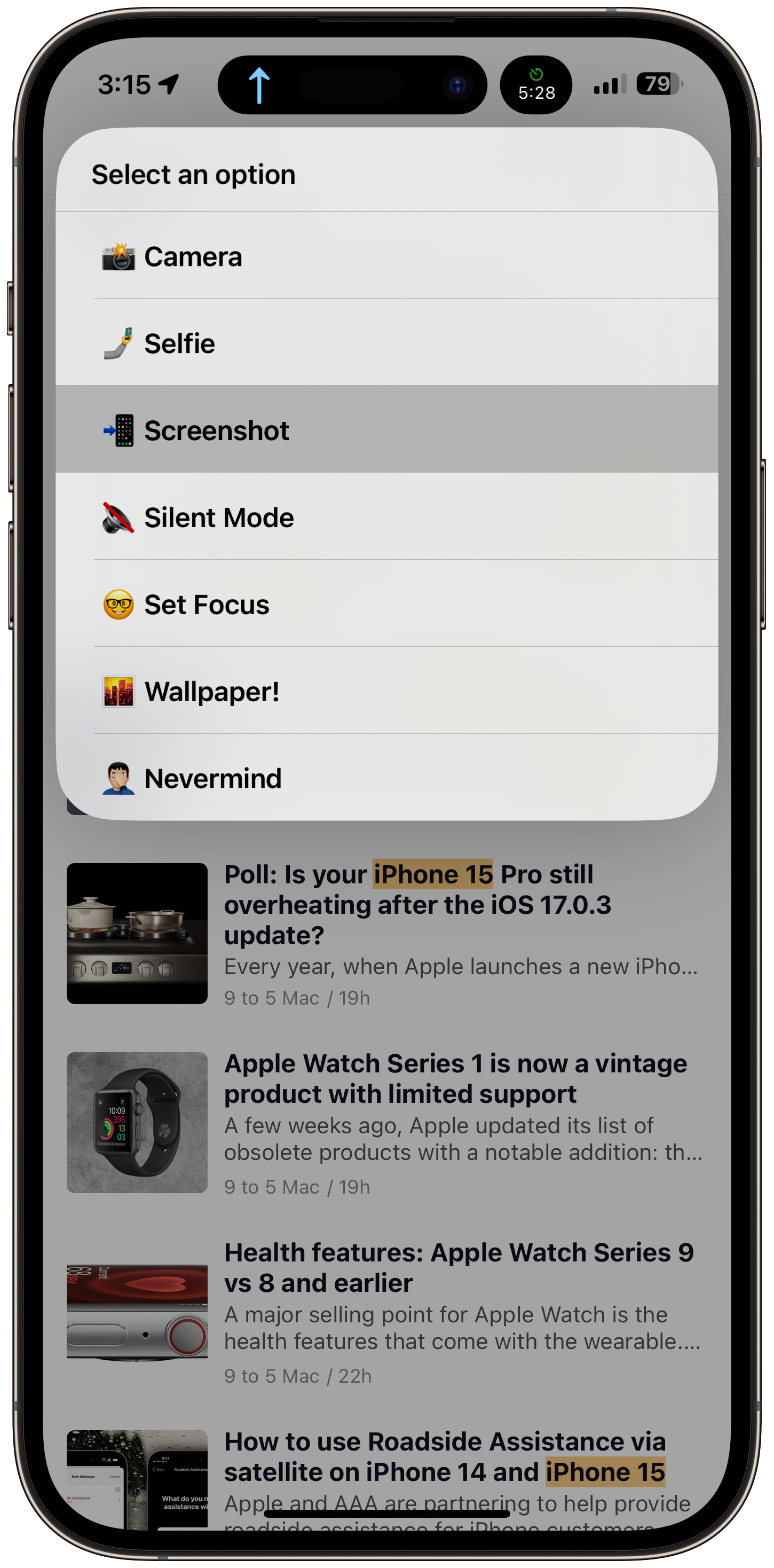
- I use the Action Button to execute a shortcut to present me with a menu of choices. At first, I wanted a single action to be triggered, but then I changed my mind.
- The new Portrait mode is transparent; it is a joy to use as we no longer need to overthink it. It’s such an improvement that it makes me smile when I use it.
- When first starting the iPhone’s Camera app, I wished there was an onboarding questionnaire to determine my profile as a photographer: an amateur-type, a semi-pro, or a pro photographer should lead to different default configurations.
- Shooting with the iPhone 15 Pro Max is not as simple as with a previous iPhone. There are many more options (HEIC, ProRAW, each applying to different lenses, lending different resolutions).
- Images are less over-processed / over-sharpened than with my 13 Pro.
- Sometimes, the portrait mode will be available for photos where there is nobody, in architecture photography, for example.
- As a webcam using Continuity Camera, it’s a solid improvement, too, compared to my previous iPhone. The sound is good enough to record a few podcasts or YouTube videos, even as a microphone.
- The telephoto lens is a welcome addition for someone like me who travels with a 70-200mm zoom. Image stabilization is impressive and makes me wish they added something like this to the ultra-wide camera for macro photography if this makes sense.
- The screen is bigger than my iPhone 13 Pro, for sure. The bezels are thinner, and I like this. There is more room to display content, but not by much. I knew that in advance, having visited the Apple Store many times in the past year to compare both sizes. Overall, It’s a solid improvement compared to the 13 Pro.
- The iPhone 15 Pro Max not only improves image quality, but the screen acting as a deluxe viewfinder is absolutely gorgeous. But overall, this iteration of the iPhone brings more options than ever when shooting photos. This and excellent image quality form an undeniably powerful modern camera.
- Some reviews will mention the limited improvements of the primary camera and super wide camera compared to last year’s iPhone 14 Pro. These remarks fail to acknowledge that many people like me will come from older iPhone generations. And this is the key to enjoying the improvements to this year’s iteration.
- On a lunch break while at the office, I went outside for a quick photo break and spent some time in a park. I took a few dozen photos using Halide. While the phone doesn’t get too hot (the device was running iOS 17.0.3), the battery power level dropped more than I would have liked. This means during a trip while walking in cities and looking for photo opportunities, battery life could be similar, at best, to what it was with my aging iPhone 13 Pro. It’s a bit of a deception. This year, I was expecting a longer battery life by going with the Max.
- One of my Apple Watch had to be unpaired and re-paired following the data migration. I wasn’t wearing it then, and it’s probably the cause. Also, many apps needed re-authentication (Microsoft Authenticator, Slack, Craft, etc.). It’s a bit frustrating and tedious. After all these years, replacing an iPhone or an Apple Watch is finicky.
"I went into the 15 Pro Max expecting a little discomfort with a giant slab of glass and metal in my hand, but to my surprise, it felt manageable." — Sebastiaan de With
Surprising confessions regarding ProRAW
Apple’s introduced ProRAW with the iPhone 12 Pro in 2020. I must confess something: I’m still unsure how to understand ProRAW. I know the RAW format concept: the iPhone takes a snapshot of the light getting to the sensor (a CCD). The RAW format dictates that the resulting file contains the sensor data without advanced processing, hence the “RAW” moniker. On the iPhone, when editing a photo in RAW format, there is this moment where the selected image will lack contrast and look dull upon entering in edit more until the iPhone generates a JPEG version of it acting as the photo preview after leaving edit mode. That, I get it.
Back to ProRAW, is the following explanation enough?
“Apple’s ProRAW actually retains a couple of the brand’s imaging techniques, including Deep Fusion and SmartHDR, so that these images still keep hold of Apple’s trademark detail and punchiness even though they haven’t gone through the usual range of other post-processing changes.” - Peter Phelps of Trusted Reviews
In other words, ProRAW does some more processing than RAW but not enough to lose the sensor’s RAW data when the image is taken. Is that it? With a ProRAW image, how does the app interpret the richer data? Why is it better if the processing probably ends up at the same place: contrast, saturation, definition, etc? I’m lost.
Josh Ginter writes:
“ProRAW skips out on Deep Fusion and provides more control for clarity, texture, and sharpness in post.”
That is exactly my point, starting from a RAW image and applying a clarity, texture and sharpness filter, you could end up in with similar visual results.
Does a query to ChatGPT through Raycast help get a better understanding? Here is what ChatGPT had to say about Apple’s ProRAW:
“Apple ProRAW is a proprietary raw image format introduced by Apple. It is available on certain iPhone models and combines the benefits of the raw file format with Apple's computational photography capabilities. ProRAW files contain significantly more data and provide greater flexibility for post-processing compared to standard JPEG or HEIC formats. They preserve more detail and offer a wider dynamic range, allowing photographers to have more control over aspects like exposure, color, and noise reduction during editing.”
I’m still unsatisfied with this explanation and how it makes a difference with RAW + manual post-processing. If you know of a better explanation, use the comment section below!
Concluding remarks
The iPhone 15 Pro Max is a solid stepping stone in iPhone history. It brings me more possibilities, mainly in creativity, especially in photography. I like the improvements to the look of photos coming out of this year’s iPhone. Like for the Canon vs Nikon, the iPhone has its look and personality when it comes to photography, and I prefer this year’s version. With the addition of the 5x telephoto lens, we get more addressable use cases that align with my style. I’ll probably keep this iPhone for the next two years. I’ll undoubtedly enjoy every moment of it.
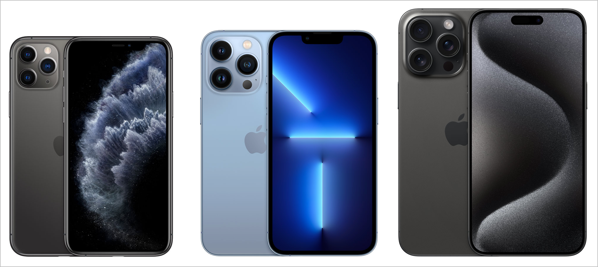
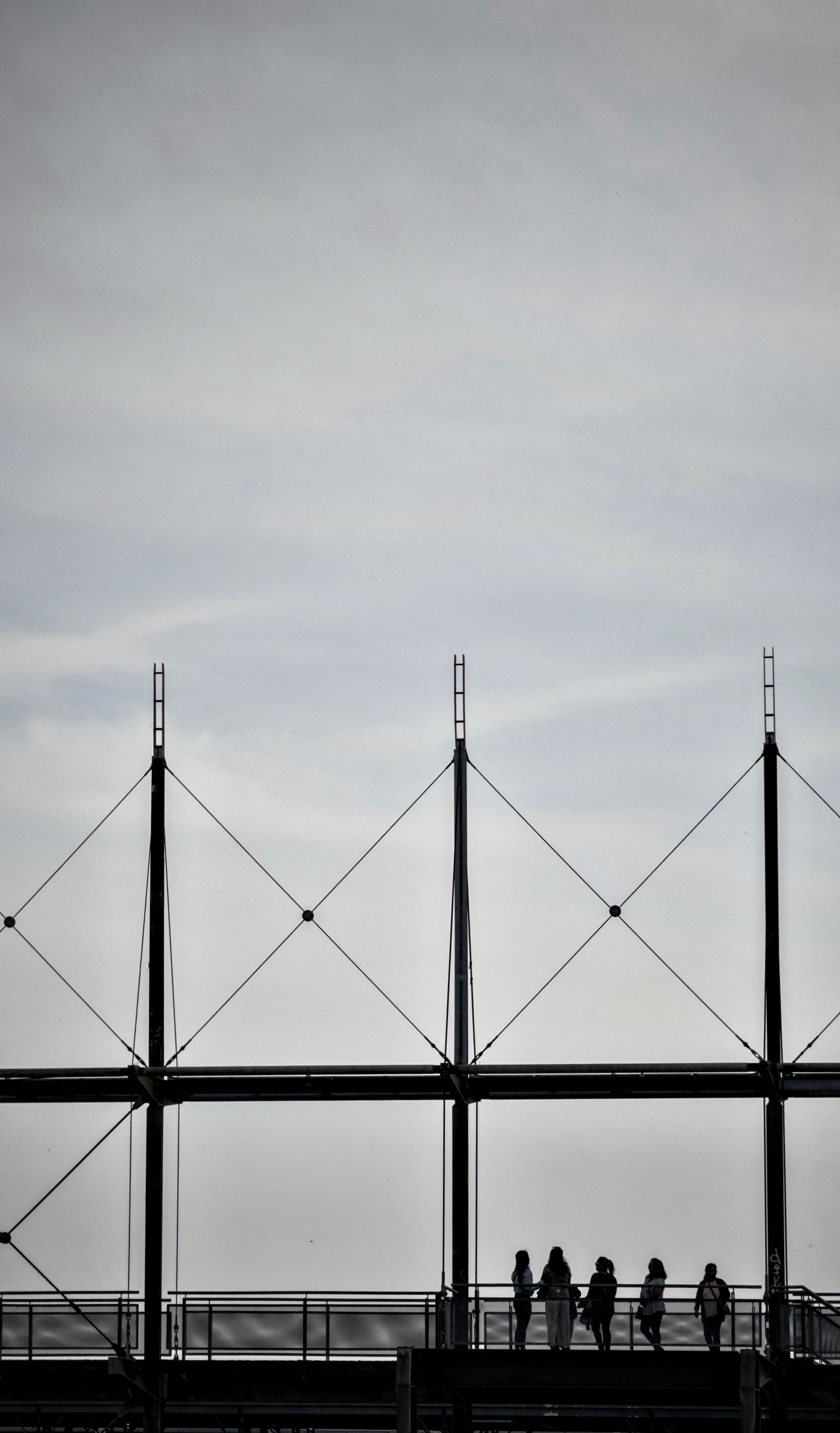
Photo section showcasing the possibilities of the iPhone 15 Pro Max



This article was written on my 2023 M2 MacBook Air using Craft and Ulysses.

