Thoughts From Last Weekend Visit to The Apple Store
Some thoughts following my recent visit to an Apple Store. An update to my future Apple purchase plans.
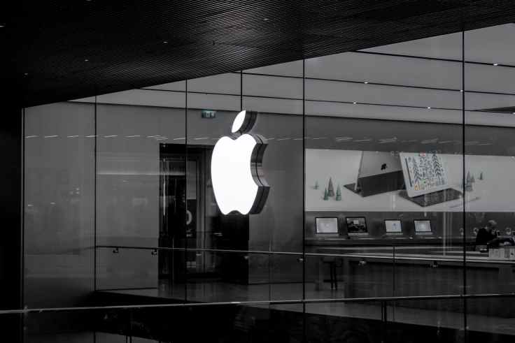
After more than 18 months without going to an Apple Store, it was time for me to pay a meaningful visit and get an experience refresh in person. I had three objectives in mind: compare the size of the iPhone 12 Pro to the Max, compare the size of the 12.9” iPad Pro to its smaller sibling, and experience the 2020 MacBook Air. I didn’t expect to buy any of these devices; just try a few things to help me make a better decision for my next Apple purchase. Here are a few of my thoughts coming out of this Apple Store visit.
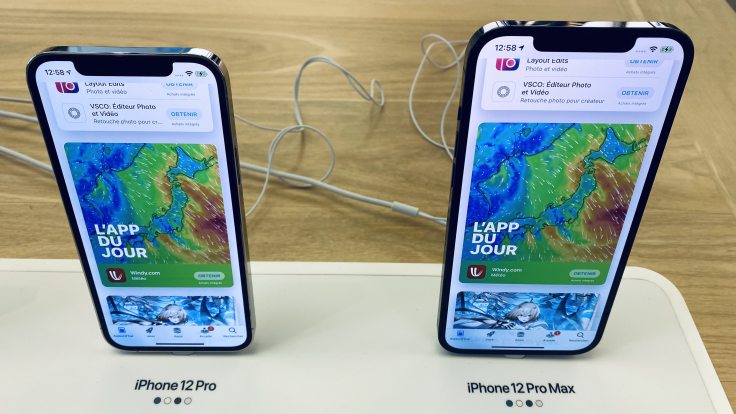
On the iPhone 12. The iPhone 12 Pro Max is big, but the information density isn’t what I expected compared to the non-Max version1. Both devices display about the same amount of information. As an example, both iPhones have six rows of applications on the home screen. Trying Maps, Photos, and Settings was enough to see how little difference there is. It’s a deception for me. The Max definitely requires both hands to operate, most of the time. The question that comes to my mind: why people choose the Max? Longer battery life? Better optical zoom? Is it because it is bigger? One last thing, the finish on the rather rough device edges makes it look cheap, and I hate it (fingerprints magnet x 1000). I much prefer the matte version on the iPhone 12. My hope is for this to improve this fall with the next iPhone iteration.
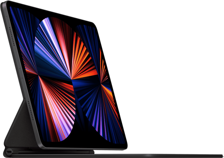
About the iPad. The 12.9” iPad Pro screen is gorgeous. In my hands, the device certainly feels big and a bit heavy. I love the information density. Using apps in split view mode while in landscape benefits from the bigger screen. While standing on its Magic Keyboard, the iPad’s 4:3 screen ratio reminds me of old PC monitors. It looks weird compared to the 11” iPad Pro.
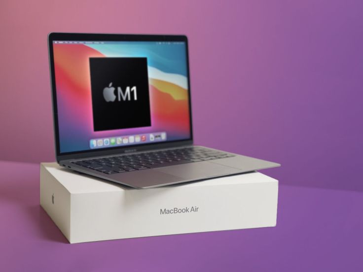
Lastly, the MacBook Air. From a size perspective, It seems closer to the MacBook Pro, while my old 2013 11” MBA feels closer to the 11” iPad. I prefer the latter. I wish the 2020 MBA would be smaller. I tried changing the screen resolution to 1680 x 1050 to get the screen to display information density closer to that of an 11” MBA, but I’m not convinced that I like the results. The keyboard is obviously fixed: nice, functional and quite different from the one on the 2020 MBA; the keys are bigger, keys spacing is tighter.
So, how is this visit influencing my next Apple purchases2? Well, I can say that I came out with a better understanding of what’s coming next. As for the iPhone, I’ll probably stay with the non-Max version this year with the upcoming iPhone 12s/13 if I ever upgrade. Let’s see what Apple has in store in September before making a final call. About this big iPad Pro: It’s a wonderful big screen, which isn’t enough to convince me; I’ll stay with the 11” iPad Pro. iPadOS has something to do with my decision. Who knew. The 2020 MBA, while a great machine, is not providing the same pleasure as the 2013 11” MBA on which I’m writing this blog post. Does it mean I’m passing on the 2020 MBA? No. Battery life and screen quality are winners. Size? Time will tell. I guess I could return the Mac to Apple if I really don’t like my overall experience.
All signs are pointing to the M1 MacBook Air, with 8 GB of RAM and a 512 GB SSD for my next Apple purchase, thanks to this Apple Store visit. It’s not fully future-proof with “only” 8 GB of RAM, but I think it will be just fine for quite some time. My current Apple purchases plan can be found in my Digital Garden.

