The Rotten Side of Tim Cook’s Apple
My love story with Apple started a long time ago. I’ve been an Apple enthusiast since 1982 when I started programming on an Apple ][+ before moving to an Apple //e then on a //c. I’m considered an Apple fanboy by my friends, my colleagues and my family. They could argue that I don’t have… Continue R


My love story with Apple started a long time ago. I’ve been an Apple enthusiast since 1982 when I started programming on an Apple ][+ before moving to an Apple //e then on a //c. I’m considered an Apple fanboy by my friends, my colleagues and my family. They could argue that I don’t have a critical sense of Apple. For them, my only take on Apple is one that they are perfect and never make mistakes. They couldn’t be more wrong. Here is why. Warning: this blog post contains many harsh statements about Apple.
Trying to strike a balance
If you want to be credible, you have to be critical. This is one of the many motivating factors behind this article. I don’t want to be perceived as an Apple hater because I’m far from it. Hating Apple is popular in the press in general, I know. It is fashionable. Why are people hating Apple these days? What are the pain points? In my opinion, behind the image of perfection Apple wants us to see, they’re many glaring issues and contradictions.
Apple fans should have a critical view of the company, its practices, its products and its services. There is always two sides to a story. As much as I like the story of Apple, their products, their ecosystem, there are many more broken things than we’d like to see, small and large, that I despise. We want Apple to thrive but not at any cost, certainly not while abusing its power.
Over the last year, I’ve been compiling my observations and thoughts on Apple in general. Today, I’m ready to expose my long list of grievances.
Before I get into it, let me explain a few things. First, when I use the word “You”, I’m referring to Apple. Second, to prove or give credence to my point, I’ll use “exhibits” as needed. Oh, a message to Apple zealots: You will probably deny many things that I mention in this article. I couldn’t care less. I have no need to justify any of this. This is my view, my interpretation. You can disagree and it is fine.
Generally speaking

If I had to choose a few words describing the rotten side of Apple, generally speaking, I would go for pretentious, stubborn, greedy, opportunistic, bully and indecisive. These words may seem harsh or even unjustified but it’s time for a reality check. In this section, It is all about problems, issues, missteps that are impacting Apple as a whole. Let’s start to dig the dirt.
It’s no longer about the products. Under the leadership of Tim Cook, it is no longer about the products. Exhibit A: As I recently wrote in “On Tim Cook’s Apple: It’s Less About the Products”, Apple is becoming more reactive to market opportunities than being a trendsetter. As an example, the motive behind the creation of the HomePod was in fact a reaction to Amazon’s Echo popularity, not because they thought they could fix a long lasting issue.
A big corporation. You might say that you are still thinking and acting like a startup internally but you are so slow to change or fix so many simple things. You’re the shadow of the startup you’ve been in the past. Exhibit A: How long did it take to reconsider the iPad as being a real computing platform which required its own distinctive operating system? Exhibit B: How long did it take to get rid of the volume hud on iOS, a simple user interface element that people were decrying to be too intrusive visually.
You are the bully in the room. You are being paid by us, the customers, to make decisions on product design, on privacy protection features in your operating systems and services, not to bully the developers with arbitrary decisions to terminate their developer account on shaky grounds. Some people would say you are highly competitive while others think you are a bully with your developers. Exhibit A: Examples are well documented.
It just works, really? Forget about “It Just Works”. It’s no longer the case. Sorry. Over the years, the Apple ecosystem saw an increase in device types, services, apps, operating system versions and features. Complexity has to increase accordingly and with it comes bugs and instabilities. It is a well-known fact that software quality has declined in general. Exhibit A: iMessage synchronization problems are lingering since Messages in the cloud has been introduced. It used to be worst but there are still issues popping up here and there. Exhibit B: Ask any developers their opinion regarding Xcode. You’ll be surprise by the responses you will get.
Greedy you can be. You are greedy at so many things these days. Exhibit A: meagre entry-level iCloud storage tier of 5 GB. Exhibit B: including a lousy FaceTime camera in most of your Macs. You started to fix this in 2021 MacBook Pro, thank you. The current pandemic and the new work from home trend should have pushed you to reconsider this much earlier. Exhibit C: The lack of SSD for entry-level Mac configuration, until recently, was a mistake. Instead, we endured the Fusion Drive with inadequate cache size.
Too stubborn to admit it. You are being perceived as stubborn by refusing to admit your mistakes quickly and swiftly because you care so much about your public image. Who remembers the MobileMe flaky debuts? Sure it was under Steve Jobs’s leadership but today’s Apple isn’t really different in that respect. Exhibit A: Remember the iPhone batterygate? What about the iPhone bendgate? Customers have to push you in the corner in order to get some results. It’s exhausting. Oh, I almost forgot: the butterfly keyboard. A disaster that lasted four years!
Missing obvious opportunities. You constantly miss opportunities. Exhibit A: The pandemic is forcing people to work from home. FaceTime, iMessage are great but not perfect. You could have used iOS14 to bring more features to these services to facilitate the work from home paradigm as I wrote in “Five Reasons Why Apple’s FaceTime is Losing The Battle Against Coronavirus”. Things are better with iOS 15 and screen sharing. You’re getting there, slowly. Exhibit B: Home networking is more and more important in this era of working from home is partially replacing traditional work patterns. Instead of pushing the AirPort product lines into new territories, you came up with the HomePod. The HomePod could have been something else entirely as I wrote in “Apple’s Biggest Mistake — No Home Networking Product” and in “Amazon, Google, Apple and Home Networks”. Instead, you made it look like the HomePod as a “me too” product. The HomePod mini didn’t change that. It’s more like a course correction.
Losing the education market. While on the subject of missing opportunities: your strategy for education is failing to help you fight against Google in the schools. Your products are for an elite, a certain type of student, a certain type of school. Poor schools are turning to Google’s cheap devices and services. Exhibit A: The loss of iTunes U and iBooks Author show that you no longer focus on educational tools beyond programming language, something that is much more narrow in scope and reachability. Exhibit B: Numbers are not in your favour, you are losing market share, fast.
Design language lost in translation

For so many years, Apple was regarded as the one who would put out the best product designs. But in recent years, this has started to change. Steve Jobs used to say design is not only how it looks but how it works. On that front, Apple’s recent years didn’t bring the best to the market. Let’s find out how.
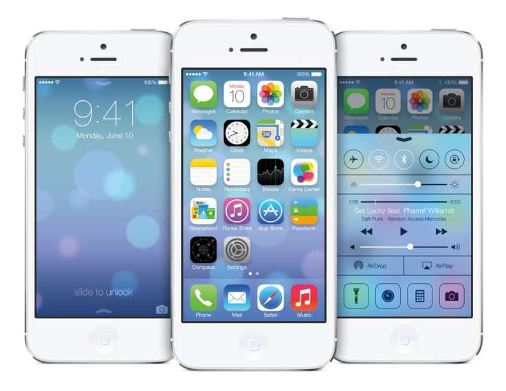
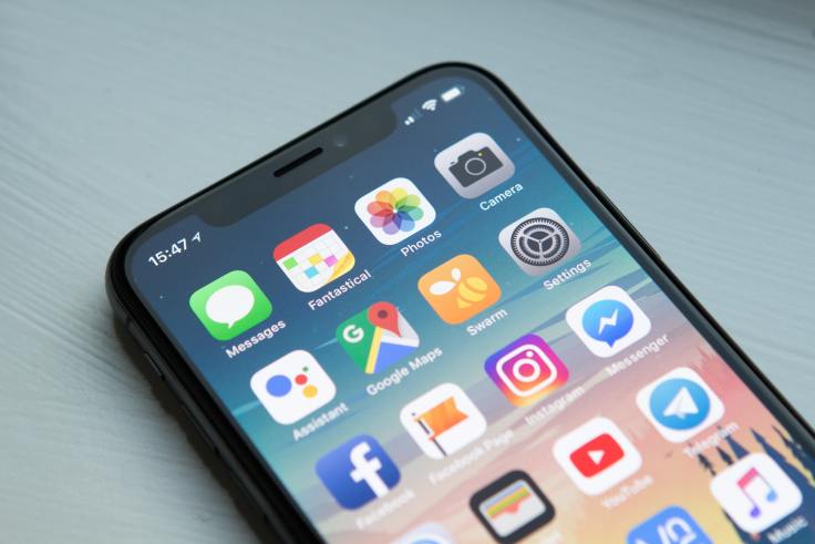
Paying the price of iOS 7. We are still suffering from the iOS 7 redesign and you cannot see your mistakes so you can’t fix them. They’re so many things wrong in this area they would require a separate article just for that. Exhibit A: Flat and drab design, weird and inconsistent iconography, hard to read text (too small, wrong contrast setting, etc.), invisible button behind text, home screen icons colour choices, etc. How many versions of iOS do we need to finally put iOS 7 bad design elements behind all of us? It’s 2022 and we are still suffering from this mess.
Absurd product design. You brag about your design prowess yet you come up with the trash can Mac Pro that nobody really liked and bought. You kept the pricing of this turd the same from start to finish: for five years. This is scandalous. Oh, again, I almost forgot about the Magic Mouse charging port, underneath.
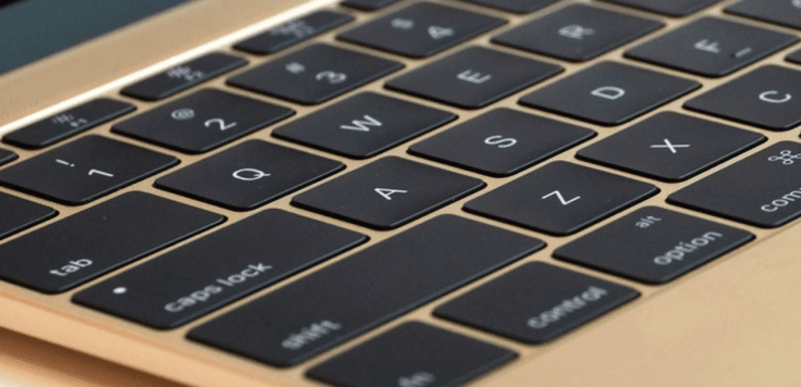
The butterfly keyboard that didn’t fly. You think you are the best design company yet you came up with the utterly flaky and flawed butterfly keyboard. It took four years to fix it by reverting to a working design. Users will have to endure their shitty keyboards for years to come until they throw out their expansive MacBook for a new one or when they switch to a Windows laptop. You thought the latest 16’’ MacBook Pro fixed all that? According to this Twitter thread, you are wrong. At long last, this heresy was finally put to an end, in 2021 with the new MacBook Pro.
User interface design choices that won’t scale. You design basic UI elements that fail at scaling. There are a plethora of examples affecting power users. Exhibit A: The Shortcuts apps which until recently didn’t support folders, a simple way to organize big shortcuts collection. Exhibit B: The share sheet redesign in iOS 13 was a mistake to merge both application actions with shortcuts. It’s a mess now. How do you manage that thing again? It is way too cumbersome.
If it works, don’t touch it. You forget too easily what is working just fine and get rid of things that you shouldn’t. Exhibit A: Text selection in iOS 13 was a nightmare. What were you thinking? Nobody at Apple uses text selection? Thankfully, it was fixed in iOS 15.
Less and less visual delight. Over the years, thanks to iOS 7, you removed so much delight in your software. You’re playing the conservative game. You still barely touch the surface of what could be done on a multi-touch device like the iPad.

Broken UI design elements. It takes ages to fix blatant basic UI design flaws like low contrast visuals, buttons not looking like buttons, too small tapping areas, etc. Are you taking accessibility seriously? Are you using your stuff and are you happy about it? That’s good enough, right?
Your user interface Achilles heel. You constantly fail at basic user interface design principles like affordance, discoverability and consistency. Exhibit A: You tried 3D touch only to remove it a few years later because few people knew about it. The same is happening on the Apple Watch with watchOS 7. It was a great idea but poorly implemented on the discovery aspect of it. With watchOS 7 you rolled back Force Touch and the transition is no going well. Another case for poor discoverability, in case you didn’t know. Exhibit B: Catalyst apps.
Device thinness obsession. You put iPhone thinness ahead of more desired features like longer battery life. Can you still read the room temperature? On that matter, thank god, things are slowly starting to change. The iPhone 13 is a good sign and the 2021 MacBook Pro, being much thicker than its predecessor.
Jony has left the building, at long last. Let’s face it, Jony Ive stayed at Apple way too long. My point of view is probably not very popular. He should have left the company when he started to get deeply involved in architecture, leaving his team at the design studio behind, without direction to go beyond the Steve Jobs+Jony Ive era. Did he prepare his successor like Steve Jobs did? I doubt it. Now, who’s in charge? Pay attention to the following Apple’s leadership page. The design team is not represented in any way.

Here is a recent blog post by John Gruber:
My biggest question and deepest concern regarding Apple’s leadership (…) whose taste is driving product development? We know the actors, we know the writers, we know the cinematographers, but who is directing? Who is saying “This isn’t good enough” — or in the words of Apple’s former director, “This is shit”? When a product decision comes down to this or that, who is making that call?Jogn Gruber
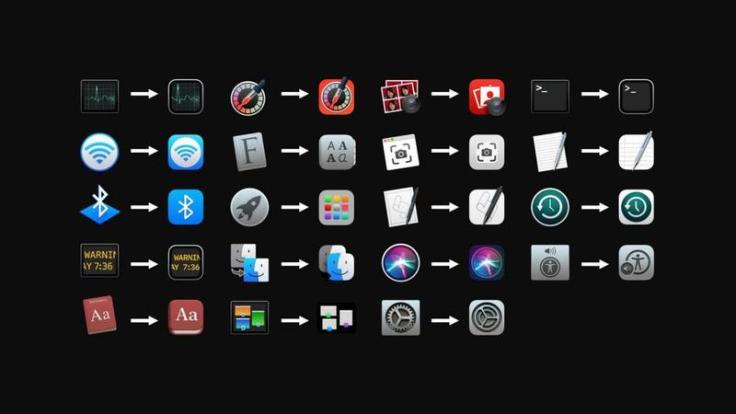
Refreshing but inconsistent. The lack of visual consistency in icon design on macOS Big Sur (and later on macOS Monterey) is questionable. This lack of uniformity makes it look like you couldn’t make up your mind. Sure it is a refreshing look but what is the purpose beyond looking arbitrary? Oh and no, it isn’t funny. Exhibit A: http://morrick.me/archives/9025. Exhibit B: https://link.medium.com/AXVOs197q9. Another example on Twitter.
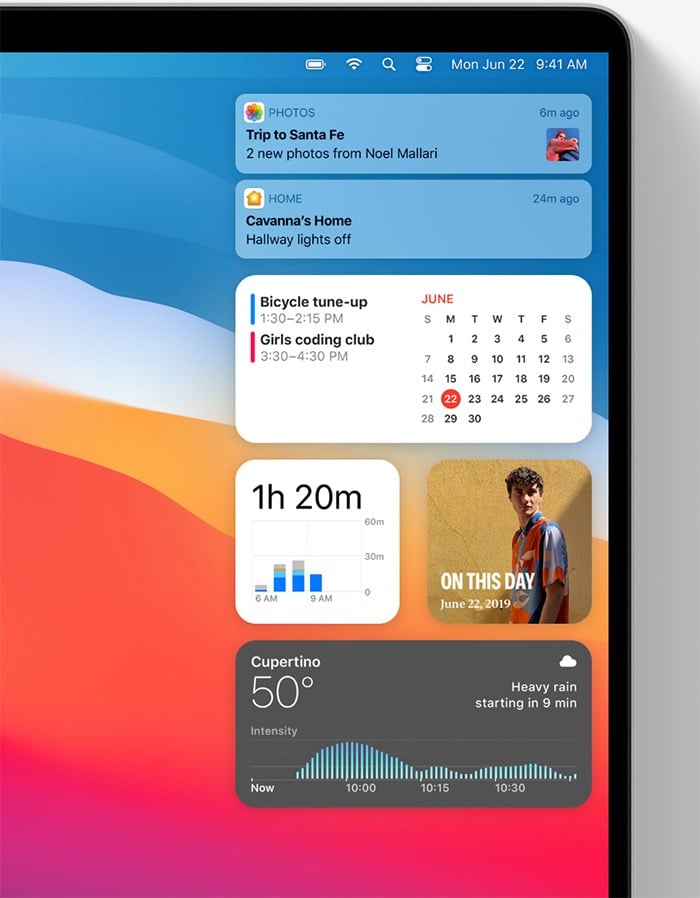
Big Sur big flaws. On macOS Big Sur, the design of the new notifications and widgets is a complete mess. You could have re-introduced the beloved Dashboard. Instead, you went with a clumsy design mixing notifications and widgets on the right, leaving the vast portion of the screen unused on the left. What is the idea of missing widgets with notifications on the Mac but on all other devices they are separate? Oh, and the animation when manipulating the objects is massively janky.
Laziness over leadership. You became lazy over the years. You don’t go far enough and try hard enough to reinvent basic things like emails and calendaring. You stopped showing the way of software design a long time ago. Exhibit A: Look at @HEY for trying something different and succeeding at doing it.
Simple missing features. Your software can be frustrating to use. Exhibit A: on iOS 14, when you enter the Edit Pages on the home screen, you cannot move pages around, just turn them off or on. Really? That’s really baffling.
Developers vs Apple
Developers are the best brand promoters. They build software and services because they believe in their ability to take monetary advantage of an ecosystem. We can argue that without developers, your success isn’t possible. You often talk about the developer community as very creative people using Apple’s latest software technologies. On the other hand, your actions can land a different message about how you see developers to your bottom line. Sometimes, you have to ask yourself if you remember how important developers are and always have been for your existence.
Power abuse. You look like you despise your developer community by abusing your power over them with inconsistent rules interpretation for anything that could endanger your bottom line.
Burning bridges. You are burning bridges with your most important allies: the developers. They are the most powerful platform advocates. They no longer can trust you and are afraid to speak publicly on many subjects. Exhibit A: Complaints from developers are numerous and well known as shown here. Those are samples from the ones who chose to speak out. It is well known that many developers are afraid to talk publicly about this matter.
The famously bad review team performance. You lost control of your App Store review team with arbitrary blockage and widely questionable rejections. Exhibit A: The most recent and high-profile case is the rejection of an update to the popular WordPress.app. Even if the case has been quickly resolved, this is inexcusable. You are inconsistent with your App Store submission reviews. The process is not fully transparent. There are way too many known cases to list here and I cannot imagine how many unknown cases there are. Not all developers are willing to talk about this.
Innovation neutralization. You are neutralizing innovative software and service creation with your inconsistent App Store review. Developers are more and more afraid to invest time and effort into new ideas because they just don’t know how the App Store review team will process submission.
Questionable tools quality. Your tools are suffering from quality and stability problems. The same applies to your developer documentation in general: incomplete, inconsistent, contradictory, absent. The trend has been worsening in recent years.
Lack of excitement for the Mac. Why so many new Mac apps these days are based on the Electron framework instead of being native? What is it that is not working for such a silent platform defection to take place? Is your only answer Catalyst? That’s it? Developing apps with Catalyst creates sub-professional, under-powered apps and you know it. Catalyst is something that you created for your desire to port iOS apps to the Mac and it shows. Good examples of Catalyst-based apps like Craft the exception, not the rule.
Customers’ shadows only. You keep obfuscating the customer relationships from the developers with less and less added value. In fact, this is becoming more and more frustrating for developers to deal with it. Sure the customer is at the center of your prerogatives, but you are not alone for which customers need to be at the center.
Inequality in developers treatment. Stop saying all developers are treated the same. This is false. Exhibit A: Netflix.
Products missteps
Being ahead of the curve can be a good thing. Apple isn’t always judged by how many times they can see where the puck will be going. We all know they enter an existing market space if they feel they can improve the currently available products. In recent years, Apple lost many opportunities that make Apple look behind the curve.
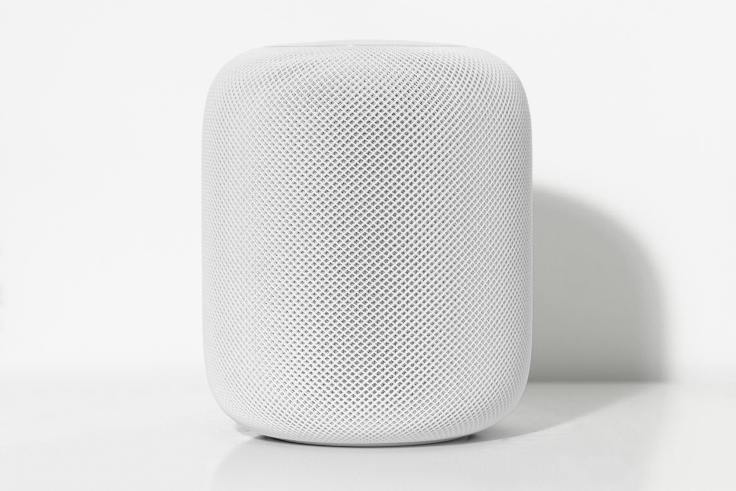
Too much hesitation. You often look hesitant while launching products in search of a purpose. Exhibit A: HomePod may be a good design with great sound performance but it is lacking intelligence and features. Exhibit B: Apple Watch Series 0: First touted as a personal communication device, later pitched as a health-centric device.
Weird product naming schemes. You suck at naming your product lines. Exhibit A: iPhone SE and now the Apple Watch. Thank god, you didn’t come up with Apple Watch Pro. Exhibit B: Even service naming can be lame and creates confusion: Apple TV+, the TV service, or the physical device?
Features with unclear or unrealized potential. Customers are replacing their devices faster than the time it takes for you to implement software that takes advantage of hardware features. Exhibit A: The most recent case is the Lidar scanner on the 2020 iPad Pro. Exhibit B: U1 ships in iPhone 11 Pro and now in the Apple Watch Series 6.
Holding back products. You are apparently holding back many of your products by not implementing features without an apparent reason. Exhibit A: The iPad is a special beast. You want it to be a computer replacement for many people. You position the iPad as a full-featured computing platform. Even after introducing support for mouse input with iPadOS 13.4, you are still holding back the iPad by not fully supporting free widgets placement or external monitors. Exhibit B: The Apple Watch is still without a watch face store which could prove to be hugely successful.
Too much security is like not enough security. macOS Catalina should have been called macOS Vista: too many security prompts. macOS Big Sur is even worse. The very first thing the user gets upon the first session is a security prompt to access your location. Not sure if this is the best user experience. macOS Monterey hasn’t changed that.
Flimsy hardware. You are making some flimsy hardware. Exhibit A: Outdated FaceTime camera in modern and pricey Macs for way too many years. Exhibit B: You let the Fusion Drive option live for way too long as everyone was moving to SSD in entry-level configurations.
Pro photographers left behind. You abandoned the pro photographers market a long time ago. Why? You brag about the iPhone 13 Pro camera prowess but don’t offer a professional photo editing application. Exhibit A: Remember Aperture?
A solution is search of a problem. Augmented Reality certainly makes great demos but beyond saying AR is the next big thing, you fail to answer why it is important for normal end-users. Use cases are still for very specific demographics and use cases.
The future of TV. Remember The future of TV is apps? Where are real interactive television shows? Is there a line that can be drawn between the future of television and augmented reality technologies? Where are you going with this? In fact, you are trying to become just another cable company promoting bundles or another Netflix.
The Touch Bar nobody asked. The Touch Bar was introduced with the wrong use cases. Since its debut, it barely evolved and too few apps are taking advantage of it. Moreover, you make the Touch Bar mandatory in every professional MacBook.
Keyboards… Do you see that keyboards, physical and virtual, are one of your Achilles heels? Exhibit A: the utterly flawed butterfly keyboard. Exhibit B: The autocorrect feature on iOS is still broken, even on iOS 15. It’s the worst release in that respect.
Fonts support on iPadOS. Why is fonts support on iPadOS is so convoluted? Is this a real computer replacement or not? Maybe with iPadOS 16.
Search is hard. You suck big time at anything related to search, especially on the App Store. Developers are complaining about it. Users are complaining about it. The quantity of junk and outdated apps could be part of the problem, I guess.
Services, the growth landscape
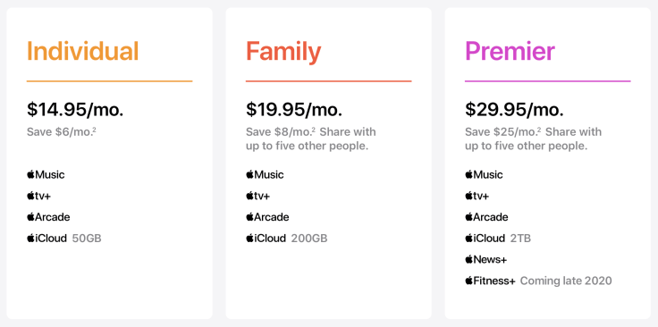
Ten years from now, we will look back at Tim Cook’s era as the CEO and see how he was intimately instrumental in the transformation of Apple going from a product company to a service company. Is it a good thing? Was it the only way for Apple to grow? How well did Apple execute in this space compared to physical products?
Apple TV a messy mess. This little black box is pushing standard streaming on us, not reimagining the television experience that could mix streaming with interactive content (remember video disk players back in the eighties? Or what about iTunes Extras?). Exhibit A: You had one job with the TV app and is utterly lacking in meeting its mission of unifying the streaming world. You know why? Because competing services didn’t think it was worth it to join your platform.
The App Store junkyard. You brag about quality but the App Store with more than two million apps is full of uninspired, useless, unfinished, outdated, broken and scammy apps that you let it in with your highly questionable review process.
5 GB of iCloud storage for free. How is this even possible that a mere 5 GB of storage is available for free while you sell iPhone capable of 4K videos?
Uneven and slow international rollout. I live in Canada. It took years before Apple News came in. We are still waiting for Apple Cash and Apple Card. Canada is not alone in this situation. It is a bit frustrating.
Concluding remarks
Make no mistake, Apple is still a remarkable and unique company. My love affair with Apple is far from falling apart. Their products are most of the time the best in their class. Product launches are still perfectly orchestrated. The M1 chip is probably the most mind blowing thing to happen to the Mac in a long time. It was an example of “savoir-faire” that is still unmatched in the industry. They keep attracting world-class talent in many fields. Yet, as an Apple observer, lucidity is mandatory and Apple is far from perfect. I don’t want to look like an Apple hater because I’m not. Really. I want Apple to keep pushing the boundaries and stay close to the “think different” mentality. I hope they don’t forget their roots and keep caring while others don’t. I do. That’s why I wrote this piece.

