The iPad Magic Keyboard: The Magic Pivot of the iPad
Amid the coronavirus crisis, Apple recently released a bunch of new products1. From an updated MacBook Air to a beefed-up iPad Pro and many new Apple Watch bands, one product stands out: the Magic Keyboard with a trackpad for the iPad. With the iPadOS 13.4 release, the new keyboard could become a pi
Amid the coronavirus crisis, Apple recently released a bunch of new products1. From an updated MacBook Air to a beefed-up iPad Pro and many new Apple Watch bands, one product stands out: the Magic Keyboard with a trackpad for the iPad. With the iPadOS 13.4 release, the new keyboard could become a pivot in the iPad journey. This is my take on Apple’s announcements.
Surprise and excitement
Many observers and tech journalists were expecting an Apple event this spring. But, as you know, the coronavirus probably forced Apple to change its plans. I’m happy to see Apple release new products anyway for our joy and excitement.
There was no keynote, but there is plenty of online stuff for us to take a look at. Take this video of Craig Federighi talking about the new iPad keyboard and iPadOS 13.4. It feels a bit strange, but the context makes it understandable. It could represent a taste of things to come for their WWDC conference in June2.
The other thing exciting is this ad: “How to correctly use a computer.” I like this ad very much because of its tone and a bit of self-mockery. It is probably one of the best iPad ads that I’ve seen. This video could have been part of a keynote.
Staying true to its core attributes
According to Apple:
With iPadOS 13.4, Apple brings trackpad support to iPad, giving customers an all-new way to interact with their iPad. Rather than copying the experience from macOS, trackpad support has been completely reimagined for iPad. As users move their finger across the trackpad, the pointer elegantly transforms to highlight user interface elements. Multi-Touch gestures on the trackpad make it fast and easy to navigate the entire system without users ever lifting their hand.
Here is the thing, the one thing that I find utterly interesting. Apple managed to introduce support for a trackpad without touching any of the visual attributes of what makes an iPad an iPad. The input methods circle is now complete (touch, keyboard, pencil, voice and now the trackpad). You won’t lose anything by not connecting a keyboard or a mouse. It is brilliant.
It’s important to note that if you don’t attach a mouse or trackpad or keyboard to your iPad, nothing will change. The iPad is, at its core, a touchscreen tablet. You should never, ever find yourself in a situation where you can’t do something on an iPad if you don’t have a mouse or trackpad handy.Jason Snell of SixColors
Let’s talk about the hardware
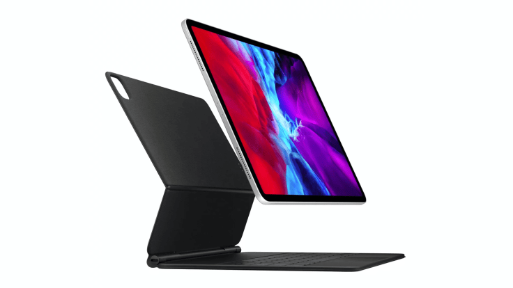
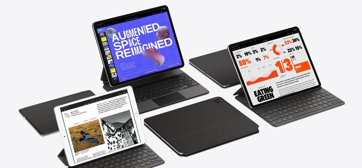
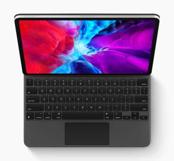
I’m a big fan of the 2018 iPad Pro design, and this year’s product release is about continuity. The floating design of the Magic Keyboard enhances the iPad general allure, and I love it. I can see, from promotional videos, that it is quite easy and natural to take off the iPad from its stand by grabbing the bottom part of the device. Clever. That is the Apple way that I like.
This thing is not designed to be a case but to be a great keyboard with a stand. And the colour, hard to tell from looking at images or videos, seems darker than what Apple has done so far. Seeing Apple gear in person always makes things even better looking.
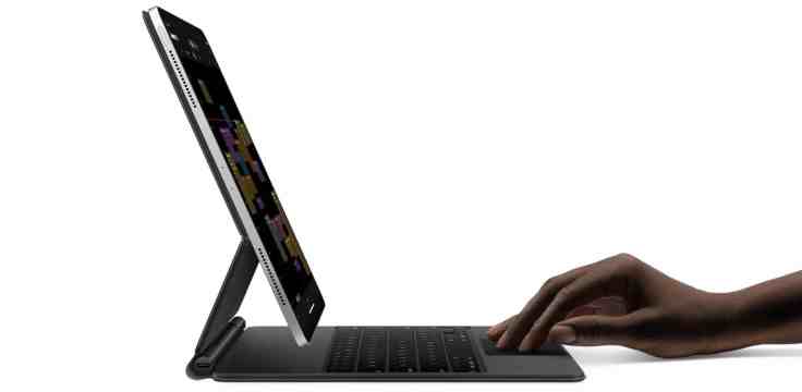
This magic keyboard design was unexpected in a few ways: backlit keyboard keys, USB-C port for charging on the side of the hinge, which is a brilliant idea by the way. The keys look like the one on the Magic Keyboard that I use and love but with rounded edges.
I wonder about the combined weight of the new keyboard and the iPad Pro. I hope that it stays on the “still light enough” side of the fence. I can’t wait to try it. For obvious reasons, I’ll buy it as soon as it becomes available for purchase. We still don’t know when Apple Store around the world will open its doors3.
Experimenting with the mouse
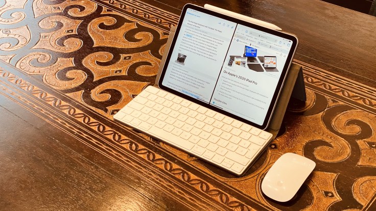
While I wait for the keyboard to be available in May, I decided to install the GM image of iPadOS 13.4 to try it with my Magic Mouse 245. I’ve been testing this setup for many hours, and so far, it is awesome. It’s not without its quirks though (more on this later), but what Apple has done here is remarkable. It feels alive 6. It feels organic 7 8. It is like it always been there.
Adding a trackpad to iPad was done in a way that reimagined not just the idea of a pointer, but in the entire package — hw & sw. That’s what makes this interesting.Steven Sinofsky
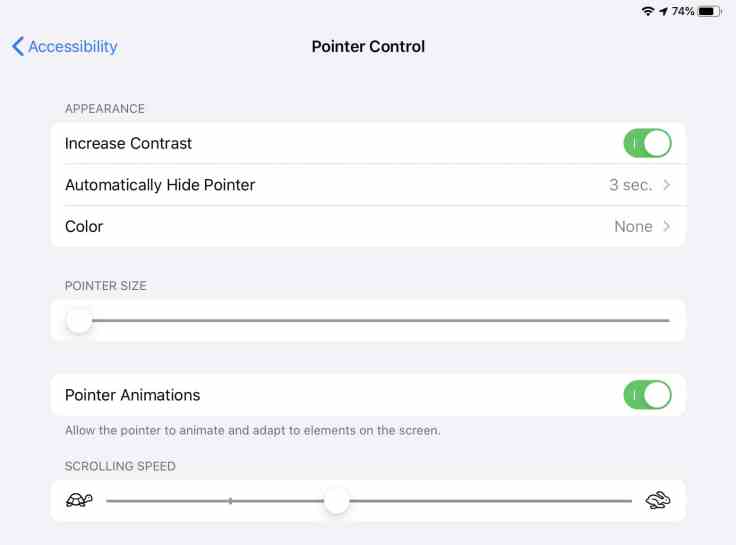
I did make a few changes to the default pointer settings though as shown here. It better fits my taste.
You can peek at how the cursor support has been implemented by looking at the web yourself. But, since I’m a good guy, here is a short reference list.
- General interaction with the mouse with a few apps, see this tweet.
- Adaptative cursor in action based on target type and how it goes from one target to the other, see this tweet.
- Interaction with the Calendar app, see this tweet.
Better at text manipulation?
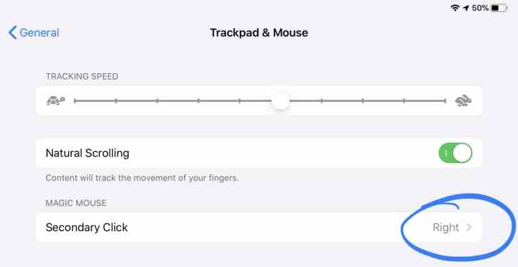
As you know, iPadOS 13 introduced quite a few changes to text manipulation. Some of the changes are quite controversial and infuriating9. How does iPadOS 13.4 with mouse support help in this context? I’m happy to report that I find it much easier to work with text in general. Positioning the text cursor is much more precise than with touch. Selecting text is what it should be. But, by default, once selected, right-clicking doesn’t bring the cut-copy-paste menu, though, which is weird. Enabling the right-click in mouse settings fixes the issue. I wonder why Apple didn’t choose to enable that by default.
To make a story short, trust me, if you write a lot with your iPad, mouse support will improve your experience a lot.
Some adaptation required but it is worth it
There are some areas where will need to adapt, though. One example of this is with iPadOS multitasking gestures. Consider this case: moving the pointer to the bottom of the screen will eventually, bring the dock. By keeping the movement downward, and eventually, the current app will be dismissed and the home screen revealed. But, if you want to bring the multitasking view, grab the horizontal handle, and move it up but do this before the dock comes into view. It sounds harder than it is in reality, and I expect the learning curve to be short for most people.
Here is an example of something that works better with the mouse than with touch.
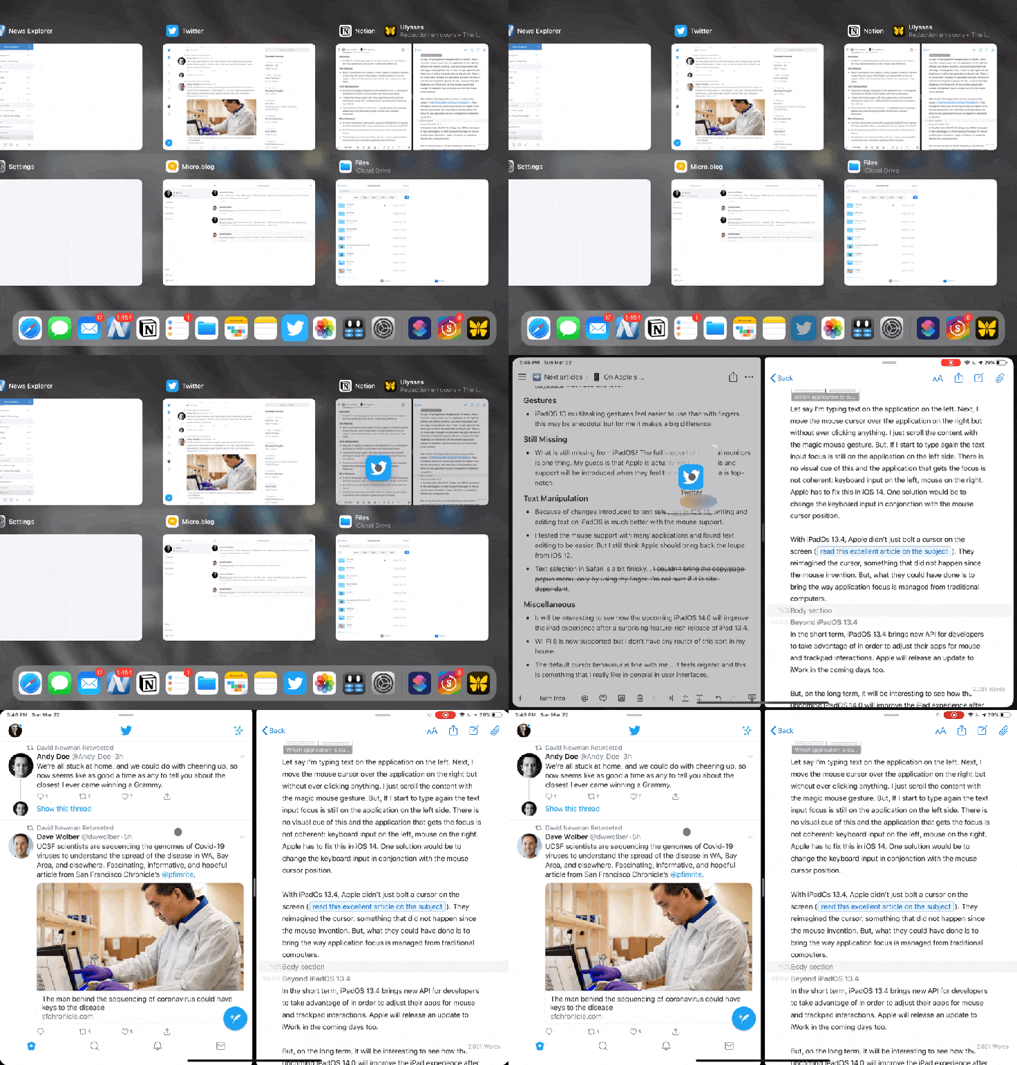
To me, at least, this gesture is smoother than by using my finger. Another example below when invoking the Cmd-Space to search while in an application.

A lack of focus?
I do welcome mouse support on the iPad, but it amplifies a well-known problem: the lack of focus of the active application while being in split-view. The absence of a clear visual cue of the currently active application in relation to the keyboard input becomes worst with iPadOS 13.4 with mouse interaction10. Let me give you an example.
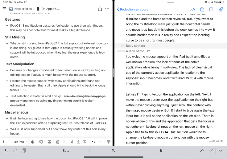
Let say I’m typing text on the application on the left. Next, I move the mouse cursor over the application on the right but without ever clicking anything. I scroll the content with the magic mouse gesture. But, If I start to type again, the text input focus is still on the application on the left side. There is no visual cue of this, and the application that gets the focus is not coherent: keyboard input on the left, mouse on the right. Apple has to fix this in iOS 14. One solution would be to change the keyboard input in conjunction with the mouse cursor position.
With iPadOS 13.4, Apple didn’t just bolt a cursor on the screen (read this excellent article on the subject). They reimagined the cursor, something that did not happen since the mouse invention. But, what they could have done is to bring the way application focus is managed from traditional computers.
Beyond iPadOS 13.4
Today, iPadOS 13.4 brings new APIs for developers to take advantage of to adjust their apps for mouse and trackpad interactions. Apple will release an update to iWork in the coming days too.
For the next year, it will be interesting to see how the upcoming iPadOS 14.0 will improve the iPad experience after the feature-rich release of iPad 13.4. One small thing I’d like to see is a less flat cursor. Adding some “very slight depth” would increase visual appeal, in my opinion.
One big thing, I think, is much-improved support for external monitors. Remember, the Magic Keyboard with trackpad comes with a USB-C port that can charge the iPad leaving the iPad’s USB-C port for other things like an external monitor. I guess Apple is actively working on this and support will be introduced when they feel the user experience is top-notch. I can’t wait to plug my LG UltraFine 4K display on it.
Some more thoughts
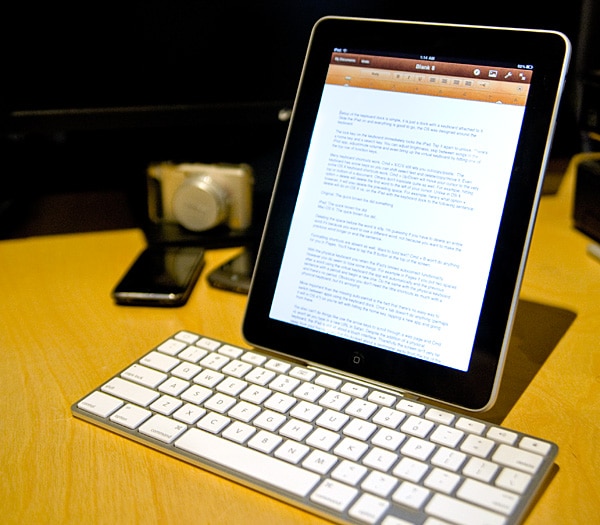
This announcement from Apple created a stir, at least, from what I saw on my Twitter feed. Reactions are overwhelmingly positive, either for the hardware or the software implementation side. But, for some people, the idea of adding a keyboard and a trackpad to the iPad kind of goes against its very nature of being a simple tablet. I couldn’t disagree more. Suffice it to say that Apple did offer a keyboard option for the original iPad, too11.
And what about those people who think that to consider a tablet to be capable of doing serious work, only Microsoft’s take on tablets was right from the beginning with the Surface. With these people, I would argue that Apple’s initial intention with the iPad was different than Microsoft’s. The starting point of the journey was also quite different. Apple started with a mobile OS that eventually was extended for the iPad, another quite mobile device. In contrast, Microsoft started with a Desktop OS that was morphed into a mobile OS. I prefer the end results with iPadOS by a long shot. By the way, Microsoft is not done yet as it tries to fit Windows OS as a more tablet-friendly operating system with Surface 8 currently in the works:
Microsoft, who is working from the opposite of end of trying to make a desktop OS more palatable to light-computer devices like the Surface Pro XDaniel Rubino of Windows Central
To me and many others (see Gruber’s tweet), Apple’s iPad and Microsoft’s Surface are converging to a stage of equilibrium. It is a good thing. Eventually, tablets will represent 80% of non-smartphone devices and PC will be seen as trucks. Just wait for it, it will happen.
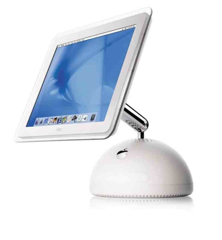
One side note, when looking at the iPad standing up on its Magic Keyboard with a trackpad, being suspended or supported in the air, don’t you see some similarities with this Mac?
Finally, each time I see people posting iPad screen recording clips, I find it hard to understand what is happening. The reason why is simple: we don’t get to see touch interactions. Well, starting with iPadOS 13.4, it is a thing of the past because of the mouse cursor is now visible!
It is an exciting time for the iPad. Apple’s ongoing investments in the platform are bearing fruits. More than ever, I see the future of computing for the masses in tablets. The last time I had the same feeling was in 1984 following the Macintosh introduction. At the time, I saw the future too.
For me, this iPadOS update is transformative of the iPad experience in many ways. The future is brighter than ever. Meanwhile, I cannot wait to get my setup transformed this coming May.
Do you think the iPad is at a pivotal time? Feel free to leave a comment and engage in discussion! It’s always welcomed!
- The updated iPad Pro is nice but having a 2018 iPad Pro I don’t feel the need to upgrade. ↩
- As I write this blog post, I still think Apple won’t cancel the online version of WWDC even if Google cancelled its own conference altogether. Who knows, maybe Apple will reinvent the conference too as we know it! ↩
- As of this writing, my expectation is that it won’t be before the keyboard is available for order. ↩
- Exceptionally, I didn’t participate in this beta. I didn’t want to mess around with my data and iCloud Drive. ↩
- I’m wondering if I should buy a Magic Trackpad but at $US 129 a pop, I think I’ll wait. ↩
- This is something that I really like in user interface design. ↩
- I’m still fascinated by inertial scrolling on iOS by the way. ↩
- The loss of the loupe is one of them. ↩
- Before you correct me, yes I know about the different tint of the small horizontal handle at the top of the application window view but I don’t consider this to be clear enough for the user. ↩
- It did look a bit weird at the time. ↩
