Stepping Up to the 15-inch M2 MacBook Air: My Observations
This is my third MacBook Air since 2021. From the 11-inch to the 13-inch and now the 15-inch, the Air still symbolizes a light and mighty computing device.
Why upgrade in the first place?
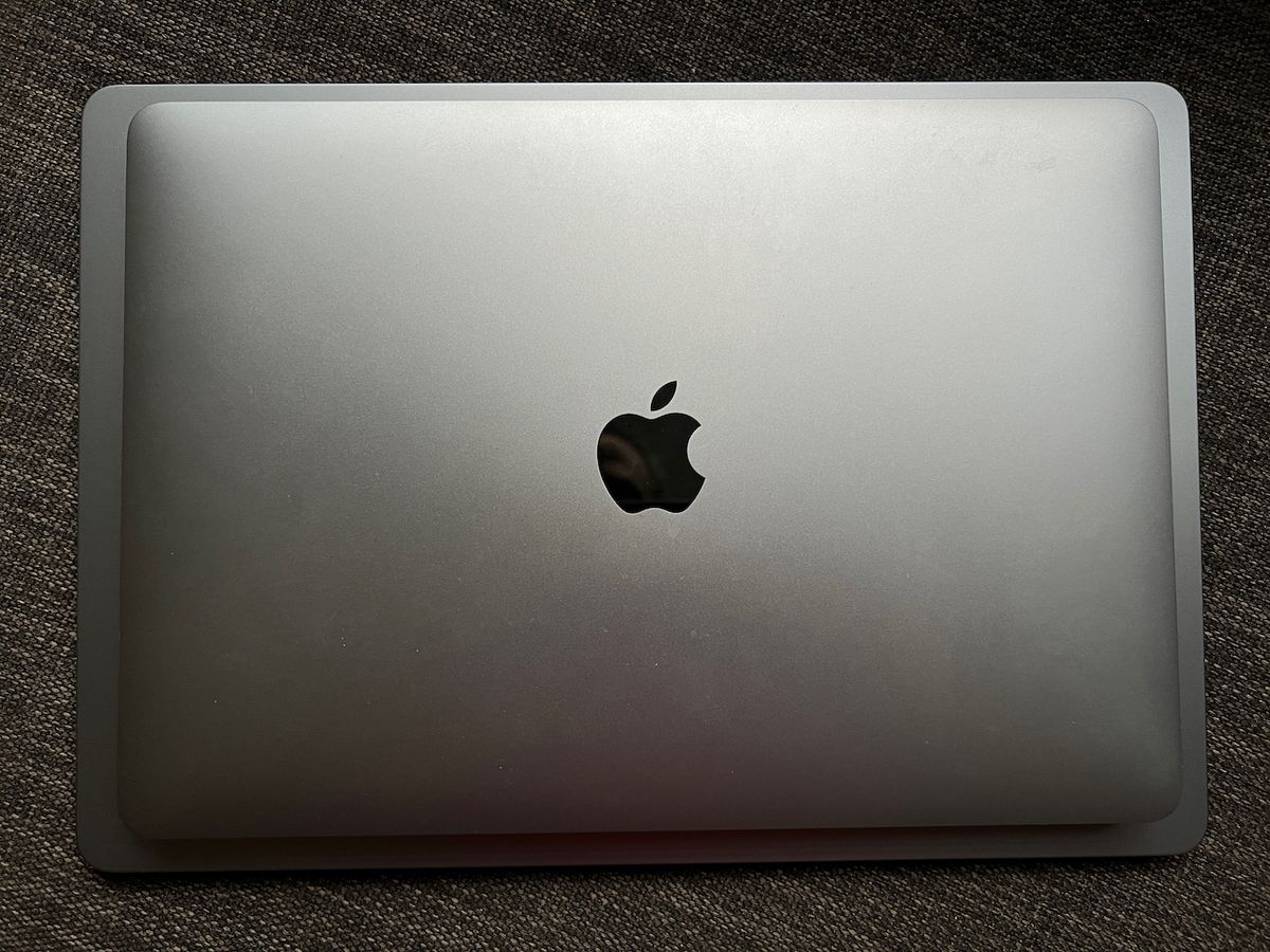
When I bought my M1 MacBook Air in mid-2021, I tried to limit my spending amount and chose the 8GB / 512 GB configuration. My intensive use of this Mac proved that it wasn’t the best decision. It’s fine 80% of the time, but when I open apps like Craft, Lightroom and Photomator, things start to slow down a bit, which is something noticeable on such a fast machine, even in its base configuration. Having to “manage” open apps is something that we shouldn’t care about too much. The new MacBook Air configuration had to address that. But, other than that, there was much more to it than simply adding more memory: the much bigger screen and the following:
- Improved overall design, which I like quite a lot (bigger trackpad, rounded edges).
- Improved sound quality because I like watching videos and listening to music on the go.
- MagSafe charging connector because removing such a clever invention from previous generations was a mistake.
- 8GB to 16 GB of RAM for better performance in all my use cases and from 512 GB to 1TB of SSD for better future-proofing.
A special note about the overall design: One could argue that all Mac laptops look the same now. The loss of the unique MacBook Air tempered design certainly contributed to this:
"When Apple changed the design of the MacBook Air with the new launch, I was disappointed. It was losing its uniqueness. Instead of an icon, it looked like any other Apple (or Windows laptop.) Sure it was thin and light, but the design looked pretty ho-hum. (…) by losing the iconic shape, Apple has shorn the “Air” line-up of its instant recognizability. For me, MacBook Air signified — practical, smart, and sensible. The new MacBook Air is just another faceless slab of aluminum in an ocean of laptops. Unlike John Gruber and others, I just can’t get over the loss of an iconic design.” — Om Malik in “Some thoughts on the 2022 MacBook Air”
I’m not sure on which side I stand. The old MacBook Air certainly had an iconic look and design, but like everything else, change comes for all purposes and objectives.
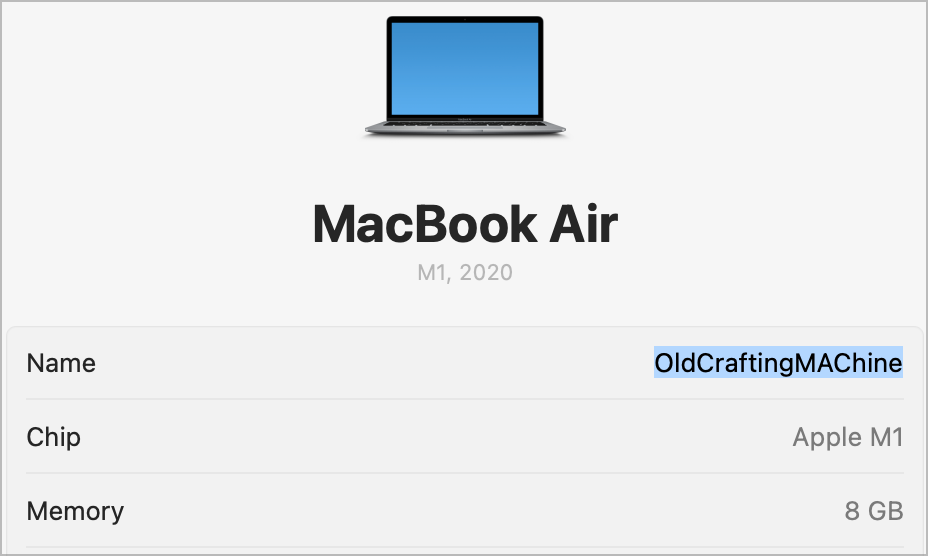
Besides those improvements, I had this question in mind: did I really need it? I had my doubts before making my final decision. The cost of the upgrade was not that much, thanks to a student store credit promotion (worth 200 $CAN), the return of my MacBook Air (worth 580 $CAN) and the use of store credits earned through my daytime job (worth more than 1800 $CAN). Overall, this upgrade is probably the cheapest upgrade ever. The decision was much easier to make.
The upgrade process using the Apple Migration Assistant
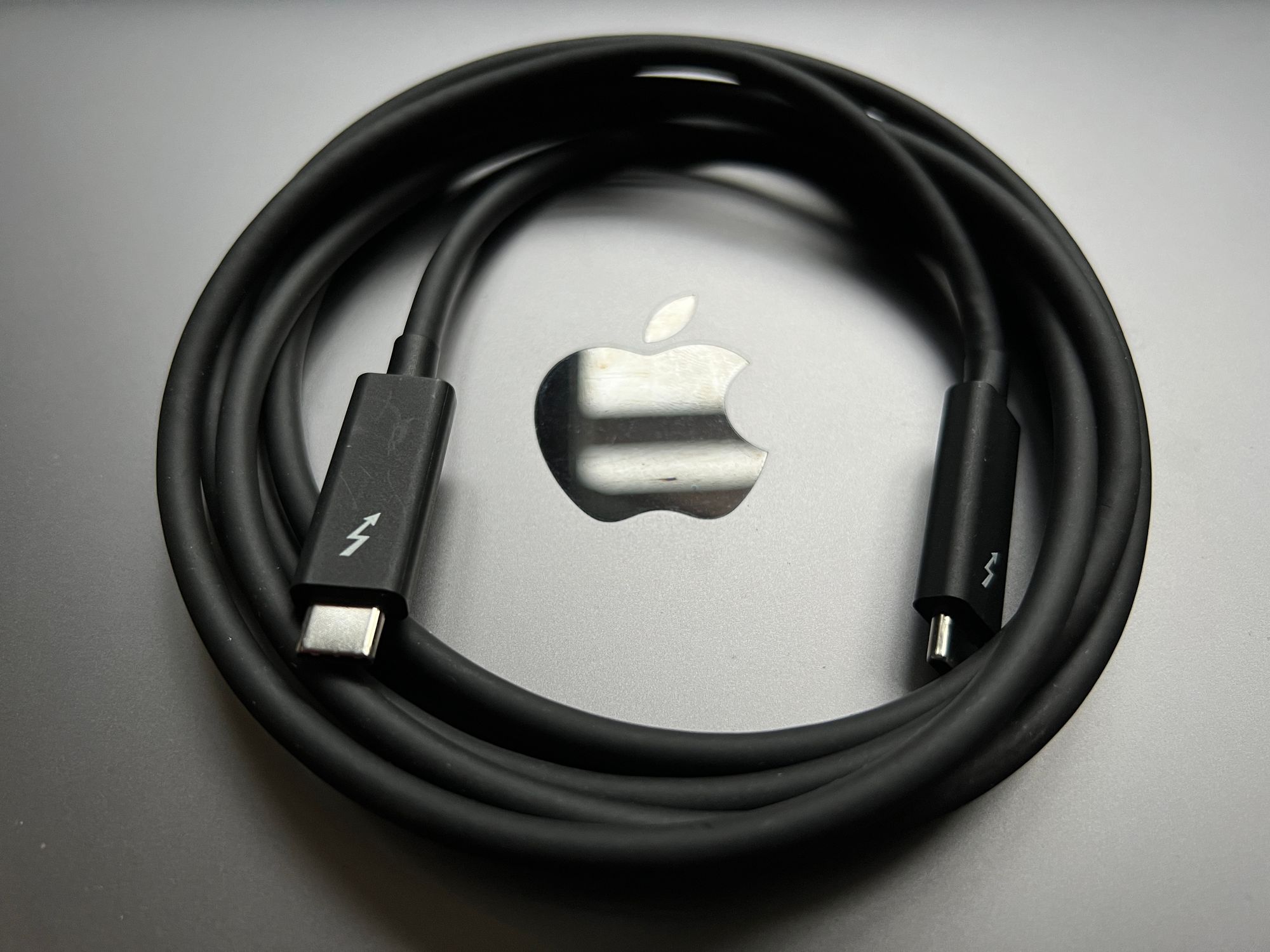
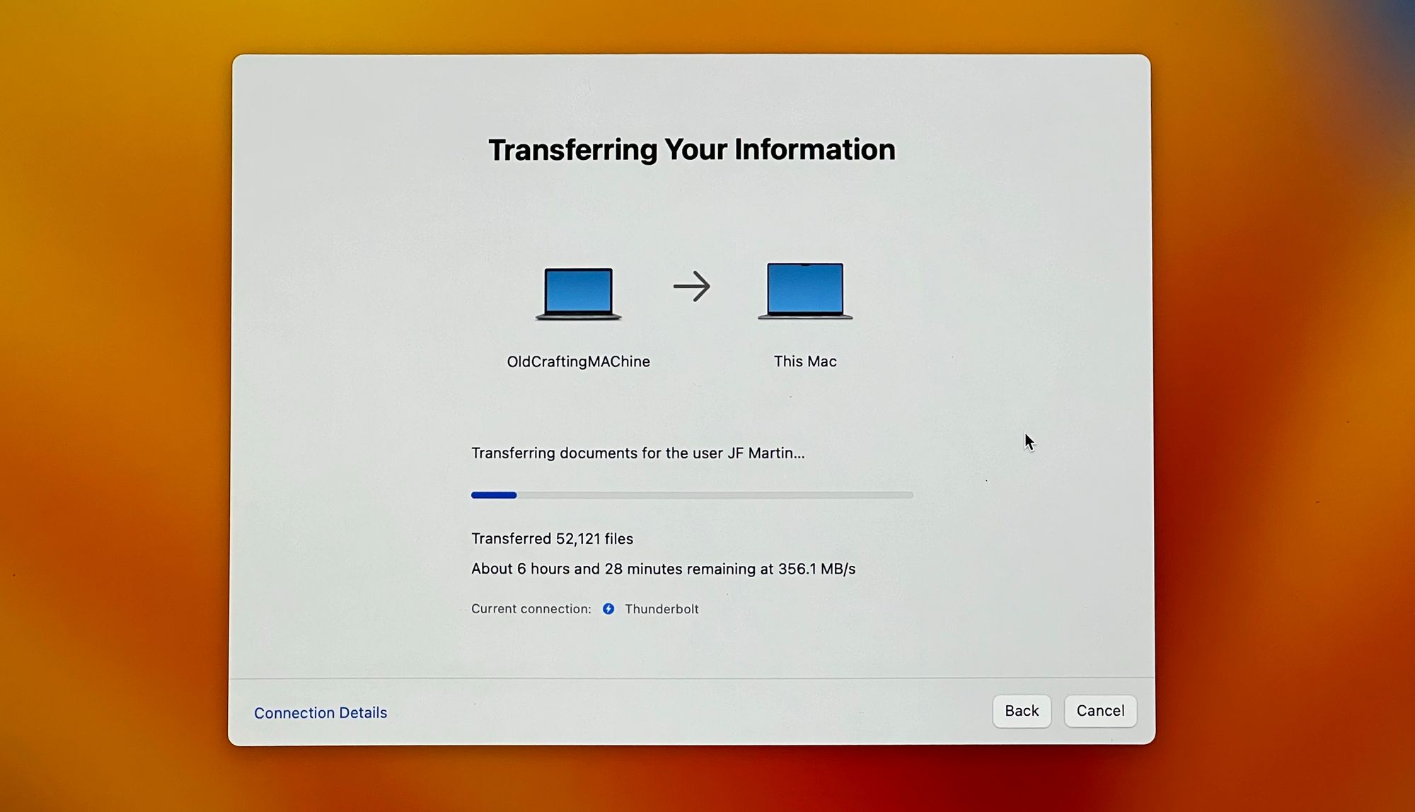
For the first time, I used the Apple Migration Assistant to transfer my apps and settings from the older MacBook Air. I had a certified Thunderbolt 4 cable to make the transfer. I thought that data from iCloud (Drive, Photos, Music) was not managed by the migration assistant and is downloaded separately as part of the user account process. But when I opened up Photos to check, all the content was already there, just like before. I expect that the migration assistant also copied that content, making life easier on Apple’s cloud infrastructures.
Before starting the migration process, I spent a few hours selectively removing unneeded apps using AppCleaner. Then, I applied any available updates from the Mac App Store and outside of the store using the mighty little and free utility: Latest.
I renamed my old Mac to add “-old” so there wouldn't be a naming conflict during the migration. I’m not sure that was necessary, though. I also ensured how to create the first account with the same naming for the home directory. The Migration Assistant takes care of that early, before creating any accounts.
I knew there would be some issues to address after the migration. Software licenses would need to be reactivated. Privacy configuration would need to be reconfigured for many utility apps. But overall, it wasn’t too bad.

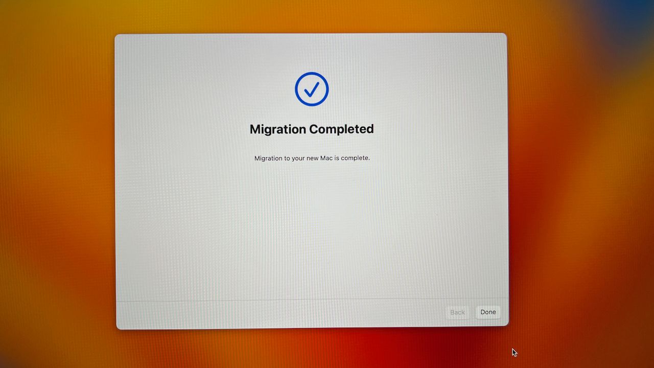
The migration process was flawless, with perfect guidance and no ambiguity whatsoever. The process took about 45 minutes to transfer about 375 GB of data spread in 700K files with a peak speed of 650 MB/s over the Thunderbolt 4 cable. The new Mac didn’t come with the same release of macOS. The Migration Assistant had to apply the latest update first. This process took about 20 minutes before the actual transfer. Overall, the migration took about an hour.

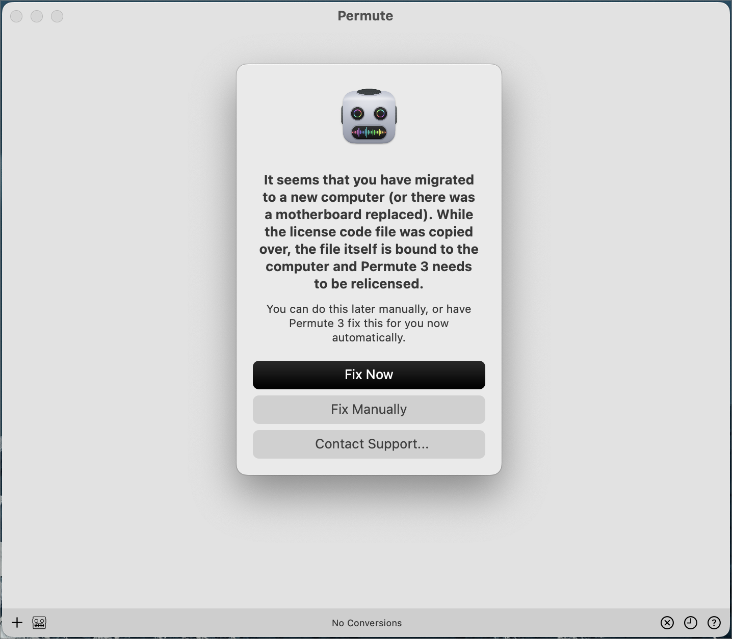
Upon the first login, I was met with many permissions requests for many utilities once the migration process was completed. Apple Pay was disabled because of an issue with the Mac update settings. All my credit cards needed to be re-added. This is the expected behaviour. Next were the few apps that needed license reactivation. CleanShot X was an example. I had to disable the license on the source Mac before being able to reactivate it on the new Mac. Again, this is expected behaviour. Some apps are better at handling the migration, though. Permute seems to detect the migration that took place and asks to relicense the app. Besides these issues, everything was right where I left off on the old MacBook Air.
My experience so far with Apple’s 15-inch MacBook Air
Safari feels snappier™. Everything feels snappier™ 😜
One of the things that I’m the most pleasantly surprised about is the speed improvement. I wasn’t expecting much in that respect, coming from the M1. The M2 processor contributes to this perception, but the 16GB RAM instead of 8GB also makes a difference. Running many small utilities consumes some non-negligible amount of RAM. Yet, it does feel faster in most of my use cases. One in particular that’s benefiting the most is Adobe Lightroom. Who knew?
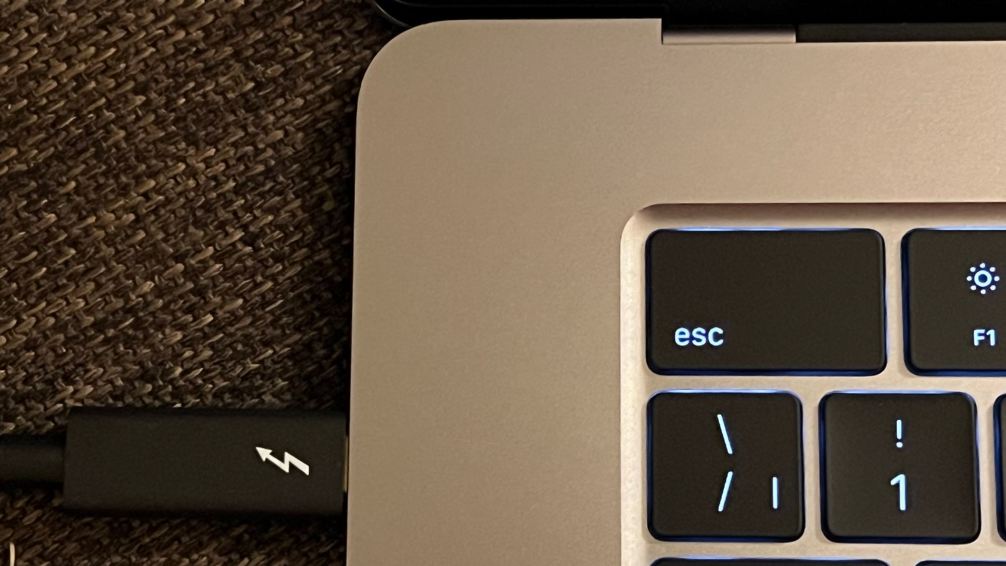
Battery life feels about the same: bigger screen but bigger batteries too! My charging habit depends on MagSafe at home and USB-C on the road. Oh, and MagSafe marks a first for me. It’s such a clever design.
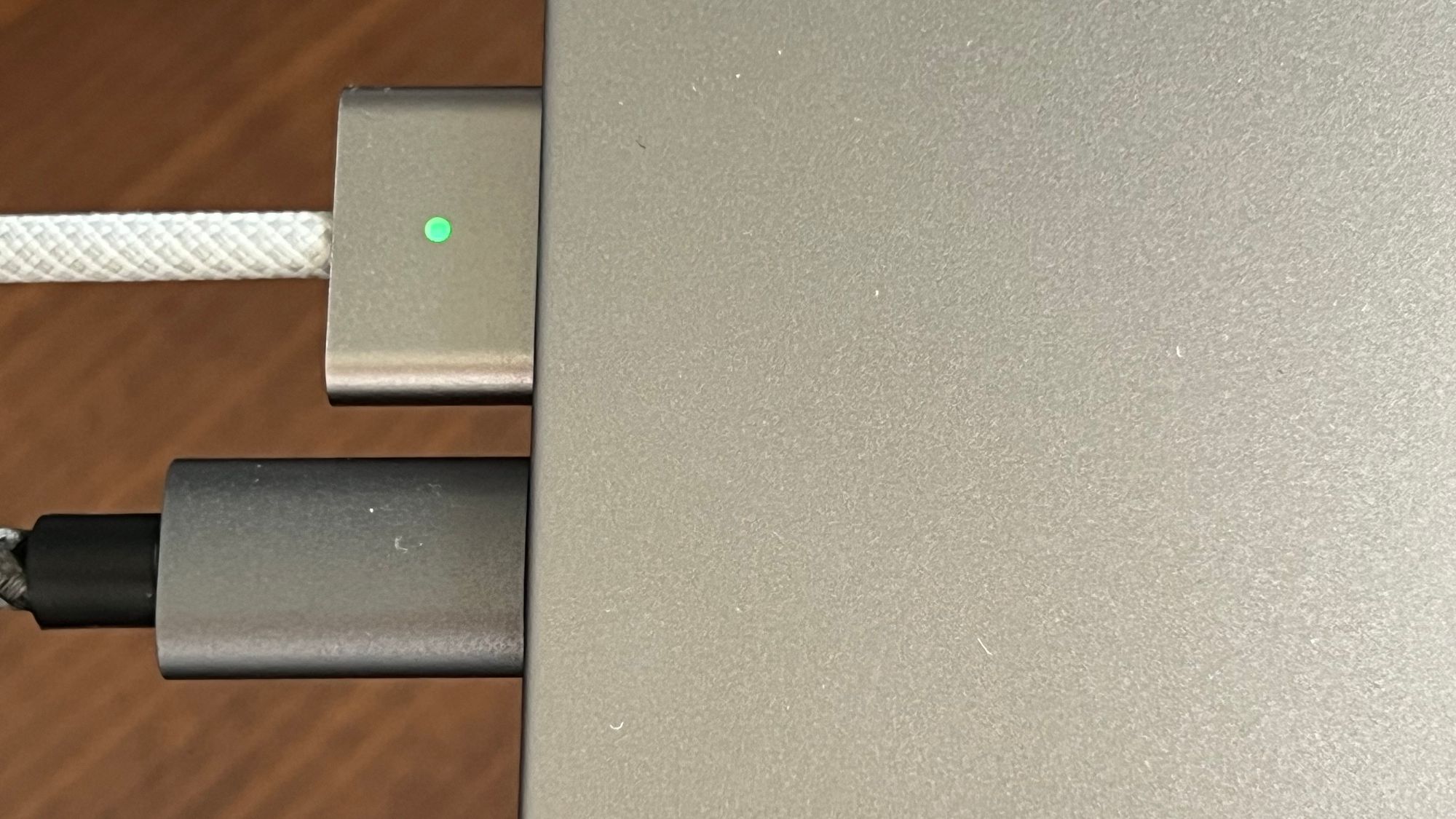
I felt the Mac was a bit heavier than expected. The rounded edges are welcome when the screen lid is closed. The space grey is a compromise over the darker tone, a much better look, but it is a fingerprint magnet. On my lap, while on the couch, the device feels right, just like my previous MacBook Air, if not a tad better. It feels more comfortable thanks to bigger palm rest areas and a bigger touchpad. I wondered if it would be too big on my lap, but it wasn’t.
The sound quality is vastly improved and, for the first time, I can consider listening to music on the Mac possible without feeling the usual cheap and metallic sound.
The expanded trackpad and full-size function keys are welcome improvements. For once, I feel Apple fixed all issues with their keyboards. Why did it take so long? Why did we have to suffer so much?
The NOTCH
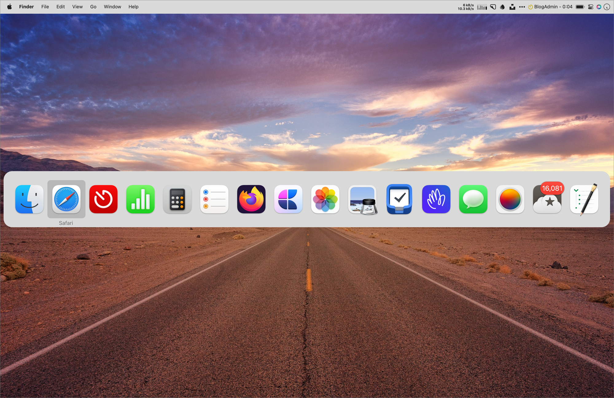
I was wary of going from a machine with a standard screen without any “imperfection” to a “notched screen”, just like on my iPhone. Sure, I got used to the notch on my iPhone, but on the Mac, the notch is so big and “in my face”! My overall experience is that I don't notice it most of the time. When I reach out to the menu bar to access a utility app, it is where I notice it the most. Sure, I hope the camera returns to the bezels in the future. In today's world, it is hard to defend that Apple needs this notch to put a rather-low-resolution webcam. I mean, come on. If Apple can create the Apple Vision Pro, they can fix the notch by removing it.

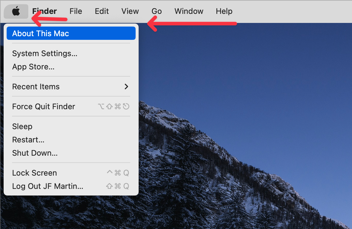
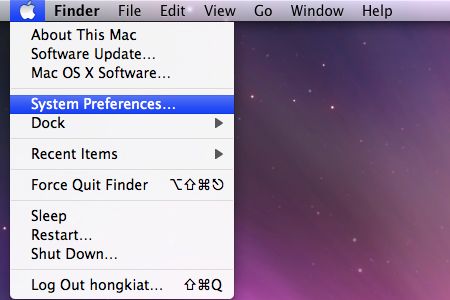
Speaking of the menubar, am I alone who doesn’t like the following two visual elements? I love the top rounded corners of the MacBook Air screen but this visual disconnect? I don’t. I prefer the old days when the menu was not visually disconnected from the menu bar. I only there was a setting to revert this design.
Mandatory utility: TopNotch, from the maker of Cleanshot X. In theory, this utility will make the notch disappear, but it doesn’t do its magic on my setup for some reason.

The verdict
I’m happy with my MacBook Air upgrade. It is well worth it. It’s THE best laptop I ever owned. The MacBook Air at 15 inches results from a perfect balancing act by Apple and their designers.
