My Thoughts on Apple’s Redesigned Apple TV Remote
Who cares about the latest Apple TV 4K, right? Apple finally did it: a new Apple TV Remote! That one was long in coming. The focus of this post is the new remote. Judging from my experience with Apple’s latest take on the TV remote, I have to admit that designing such a device must… Continue Reading
Who cares about the latest Apple TV 4K, right? Apple finally did it: a new Apple TV Remote! That one was long in coming. The focus of this post is the new remote. Judging from my experience with Apple’s latest take on the TV remote, I have to admit that designing such a device must be a daunting task, because… I’m not sure if waiting all those years was enough to fix everything. My thoughts here.
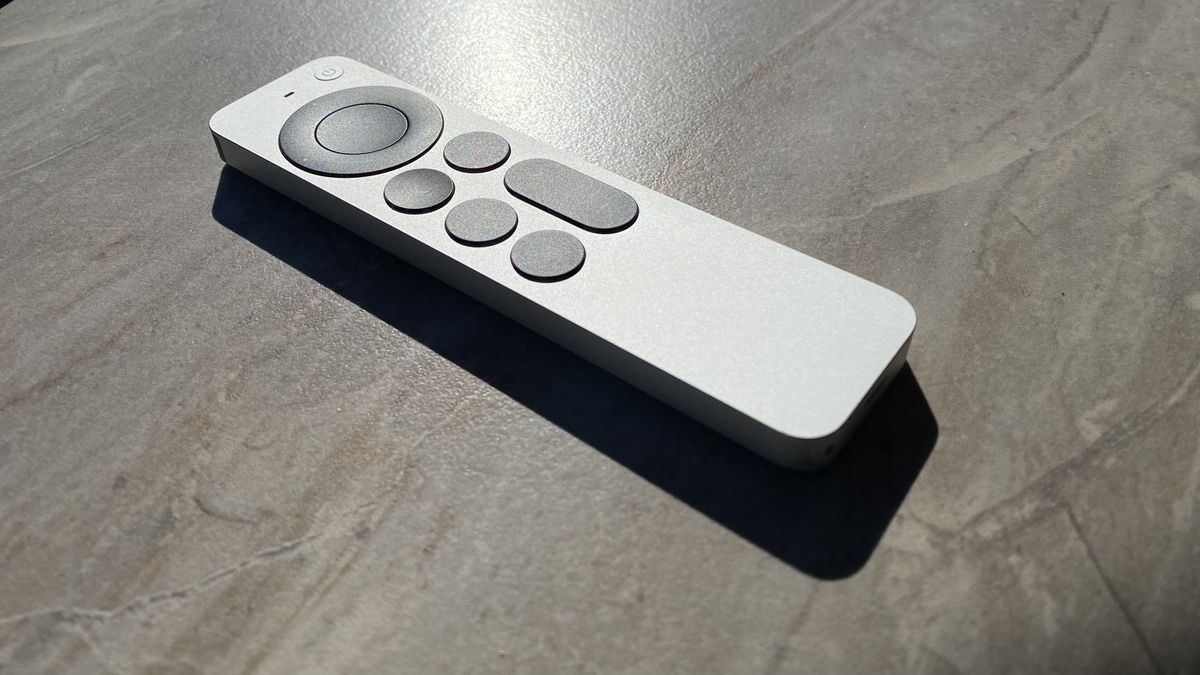
- I like the weight and the size. Good balance.
- Edges aren’t as sharp as they look in photos, but they could have been made “softer”.
- The rounded bottom makes handling the device in hand quite pleasing.
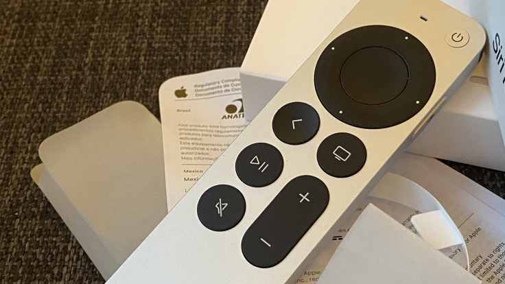
- I wish the D-pad ring of the clickpad would have a bumpier design so it « better stands out » of the clickpad.
- The power button is not entirely flush with the surface which also helps locate it without having to look at the remote.
- The black part in the front of the remote acts as a visual indicator of what is the front of the remote.
- The up and down volume buttons don’t work with my 2020 LG Smart TV as the Apple TV is connected to my home theatre unit. Same goes for the mute button. I’ll have to reconsider my setup and plug the Apple TV directly into the TV or change some settings in my TV itself.
- The D-pad ring behaviour is not what I was expecting. It’s not like the iPod click wheel back in the days. Fully circular gestures produce weird user interface behaviours. Not a good experience for someone who owned a few iPods. Gruber had this to say:
Even better, the D-pad ring is also touch sensitive — you can run your thumb around it to use it as a jog dial for scrubbing forward or back in a video timeline, . UPDATE: [It doesn’t really work for scrolling vertical lists.] It works exactly like a classic iPod click wheel. Making the remote feel like an iPod in your hand suddenly seems so obvious. That’s a sign of a great idea — that it feels obvious once you’ve experienced it.
- It’s the only Apple Product for which I read the instructions sheet that comes in the box after spending a few moments with the remote. It’s not a good sign I guess.
- Using the Siri side button reminds me of the walkie-talkie experience.
- I’m still undecided on how to set the center button of the clickpad: click only or touchpad too? Neither is fully satisfying.
- I have the feeling that tvOS is not fully taking advantage of this new remote. Maybe in tvOS 15, Apple?
Will I buy the updated Apple TV 4K? It will depend on the eARC support and the possibility for me to upgrade my home theatre unit. For now, I’ll try to enjoy the redesigned remote.
I like this take from Gruber.

