My Observations of the “It’s Glowtime” Apple Event
Incremental updates for mature devices shipping soon, Apple Intelligence shipping later.
Generally speaking, the “Glowtime” event has too many tech sheet talks, lacks emotional conversation, and feels too long. When a device is mature, new iterations are so subtle that mentioning those subtleties is the only way to entice users to upgrade. Or is it? I’m getting tired of the Apple headquarters. I can’t believe Apple invites the press to watch a video on a big screen. What a waste of resources and money. Here are some things that I find worthwhile talking about, at least for me.
About the Apple Watch
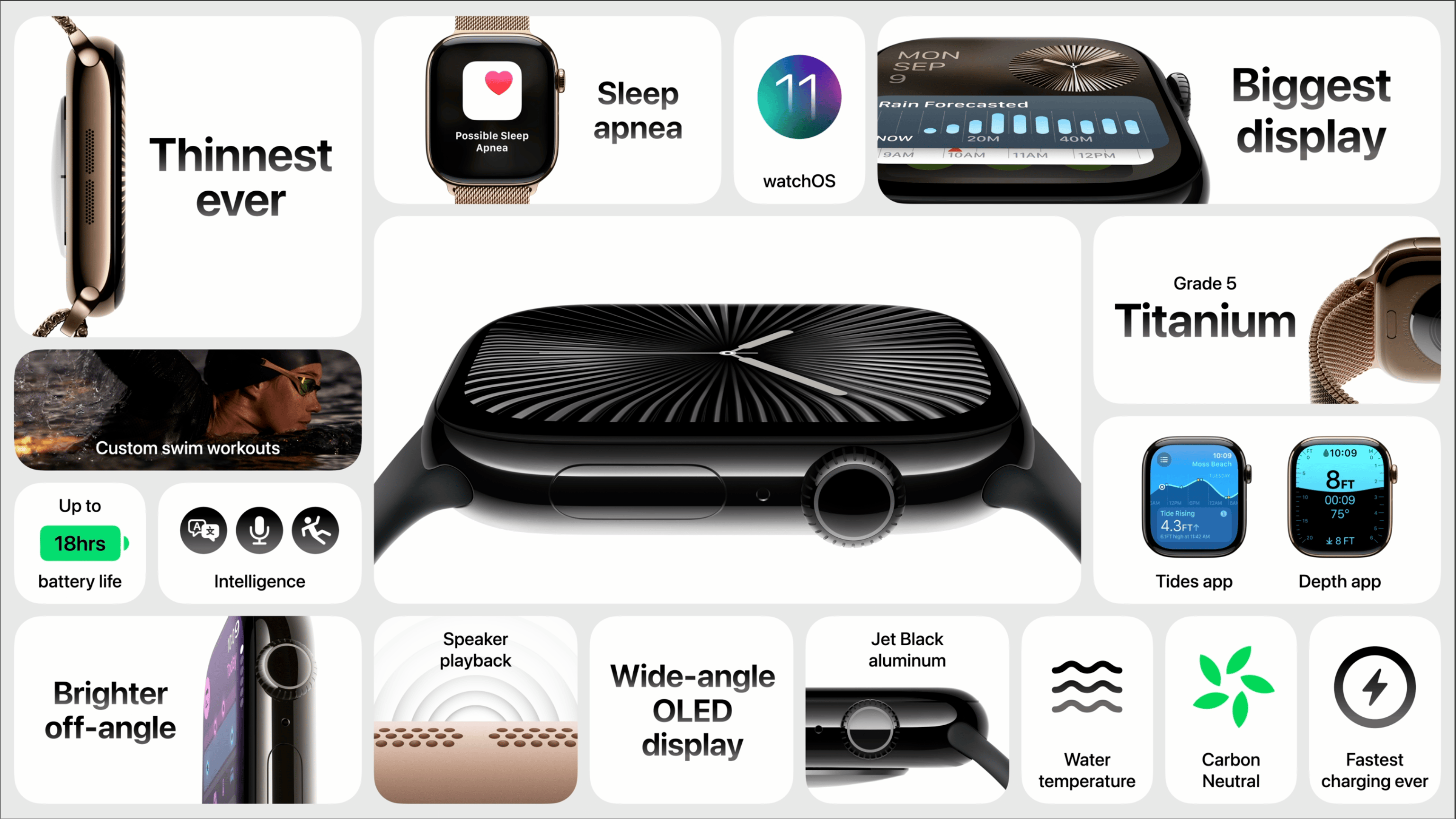
First, I’m a bit surprised that Apple didn’t mention the tenth anniversary of the Apple Watch. I would have preferred an emotional retrospective segment over the specs-packed ones. And we didn’t get the redesign the iPhone underwent with the iPhone X in 2017. Speaking of design, the new watch is barely thinner by 1 mm. As per the Apple Watch mini website, the following visual comparison lets people get the gist of it. However, the jet-black finish accentuates the slimmer design over the one in black matte. I would have preferred that they used the silver finish on both sides to be a fair comparison.

Another strange thing is that the Apple Watch mini website offers another visual comparison, which is the screen size. Why is the Series 8 and 9 absent from the comparison? Maybe the difference would have been too incremental. Is Apple targeting mostly Series 6 and prior owners? Anyhow, I would have liked to see the Series 8 in this comparison.
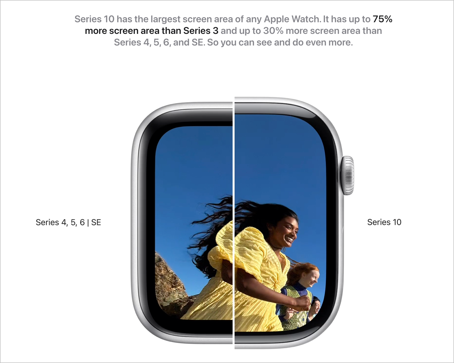
More apparent is the Series 10 design change: the watch roundness, thanks to a more pronounced corner radius. I kind of like it. As always with Apple products, seeing it in person will help you make a final decision. Also, Series 10 sports double the storage of Series 8.
One more thing, absent from the keynote is Jony Ive showing a new Apple Watch band with the newly designed “button”. Is such a thing possible? I wish.
Other notes
AirPods Max was given a new charging port and colors. There are no audio improvements, no size reduction, and the same stupid carrying case. Jarrod Blundy for HeyDingus website sums it all up. The AirPods Max are now the new original HomePod, IMO. Getting new features with software upgrades is great, though. This is the case for the AirPods Pro 2. That's cool, and the messaging around it was to the point.
Oh, the iPhone 16. I find it less exciting, but I wonder if it is because the features gap is less pronounced this year. The Main camera got a new name: 48 MP Fusion camera. Confused. This new camera button and mini user interface look great.
Some of the photography-related changes are intriguing: the new photographic style in post-edit is really cool. The user interface for editing a photo with a specific style using a multicoloured pad is dope. I can’t wait to try it in the Apple Store on my next visit.

As expected, Apple mentioned Apple Intelligence a bunch of times. You can find the logo everywhere on the iPhone mini website. I can’t wait to see real-world Apple Intelligence benchmarks for the iPhone 16 Pro compared to the iPhone 15 Pro; how much difference does 8 GB of RAM and the A18 / A18 Pro CPU make? It would cost me over a thousand Canadian dollars to upgrade from my now-discontinued iPhone 15 Pro Max. I’ll pass and wait for the iPhone 17 next year.

