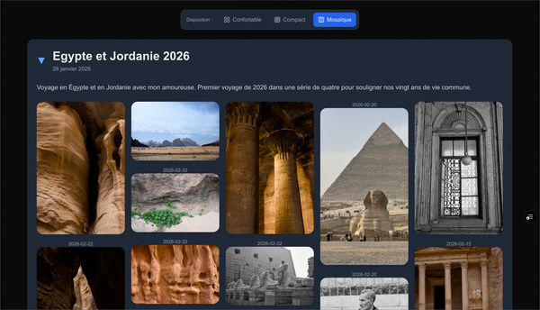
My Experience With Exposure — a Visual Storytelling Service
In this article, I share my experience of creating visual stories on Exposure, a visual storytelling service for photography enthusiasts.
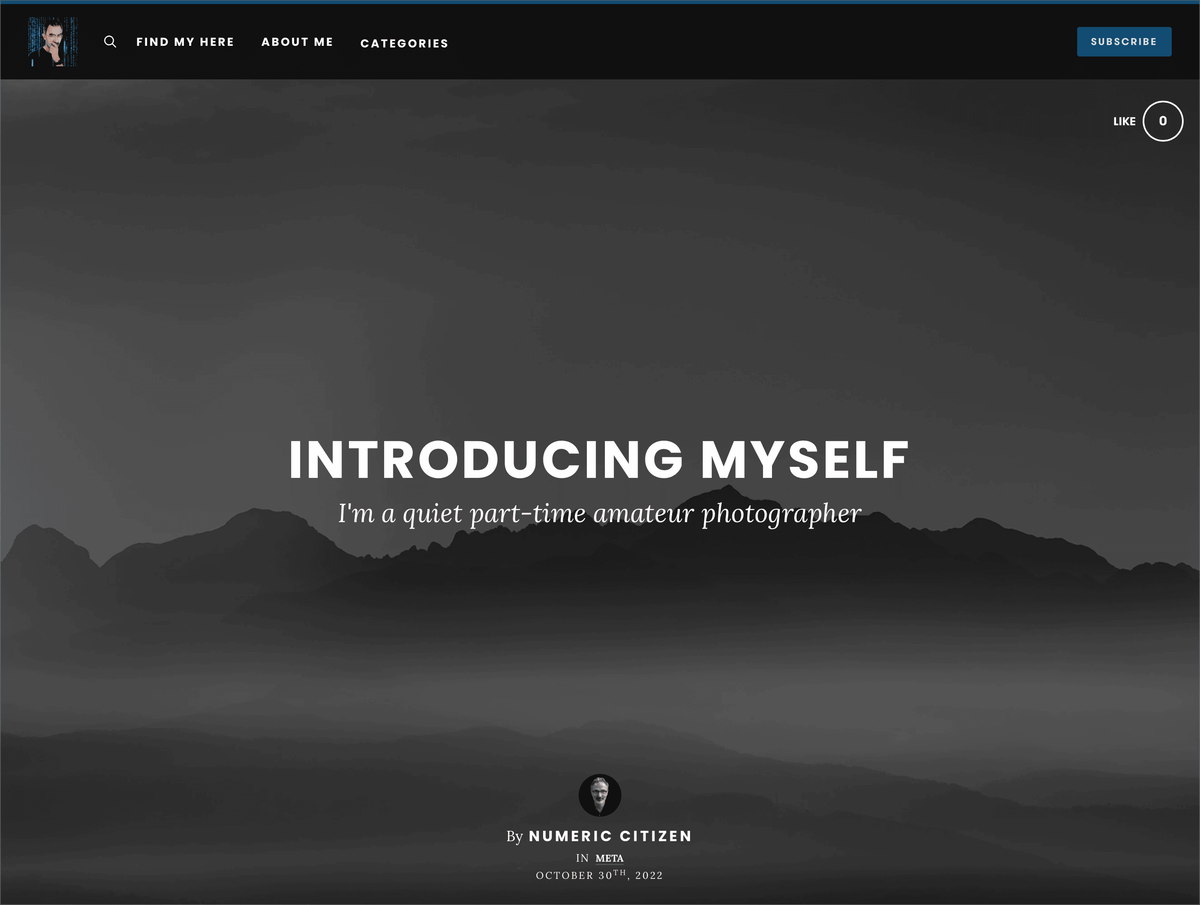
I’ve been a long-time subscriber to photo-sharing web services. First with Flickr back in 2008, then 500px before moving on to Smugmug and Glass more recently. The latter is undisputed, the one I’m keeping, but Smugmug is in clear danger of being kicked out of my digital landscape, thanks to a new experiment with Exposure. Here are my observations and thoughts following my recent work with the service.
Why Exposure?
First, let me share the reasons why I was tempted by Exposure and started to publish visual stories on it.
- Older companies like Smugmug have become lazy and offer things I don’t need, like importing all my photos into the service or backing up my RAW files. This is not what I’m looking for, and I have no need for these new features.
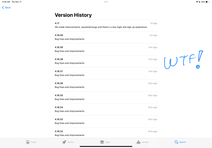
- I generally like Smugmug, and it was a big step up after leaving Flickr, but I find their lack of support of Apple’s latest features like Widgets a deal-breaker, and I’m not talking about their lack of RSS feeds, which is a shame in 2022.
- As much as I love Glass, I don’t feel this is the place to write visual stories. It’s ok to post a few photos here and there and interact with photo enthusiasts, but that’s about it.
- Exposure has been around since at least 2013, according to this review and this one from The Verge. I consider Exposure to be a solid foundation for sharing photos and stories.
- Exposure better supports my desire to express something beyond images. Something that I do in my Photo Legend Series, for example. I like the concept of writing short stories behind an image or a set of images. Exposure allows that in a beautiful editing environment.
- Exposure isn’t cheap but offers relatively fair differentiation across the subscription tiers. I’m subscribing to the Pro Plus plan because I want more features like in-story audio and more flexibility in designing my posts.
The Exposure Editor Experience
Now, let’s talk about the story writing and editing experience.
- I have created three stories so far. I consider myself quite acquainted with the service.
- Somehow, Exposure reminds me of Squarespace from a design perspective and of Medium for their story editor. Both services try to provide the best user experience to support content creators in sharing their work pleasantly and as frictionlessly as possible. Exposure’s editor is based on blocks where you can insert different photo arrangements, text blocks, embeds, quotes, etc. It offers just enough possibilities for creating rich visual and textual stories.
- In a sense, I’m experimenting with Exposure just like I did with Universe, another visual website creative service. My stay with Universe lasted one year. It was good for posting images but lacked text editing.
- Smugmug and Flickr have mobile apps but generally lack evolution (see release notes of these apps! This is pathetic). Exposure, the underdog, offers a great web experience with a constant flow of meaningful improvements. Surprisingly, editing a story from an iPad is good. I largely prefer working on a Mac, though.
- Exposure offers quite a lot of design flexibility for the general look of a website. Branding a website is straightforward. You happen to be able to create something unique yet familiar to Exposure design language. I prefer my design on Exposure to the one on Smugmug.
- Designing a sophisticated website is also possible using the Exposure menu builder.
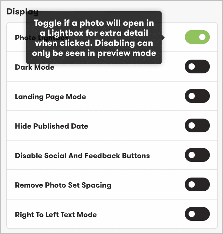
- Formatting options are flexible. Photos can be inserted as individual images or as a photoset. There are many formatting styles for each option for photos and text positioning.
- Going from edit to preview mode and back is super smooth. It’s very fast to see how the story will display while editing in the browser. Any changes made to the content are immediately reflected live on the site.
- In principle, Exposure offers a WYSIWYG editor. Still, in a 2014 review of Exposure, there was this remark: “There are a couple of design oddities about the site that I came across while going through the process. When adding the title, the text is in a nice lowercase font which actually looks quite well, but when you publish, it turns to uppercase. In the FAQ, it says that this is an aesthetic choice, but as it’s a WYSIWYG editor, I don’t get why it’s in lowercase to begin with. I know this is a little thing, but as a design-focused site, it’s a bit of an odd decision.” The behaviour is still the same today.
- Stories can be assigned user-defined categories and can be submitted to Exposure-defined categories for curation and eventually for publication on one of their curated feeds. I’m excited to report that one of my stories has been selected for the photography category. Was it because they knew I was still on the 14-day trial period and wanted to incite me to subscribe? I’m a bit cynical here.
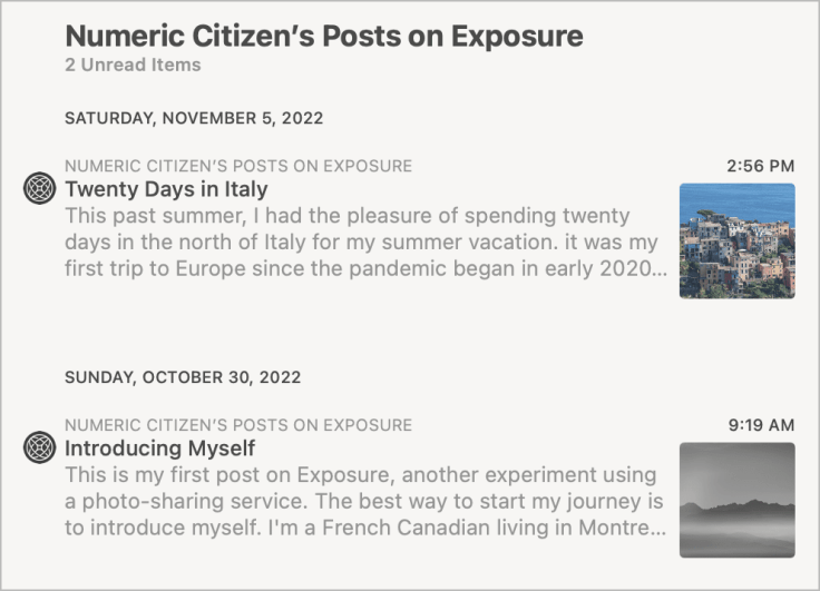
- Contrary to Smugmug, Exposure supports RSS feeds. The content of each post comes from the first image and the first text paragraph. I like this.
- Exposure offers plenty of options for story embedding. I tested story embedding in Ghost and WordPress editors. The best results are on WordPress.
- Setting a story’s unique URL to a readable format is possible and is recommended for better SEO.
- Speaking of SEO, Exposure offers SEO-related features like site metadata for indexing and social media sharing appearance configuration.
- Once a story is published, Exposure offers a media view called “Media Archive,” which is a condensed view of the story’s visual content where each image can be individually downloaded. I like this a lot.
- I decided to move my numericcitizen.photos main domain out of Smugmug and assign it to Exposure instead. So, it now becomes stories.numericcitizen.photos. It was an easy process that took five minutes to accomplish.
About the Consuming Experience
Once stories are created, consuming stories created and published by others is pure joy.
- Since Exposure uses high-resolution images, browsing a story is network bandwidth-hungry, and loading images can take a few seconds. I experienced a 4-6 seconds delay constantly.
- Browsing images is keyboard-friendly. Right and left arrows and the ESC key are supported to return to the story’s main page.
What’s missing so far?
- Only Google Analytics is supported. I wish there were more flexibility and a way to support Plausible, which I use for my other.
- Again, I don’t mind having only the website to interact with Exposure. It’s probably because it is well-designed and way better than Smugmug, Flickr or 500px.
- Unless Exposure branding is turned off, Favicon is not supported. The RSS feed or bookmark in any web browser will display the Exposure logo. I made sure Exposure branding is off.
Looking Ahead
I’m planning to close my Smugmug account when my current subscription comes to an end in 2024. This allows me to move my content from one platform to another in no rush. Thankfully, it is easy to download my images into a zip file, ready to be re-imported into Exposure to create a new story.
Concluding remarks
During the 14-day trial period, I had enough time to learn to use Exposure by setting up my website and putting together three visual stories, one of which made it to the curated view of the Photography section. I wonder if it has something to do with the curation on the last day of my trial period to entice me to sign up for a subscription plan. I’m a bit cynical here, I know. That said, I’ll subscribe to Exposure, and it will be a great alternative to Smugmug and a nice complement to my Glass profile page.
Update: 2024-02-08: I'm no longer using Exposure: too expansive and no new features.
