iA Presenter — A Different & Clever Take at Presentation Software
We don’t get to see often newcomers in the presentation software category. iA Presenter certainly makes for a welcomed and novel addition to this space.
A long time ago, I was a happy user of iA Writer, a well-known minimalistic text editor. Then came along Ulysses, and I made the switch (why is another story, for another day). Recently, I came across iA Presenter, created by the same developers behind iA Writer. I immediately recognized the visual signature of iA Writer and remembered how I used to love that writing app. It felt familiar and yet very different. I gave iA Presenter a try by joining the beta program.
Now that iA Presenter is finally out of beta, I’m happy to share some thoughts and observations after using it for a few weeks in my creative workflow, specifically while producing YouTube videos.
I’ve been using presentation software since the beginning of this software category. First PowerPoint, then Keynote. Today, I still use both. PowerPoint is for work, and Keynote is for personal projects. iA Presenter holds a unique position because of its focus on the content for editing. This sounds like a big gamble for presentation software in today’s world, where the visual plays a significant role. Yet, iA Presenter really focuses on the content, the story, not the presentation. The latter is handled automatically by markdown formatting interpreted to generate the visuals. It’s really a novel idea.
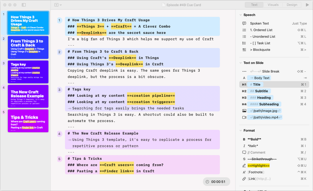
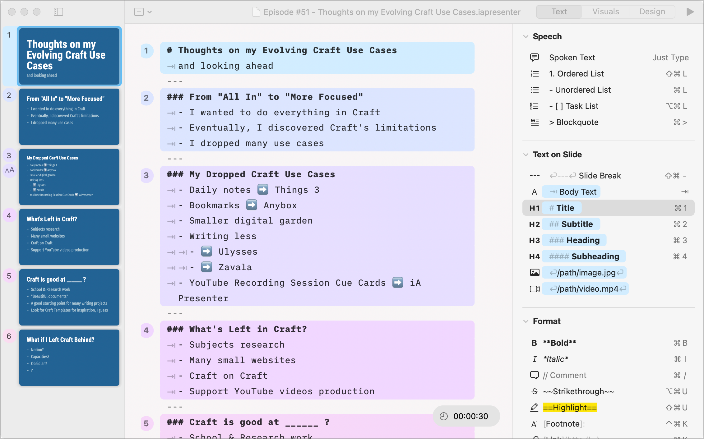
The central concept behind the design of iA Presenter is to let the user focus on the story instead of worrying about the formatting. iA Presenter uses Markdown formatting to build and render the presentation automatically. I like this idea a lot. Compared to PowerPoint or Keynote, iA Presenter doesn’t work on the principle of direct manipulation of the visual canvas. Everything is done through a simple and effective text editor, and iA Presenter automatically renders the output in the slides sidebar according to the slide template and the header level. You influence the presentation’s formatting and structure by using specific text markup, like three consecutive dashes, marking the creation of a new slide. Presenter’s notes can be added to each slide simply by typing text without indentation. A markdown formatting guide is handily available on the right sidebar for those unfamiliar with this.
Did you know that the first presentation software is generally considered to be Harvard Graphics, which was released in 1986 by Software Publishing Corporation? It allowed users to create slides with text and graphics, and was widely used in the early days of computer-based presentations. However, it's worth noting that there were earlier predecessors and alternatives, such as Slide Show, a program developed by Apple for the Apple II computer in the late 1970s.
The slide type is based on the heading level on the first line. Slide body text is triggered by typing a tab and entering the desired body text. Most of Markdown is supported, which gives more flexibility in formatting. Most styling can be applied using a keyboard shortcut. Tables can be added too!
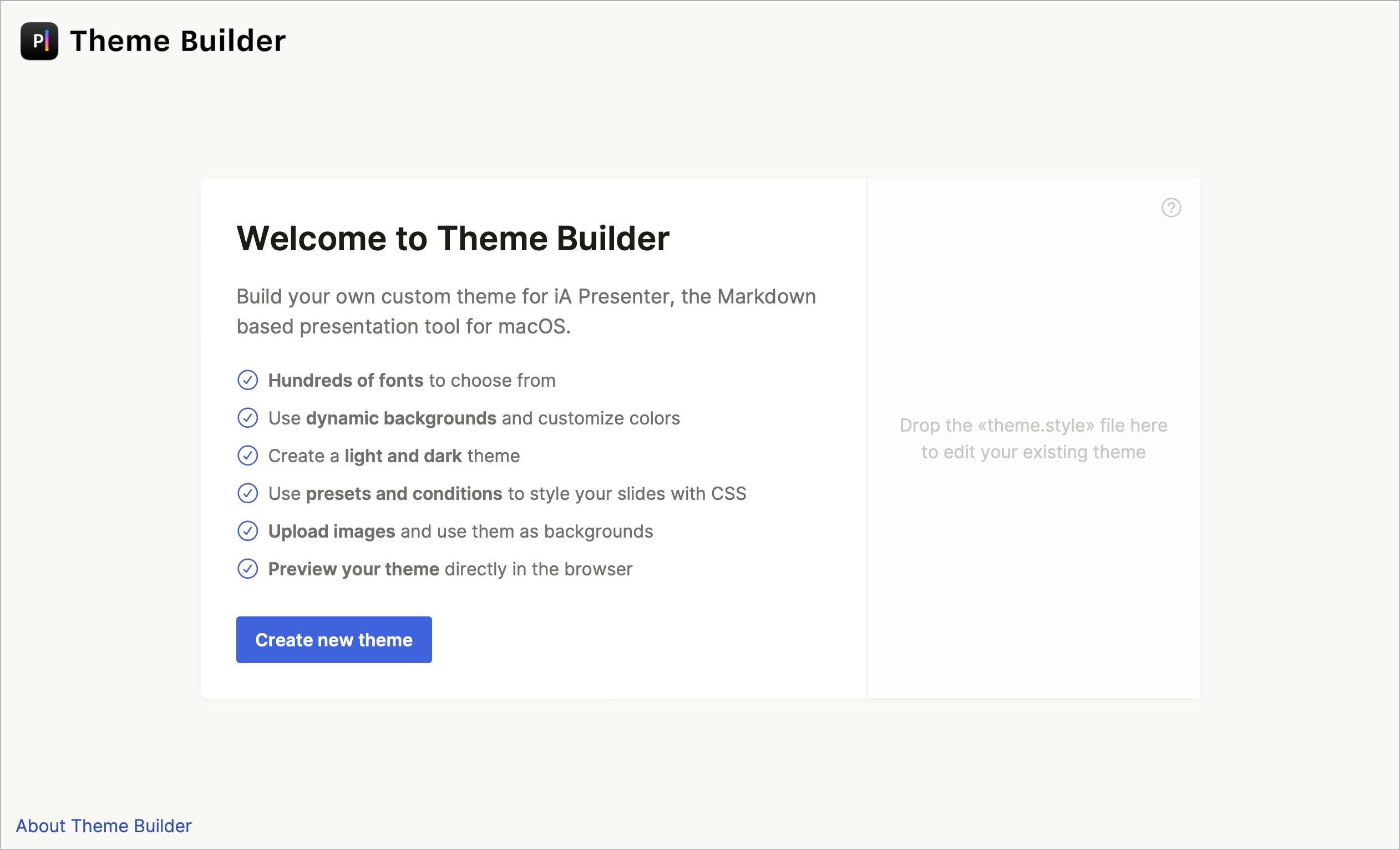
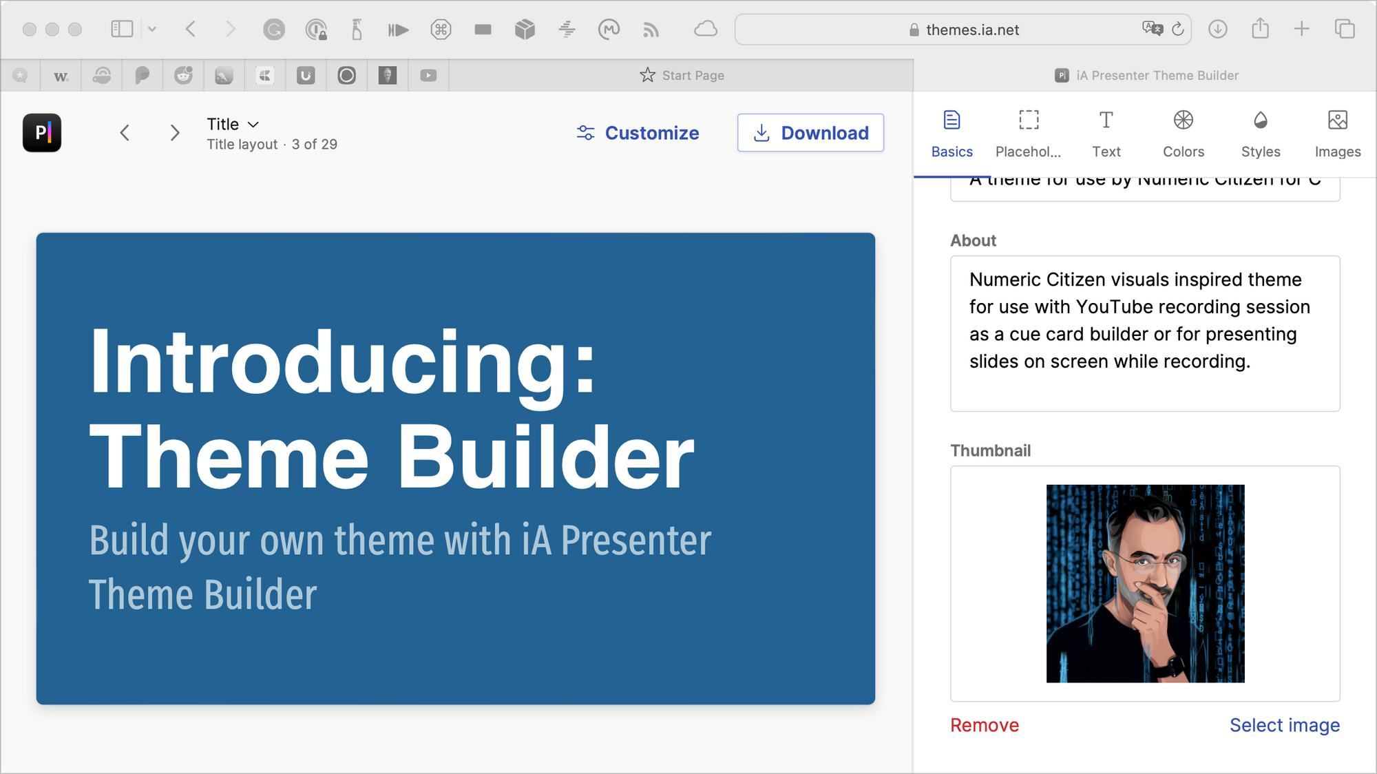
Presentation formatting is based on formatting attribute rules for each markdown instruction forming a set of slide templates grouped in a theme. A theme builder is available on the web (but will be added to the application in a future update). I created a personalized theme reflecting the Numeric Citizen branding. I’m not sure I’m done yet with my theme. I don’t think it reflects my Numeric Citizen branding enough. I'm finicky. I’ll keep working on it in the near future. Nonetheless, It’s one of the best theme builders that I experienced. Once completed, these can be downloaded and imported into iA Presenter. Many different themes can be downloaded and used right out of the box.
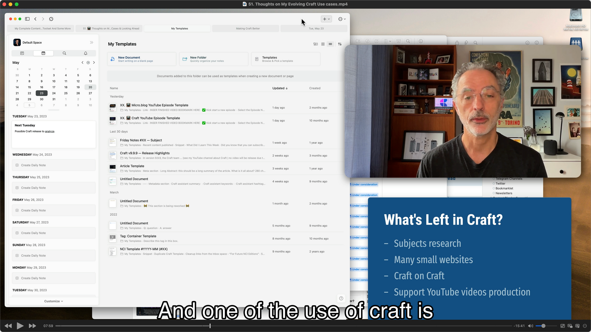
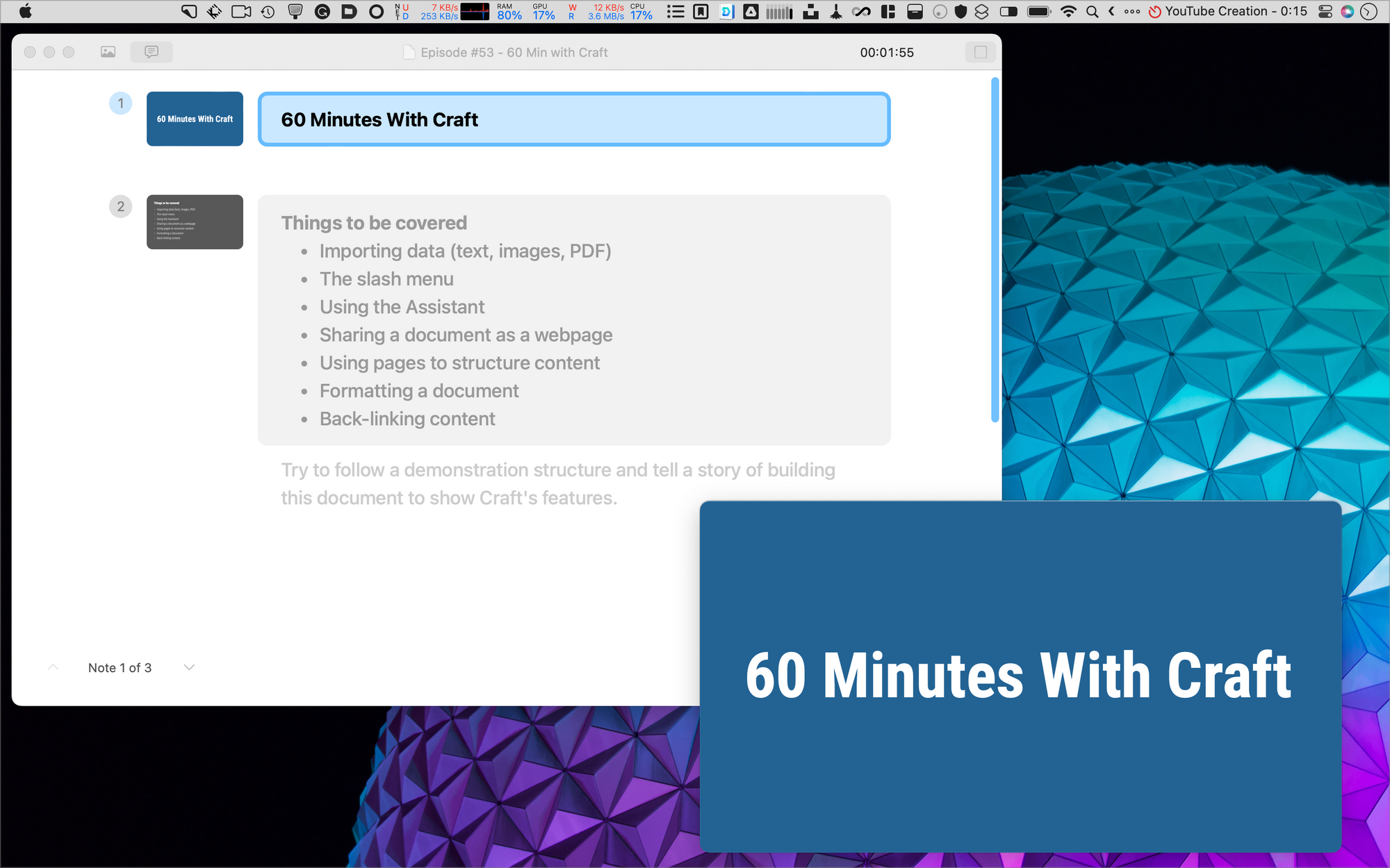
Entering presentation mode is done by clicking a play button on the slide thumbnail on the left sidebar. There is no animation effect in iA Presenter. This could be a deal-breaker for some who like to present their content one step at a time. I suspect this could come later in a future release. It’s not an issue for my use case, which is to build cue cards for my YouTube videos. One example of this can be seen in this video: the presentation sits at the bottom right corner and is a visual support in my video. This is not something we see often these days on YouTube videos. I don't know what the viewers think about it, though.
History fact: Steve Jobs, the co-founder of Apple, had a vision for presentation software enabling users to create stunning presentations with elegant typography, smooth transitions, and visually engaging effects. He wanted a tool to empower presenters to captivate their audience and deliver impactful messages. This is why Apple created Keynote.
It’s important to note that iA Presenter can export the presentation in PowerPoint format. This means that it can also be used in Keynote. After a few tests, my results were mixed. If iA Presenter depends on a non-standard font, the exported presentation might look weird and need work. Since Keynote is not supported (yet), exporting in PowerPoint and then importing in Keynote is probably not the best workflow.
In conclusion, iA Presenter is a refreshing take on an old software category. Will it take over PowerPoint or Keynote? No, and that’s just fine. iA Presenter’s focus on content instead of formatting makes it a simple and effective presentation software. Of course, markdown is fundamental in formatting the slides deck, which could be considered rebarbative for some users. Still, a formatting guide constantly available within the app’s main window could help make it easier to use. I can’t wait to see where iA Presenter is headed.
