How is iPadOS 15 Helping Me as a Blogger and Content Creator?
Many tech pundits will argue that with iPadOS 15 Apple missed the opportunity to up the game with iPad. Not so fast. There is a lot to like in this iterative update from a blogger perspective.
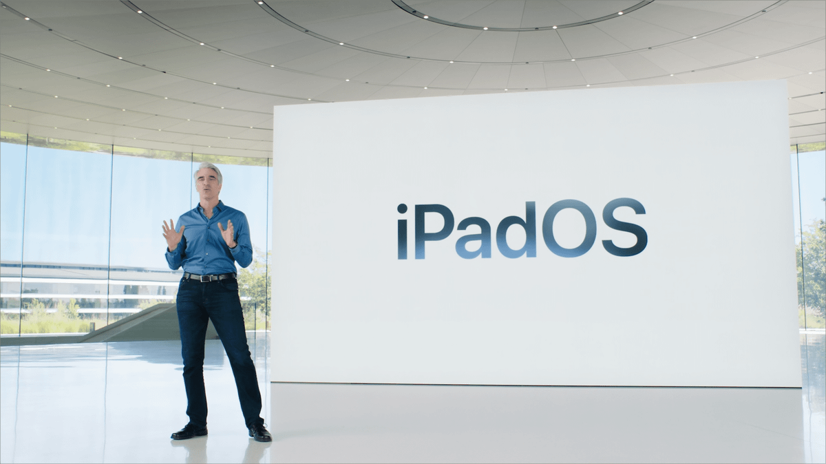
This isn’t a review of iPadOS 15. MacStories is much better than me at writing this (their complete review is astonishing). It is more like a short essay on how iPadOS 15 is helping me be more productive and efficient at blogging and creating content on my iPad Pro. There is a general sentiment that this year’s updates are barely incremental. I would argue the contrary. These updates are tying things up quite a bit, and in itself, are enough for me to upgrade. So let’s have a closer look.
- The start of the iPad experience is the home screen. As you probably already know, iPadOS 15 brings feature parity with the iPhone experience: free widgets placement. After installing iPadOS 15 on my iPad Pro, the first thing that I did was to delete all my home screen pages and start over be creating theme-based pages. Next, these pages were associated with their corresponding focus mode. Gone were bookmarks on all home pages because they aren’t shown in the App Library. While redesigning home screen page content, something unexpected emerged: I no longer use folders, except for one which is sitting on the Dock, on the rightmost slot. Why? Because home screen pages are so easy to design, are more flexible than ever, easy to reorder or hide — they act like big folders in themselves. A side effect of the proliferation of home screen pages creates the need for some sort of home screen page switching mechanism, something along the line of the App Switch but for home screen pages. The only way to switch between pages is by swiping left and right.
- Home screen design flexibility is such a welcomed change this year. Coupled with Focus modes, iPadOS 15 feels like a breath of fresh air from a productivity protection and boosting perspective. If I want maximum focus while writing, I’ll select the “writing” focus which will enable the right home screen page, disable notifications except for a few contacts.
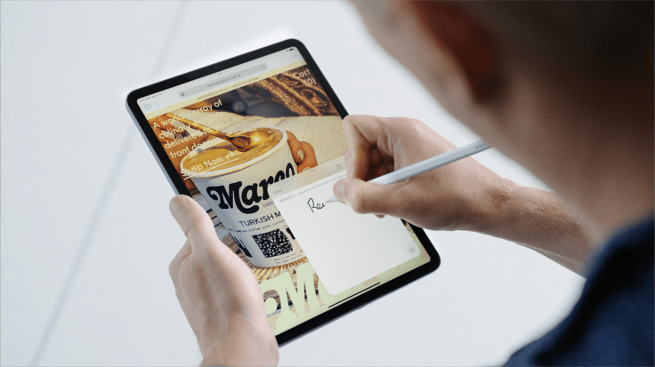
- Apple’s introduction of Quick Note is a wonderful complement to Craft. They have a big advantage compared to Craft’s Share sheet: contextual information, which mean that browsing a web page will bring back any Quick Note associated with it. I’m still trying to figure out how I’ll take advantage of Quick Note together with Craft in my workflow in general. Quick Notes appear as standard notes on iOS 14.
- Tags in Reminders allow for easier organization of links to be processed soon. Some links will become link posts, others will head to my read later list. The subject of the link is also tagged (apple, photography, privacy protection, climate change).
- Tags in Notes also add a new dimension for organizing quick notes, as they tend to form a growing collection. Tags make Apple’s Reminder and Notes even more useful in my workflow.
- iPadOS multitasking tweaks do provide a better experience for entering into a multitasking state or for managing which apps are needed side by side. Being able to manipulate apps in the app switcher is a welcomed change in the “finally” category.
- The only home screen folder that I’m using sits on the Dock, and is named “Quick Access” and contains apps for things like the App Store, Settings and authenticating apps as well as 1Password.
- Notifications Summary, when configured and tweaked properly, is another welcomed update. News related notifications, non-essentials notifications are all grouped together and presented like a newspaper. Four summaries are created for me at 8:00AM, 12:00PM, 5:00PM and 10:00PM. It does make a difference on my focus while I’m working.
- Not that this is new in iPadOS 15, but setting a few app limits in Apple screen time is also helping to focus more. For example, I set up a 30-minute limit for Tweetbot & Twitter per day. Reddit does have a 30-minute per day limit. I rarely hit those limits. These are safety limits.
Did you know that widgets and icons positions are separately set on the portrait and landscape orientation? Yep. That’s not a big issue, in fact, I would say this enables optimal placement of each object for each orientation.
Does iPadOS 15 provide the right tweaks and updates to make my life easier as a blogger or content creator? It’s a resounding yes. Home screen design flexibility, notifications management, and focus modes are central to these user experience improvements.
Looking ahead
There is one thing that I didn’t talk about is Shortcuts. They are at the center of my iPad workflow, and this fall, they will come to macOS Monterey. Having a single automation engine across devices is simply beyond any of my dreams. I do have many shortcuts that will be useful and transpose directly on the Mac, and I cannot wait for that moment to arrive. An example of useful shortcuts for macOS Monterey is one for switching focus modes after starting a specific application, setting up a group of applications to start together at the beginning of a writing session. New shortcuts will probably emerge as being helpful when I begin to experiment with them when Monterey finally ships later this fall.
