Going All In With iOS 14, iPadOS 14, macOS 11 Big Sur and watchOS 7 Betas
For the first time since Apple is releasing public betas of its operating systems, I’m going all in with iOS 14, iPadOS 14 and watchOS 7. This year’s round of betas are exceptionally exciting and stable for their first incarnation. This sentiment is also echoed by M.G. Siegler on 500ish. This year,
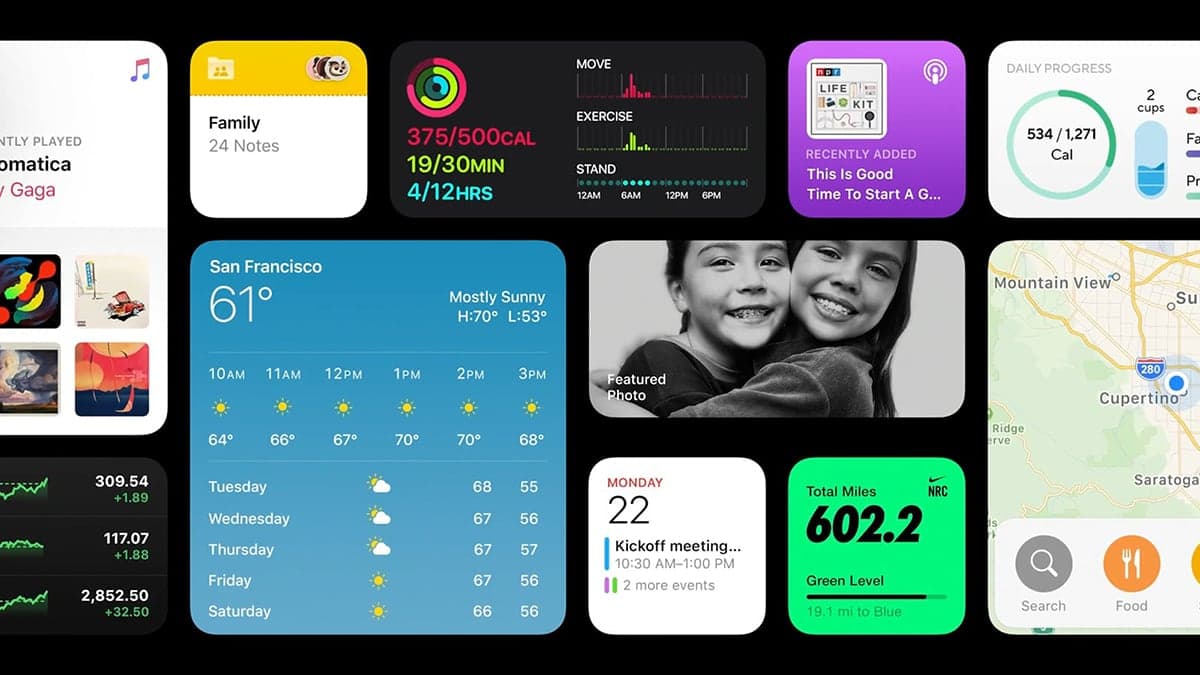
For the first time since Apple is releasing public betas of its operating systems, I’m going all in with iOS 14, iPadOS 14 and watchOS 7. This year’s round of betas are exceptionally exciting and stable for their first incarnation. This sentiment is also echoed by M.G. Siegler on 500ish. This year, there is nothing ground breaking but my interests goes into the details these updates bring to the Apple ecosystem.
Before testing these betas on my main devices1, I bought a used iPhone 8 to experiment with iOS 14 that I’ll later give to my oldest son2. The installation of iOS 14 beta 1 at that time went without any issue as I chose to set the device as brand new. But, after playing with it for a while and by looking at people’s reactions, something was clear: this is one of the most stable beta release of iOS in a long time. I mean, for a brand new major release, iOS 14 surprisingly stable, compared to my experience with iOS 13’s initial beta release last year.
I was very enthusiastic by the new iPhone home screen experience, I knew I would need to re-imagine my applications layout. After much thought, I published “Getting Ready for the new iOS 14 Home Screen Experience“. Since the publication of my article, my thoughts are still the same: remove never used apps entirely, remove rarely or barely used apps from the home screen and rely on search to find them later3. Create theme-based home screen pages with enough space to accommodate widgets at the top. Eliminate folders as much as possible. This is an entirely new way of managing my home screen which forces me to adapt.
After beta 2 came out, I was convinced to move ahead and install it on all my devices. One of the motivational factor was the fact that, this year, Apple didn’t touch some fundamentals features like iCloud synchronization or database format of iCloud Photo Library4.
I started with the iPad followed by my iPhone 11 Pro. Finally, it was the turn with my Apple Watch. All in the same day. The following section goes a bit deeper of explaining my general experience for each operating systems. But, before going any further, a warning is required:
Don’t do the same thing at home because my experience is vastly positive. Results may vary. Every device is unique by its content and setup. Your experience could be much worst and result in data loss.
iOS 14 Beta
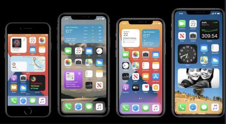
For iOS 14, the things I wanted to experiment the most are the new widgets and the App Library. I’m happy with Apple’s implementation of widgets. But the best is still to come as developers are actively updating their apps to support this new feature. But I see two missing things: widgets resizing5 and a 4×1 widget format6. According to a Readdle’s blog post about their upcoming applications updates, I expect widgets to be the star of the show this fall. Another thing to improve is the Siri Suggestions widget which currently doesn’t have a different background color, making it difficult to distinguish it from normal application icons arrangement.
Since using iOS 14, my usage of folders decreased dramatically but I need more home screen pages. Reaching an app now requires much more page flipping. The easiest way is to use the search feature. The problem will be more acute this fall when a massive amount of new widgets will be available from the App Store. This is why, with iOS 14 widgets support, I may reconsider my stance on big iPhone like the iPhone 11 Pro Max for my next iPhone7.
The general stability of iOS 14 is impressive. Sure, the battery drains a bit faster and there are a few visual glitches here and there, mostly with widgets. CarPlay is having issues too with Maps crashing quite often. The speed of this beta is impressive. In fact, it doesn’t feel as a beta release. That’s refreshing from last year’s iOS 13 disaster.
iPadOS 14 Beta
My experience with iPadOS 14 is mostly positive except for one thing: the lack of the same flexibility in widgets placement is a major downer. Again, as I recently wrote after the WWDC conference in “WWDC2020 — My Observations and a Survey of Comments”, the iPad is taking a small pause this year8.
The new Siri interface is interesting and less obstructive, but as you probably know by now, you cannot interact with the screen content while Siri is on screen. I suspect Apple is reconsidering this design choice as I wrote these lines. Scribble works great, most of the time, but I don’t expect to use it much. The automatic geometric forms recognition is really nice, it reminds me about the Newton in 1992.
As for the iPhone, this beta release feels fast and quite stable but a bit less than iOS 14 on my iPhone. That being said, I’m not concerned as this release of iPadOS 14 is much more stable than any beta releases of iPadOS 13.
All in all, with each major iteration of iPadOS, the iPad is more and more acting like a fully featured computer, while keeping its essential simplicity.
macOS 11 Big Sur Beta
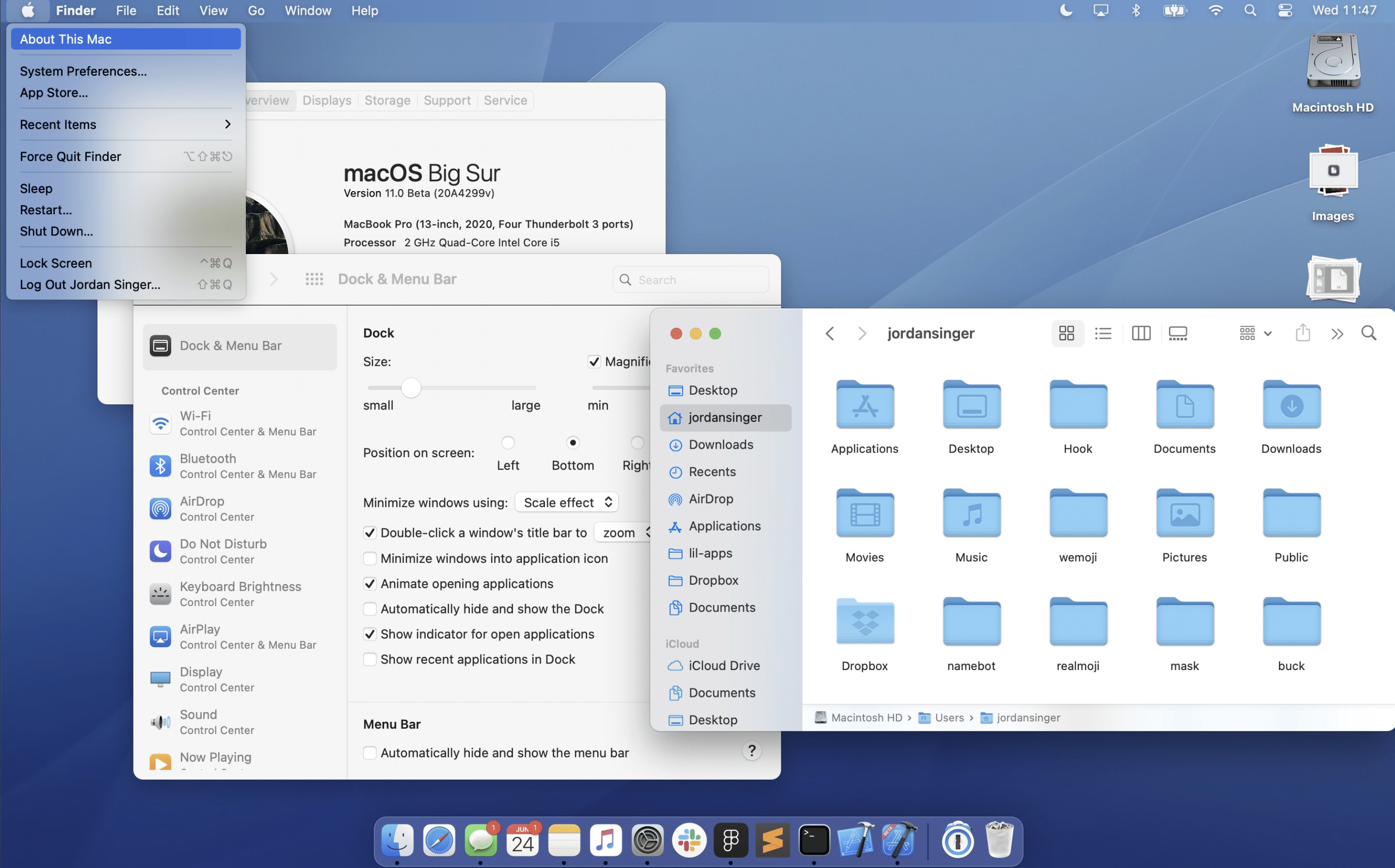
For macOS 11 Big Sur, I used my work machine to install beta 1 on an external SSD drive, a SanDisk 1 TB Extreme Portable External SSD. My first try failed. I was trying an upgrade from Catalina and it didn’t finish. For my second try, I simply installed Big Sur after formatting the external SSD as an APFS volume with a GUID-type partition. This time, the installation completed successfully. My first login into macOS 11 Big Sur was a refreshing experience. Big Sur is fresh yet familiar, we can feel the iPadOS touch9 here. And I am pleased with this direction. Not all is perfect, some design choices are steps back but in general, the intention is valuable. Don’t miss my comments on Big Sur compared to Catalina on Micro.blog.
Big Sur is probably the least stable beta among the bunch. I don’t expect to upgrade my main machine, a 21.5” 2017 iMac anytime soon. I may postpone it to late fall. I’ll see.
watchOS 7 Beta
For the first time ever, I installed a beta release of watchOS on my Apple Watch. Again, the installation went smoothly. Upon my first use of watchOS 7, the speed is the first thing I noticed. Everything is super speedy. Again, Apple is proving that they want to push boundaries on current hardware.
A very welcomed addition is the possibility to automatically change watch face according to a specific schedule. This is something I wished for in watchOS 7. What Apple did is even better: you can automatically change the watch face using an automation in Shortcuts. For example, I’ve set up an automation to set the Apple Watch to use the Siri watch face at 8 in the morning. I have another one to set the watch face to Infograph Modular on weekdays at noon. It’s very cool. I plan to spend some time in the future to set up something more useful on the weekend.
But, not all is good about watchOS 7. The first problem is about activity tracking. My first two tries resulted in bad calories count and wrong distance calculation. Next, I experienced one occurence of super fast battery drain. I’m not able to reproduce it, though. Time will tell.
The lost of Force Touch is a big deception too. Apple had to re-do many portions of the UI with the result being more complex because everything has to be explicit now. For example, clearing all notifications now requires going to the beginning of the list which is not optimal. A long press on the screen would have been better and more in line with the iPhone or iPad experience in my opinion.
Finally, watch face customization has been redone too. At first, I thought Apple made a mistake with the new design. But, after playing with it for a while, I think in the end this is a better design. Selecting colors options and complications in particular is easier to see as you scroll through a list of possible complications. The only drawback is you don’t see the end-result directly on the watch face until you tap your selected complication.
Looking forward
I never went so fast and so wide in adopting early betas from Apple. Software quality took over Apple’s focus this year. I’m delighted with that. All in all, I’m quite pleased with where Apple is going in terms of features, design and a continuous focus of privacy protection. There may be no game changer this year, but there this shift in iOS that will mark the way we use our devices for a long time. But, the most significant change is yet to come and it will play out in the Mac universe. Stay tuned. The Mac future is exciting again.
- Yes, you read it correctly. I’m using Beta 2 of all my mobile devices. ↩
- He’s 18 right now. The iPhone 8 will be replacing is old iPhone 6 as a birthday gift. ↩
- I’m not very found on the new App Library. Yet. ↩
- Remember about iCloud Drive migrating to a new sync mechanism where people were losing data? Or when migrating to the new Notes format when previous versions couldn’t open notes created with the more recent Notes? None of these problems are present this year. ↩
- As of beta2, to resize a widget, you have to first remove it then re-add a different size version. Too complicated. ↩
- Currently supported widget sizes are 4×4, 4×2 and 2×2. ↩
- I don’t expect to upgrade to iPhone 12 this year but a last minute surprise or game changer could force me to reconsider. ↩
- Another bad surprise was the lack of added support for external monitors. ↩
- It is clear to me that Apple is positioning macOS Big Sur as a touch-friendly upgrade for future Mac hardware. ↩
