Carousel: The iPhone App That Never Was
Here’s a short story about a short episode of my journey as an indie and part-time iPhone apps developer back in 2009. From 2009 to 2013, before becoming a content creator, I spend my spare time creating iPhone apps. There was a short period between the two where I took a break from digital creation

Here’s a short story about a short episode of my journey as an indie and part-time iPhone apps developer back in 2009.

From 2009 to 2013, before becoming a content creator, I spend my spare time creating iPhone apps. There was a short period between the two where I took a break from digital creation. As an indie iPhone developer, I had a few application ideas, one for an app called “Carousel.” The goal of this application was to enable its users to capture digital elements like photos, sound, videos, etc. and then act on these captured elements by sharing them on social networks or on the device itself. At the time, Posterous was a popular social network, my application would have been a Posterous client.
First, let’s define what a Carousel is, according to Wikipedia:
“A carousel or carrousel (mainly North American English),[1], merry-go-round (international), roundabout (British English),[2] or hurdy-gurdy (An old term in Australian English, in SA)[3] is a type of amusement ride consisting of a rotating circular platform with seats for riders. The “seats” are traditionally in the form of rows of wooden horses or other animals mounted on posts, many of which are moved up and down by gears to simulate galloping, to the accompaniment of looped circus music.”Wikipedia
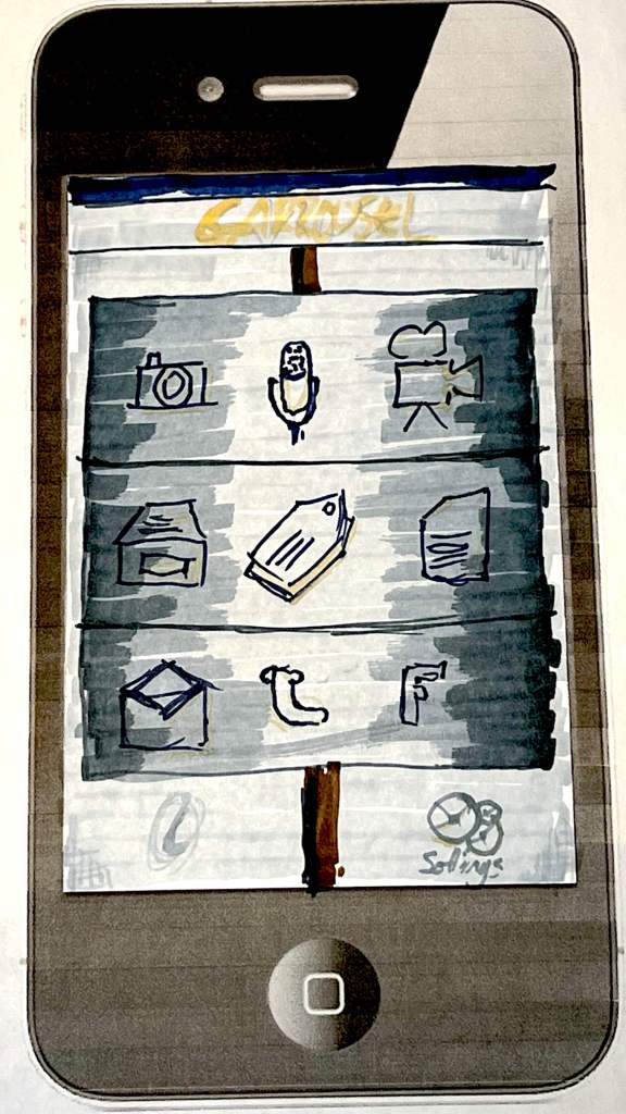
At the beginning of the application conception, I wanted to call it “Capture” because it was, for the most part, the starting point of the application usage. But, after a while, I remembered that I thought this name was a bit lame and wasn’t catchy enough, so Carousel came up because of the general design of the screen. When I had the concept pretty much drafted, I went to see iPhone app developers I knew about, asked them to sign an NDA, and then exposed the application concept and design. It didn’t impress, at best; they found the basic design “interesting.”
The design elements at the center of my Carousel app were three rotating circular cylinders. Each cylinder had a specific row of icons for a designated set of available actions. The top row was the “capture” cylinder. The user could rotate the cylinder and stop at specific action, for example, the camera icon. The middle cylinder was the action row where the user could save, tag, and file the digital element he was about to take (from the top cylinder). The lower cylinder was the “share” row from which the user could share the digital nuggets with another person or post on social networks for which the user would have set the credentials. That was the gist of the app. I know there was a link between the three rows of icons, but I can’t remember exactly what it was and how it would have affected the application interaction. Finally, the application’s settings were accessible by tapping the bottom right gears icon.
Eventually, I abandoned this idea and moved to something else. I made a password manager, which I put on sales and maintained for five years. It was an enriching experience. I made 5000$ along the way and learn a lot about iPhone app development and the App Store publishing journey.


