Better Focus With iPadOS 15 and iOS 15
This article is about using the focus mode which is part of the recently released iOS 15, iPadOS 15, and in the upcoming macOS Monterey to better focus and create a personalized experience.
This article is about my use of the focus mode, which is part of the recently released iOS 15, iPadOS 15, and the upcoming macOS Monterey.
This year, I was more excited about iOS 15 and iPadOS 15 than any recent dot zero releases. It wasn’t about a refreshed design or a tent pole feature, thanks to focus modes. Instead, it was about personalizing my experience to bring it more in line with my personality. I did that last year with my Twitter experience (see “The Ultimate Twitter Tips and Tricks for Mastering Your Twitter Experience). Now, it is the iPad and iPhone’s turn.
While setting up focus modes on my devices, everything from home screen design, notifications settings and summaries, widgets placement has been revisited, configured and put to good use and contributes to a better and more focused experience. So let’s see how I did it.
Home Screen Page Design Principles for My iPad Pro
I started creating my focus setup by removing as many rarely used applications as possible from all Home Screen pages. Let’s see more closely the design and configuration principles behind this focus mode setup, starting with the Home Screen pages design.
My iPad Home Screen pages were designed by following a few well-defined rules. Frequently used and common applications that must be easily accessible across focus modes go in the dock. The dock is limited on the iPhone but quite spacey on the iPad. The first home screen page is the default one and is never hidden, so it is common to all focus modes. It is generic in nature.
Applications can be replaced with their 1×1 widget equivalent whenever they are available, which doesn’t take more space on the iPad. It is much nicer to use an application widget instead of the application’s icon, provided the widget is well-designed. If an application is represented on the home screen by one of its widgets, there is no need to place the application icon too, thus reducing required space.
“The more I read about Apple’s Focus in iOS 15, the more I thought this simple feature would be transformative to my experience. I was right.”
Maximize the use of the App library to keep home pages task-oriented, which makes them more focused by design1. The App Library is generic in its nature and acts as the second launch pad for applications after the dock.
Minimize the use of folders. Use folders only to put “others apps”, those that are less frequently used but still needed. There is one occurrence of this type of folder on my iPad, which is located in the dock.
Applications common to all focus modes sitting in the Dock are Safari, HEY, iMessage, FaceTime, Calendar, News Explorer, Craft, Reminders, Notes, Files, Photos, Timery, Toggl. Finally, a folder contains 1Password, Authy, App Store and Settings for quick access.
Today’s view is still available on iPadOS 15 and iOS 15. With the possibility of placing widgets anywhere, the Today’s view role has evolved. Utility widgets like a shortcut launchpad, batteries, world clocks go there. Those provide status or quick access to frequently used items. I’ve set up a Shortcut widget to access Timery’s timers easily. Timery was part of my time tracking experience, as documented in “Why and How I’m Tracking Time with Toggl“.
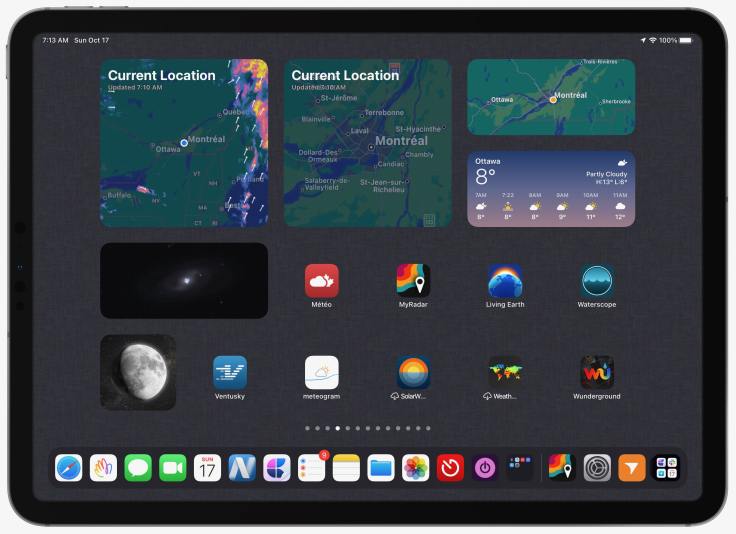
My focus mode setup depends on the following home screen page themes: Default2, Weather3, Finance, Music, Photography, Blogging, Reading, General News, Apple Focused Stuff, Work. Some of those themes aren’t linked or triggered by a focus mode. Using Shortcuts automation to move between focus modes is handy and reduces friction. Each focus mode, when activated, reconfigure my device’s Home Screen pages. It’s quick and seamless. I love it.
This concludes the design principles. One could argue that focus mode requires a lot of configuration. I tend to agree with this statement. I guess that’s the price to pay for having flexibility. Once set up, though, it’s easy to forget it.
On Widgets Placement
On the iPad, widgets are confined to the top portion of the home screen as much as possible and must be selected based on their intrinsic value to the theme of the home page. Smaller size widgets are preferred over the bigger ones to strike a balance between widgets spacing and the number of icons on the page. Widgets that are 1×1 in size are preferred over the application’s icon as they increase information density to the home screen. Great examples of 1×1 widgets are WaterMinder, Streak, and Apple’s Weather application. I don’t use the big widget introduced with iPadOS 15. From what I’m seeing, they are poorly designed, don’t show enough data and provide low value. Widgets that are 1×1, 2×4 and 4×4 in size are my preferred sizes.
Setting Up Focus Modes and Notifications
Notifications play a big part in unfocused work. It is too easy to get distracted these days: notifications are temptations to divert our attention. Apple recognizes this, and with iOS 15 and iPadOS 15, they are bringing new features to the users to tackle the problem. Focus mode was created to help alleviate the burden of receiving too many notifications. In my case, special care went into configuring each of them.
A few weeks ago, I accidentally turned on Do Not Disturb, not for an hour, not until the evening, not until I left my current location, but in perpetuity. I haven’t turned it off, nor have I wanted to, and honestly, it’s one of the best decisions I’ve made in a long time. — Basic Apple Guy
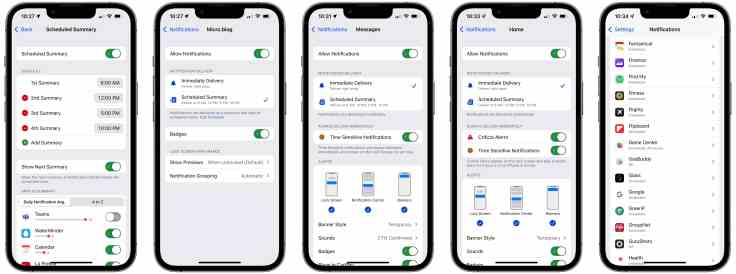
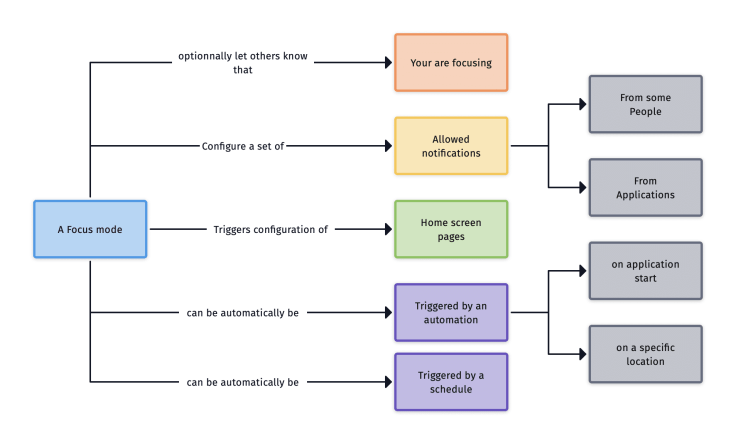
To configure all parameters related to focus modes, the following diagram puts all related things together. A specific focus mode is a grouping of different settings controlling what notifications are allowed, which Home Screen pages should be enabled. Moreover, a focus mode can be triggered manually, by automation or by a schedule. It’s clear to me that Apple has been working on this for quite some time.
Before installing iOS 15 earlier this summer4, I decided to revisit my notifications set up on all my devices, starting with the iPad5. One principle to my notifications reset is to recognize the fact that very few notifications merit immediate attention with a sound. So the first thing I did was to disable Lock Screen notifications for all my applications except messaging ones. By doing this, notifications are less accessible; a swipe down from the top of the screen is required to see past notifications. It is an intentional gesture. This way, I’m the one who decides when I want to be interrupted.
Basic notifications setup that is common to all focus modes is done the following way. Very few applications should request my immediate attention. My time is too precious for that. Most of my notifications are delivered as banners only (no sound, no application red badge, no Lock Screen presence). Very few Siri suggestions are enabled. No notifications are allowed between 10 PM and 8 AM. That’s the minimum required, in my opinion.
Notifications have become a nuisance in many people’s life. Some are struggle to get back some control in their numeric life because of them.
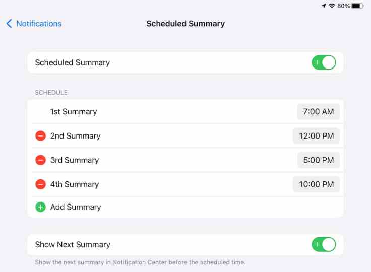
I set notifications to be delivered using the Scheduled level for those applications that can send notifications, so they are grouped in the next scheduled notifications summary. They are used for news-type notifications and are sent four times a day: morning, noon, afternoon, and in the evening.
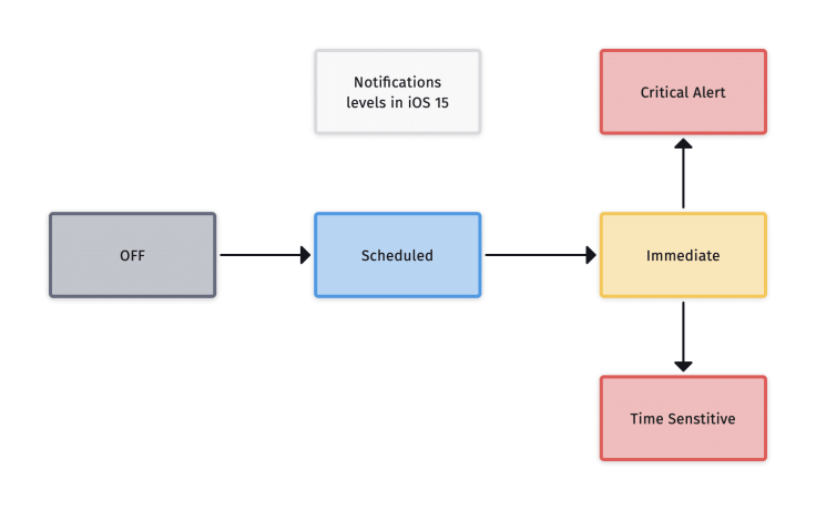
The Immediate level is reserved for applications like messaging or time sensitive ones. Some third-party applications support the Time Sensitive notification type. Yet, not many applications that I use benefit from this in my setup. Finally, Critical Alerts notifications are enabled in the Home application.
Red badges are reserved where they really make a difference in using the application like messaging applications, collaboration applications like Microsoft Teams. Other than that, they aren’t enabled.
When a time sensitive option is available, I turn off the lock screen display of a notification. In other words, time sensitive notifications will always be on the lock screen, but for up to an hour after being received.
There is one thing that I would like Apple to reconsider: shortcuts notifications location. The shortcut runtime is chatty and overloads the notifications center. It’s terrible. Suppose Apple wants to keep it this way. In that case, they could consider creating a separate view in the notifications center just for shortcuts execution or, better yet, in the Shortcuts application itself.
Focus modes on macOS Monterey
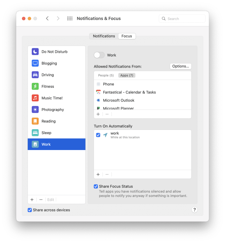
Focus modes on macOS Monterey6 lack the Home Screen configuration, as there is no such thing on the Mac. Configuration happens in System Preferences under the Notifications & Focus section. Since many applications aren’t available on the Mac, configuring which applications can send notifications can look buggy. For example, there is no Phone feature on the Mac, so the Phone entry lacks the Phone application icon. Zoom not being present on my MacBook Air, an entry is present, but the application’s name is wrong. I guess those issues might be fixed when the final release ships7.
A Few Important Takeaways
In summary, here are my tips for designing the best customized and focused enabling environment.
- Turn off notifications for each application, then promote only the required ones to the scheduled delivery status as needed.
- Reserve the time sensitive notifications to the most critical ones.
- Create theme-based Home Screen pages, and link them to a specific focus mode, whenever it makes sense.
- Use 1×1 widgets in place of application’s icons. Widgets are cooler and doesn’t take more space.
- Remember to create a default home page and maximize the use of the Dock and the App Library.
- Maximize the use of scheduled notifications summary, it’s a brilliant addition that helps bring more focus.
Creating a perfect focus mode set up to enable a personalized, task-oriented experience involves home screen pages design, judiciously selected widgets, and scheduled notifications summary configuration. Setting it all up is time-consuming and requires many iterations. However, once completed, it can enable a more focused and personalized experience. Focus modes are better experienced on iOS and iPadOS than on Mac, as they can reconfigure the Home Screen. It’s pretty cool. The level of personalization is not something we usually get from Apple.
Now, let me turn off my Blogging focus mode. Thanks for reading.
- I’m not a big user of the App Library on the iPhone. Now that it is available on the iPad, coupled with widgets and focus modes, it has become instrumental to my home page design principles. ↩
- The default Home Screen page is the leftmost one, the one that is common to all focus modes. ↩
- I’m a big fan of weather-related applications, as noted in this article. ↩
- My journey with iOS 15 started with beta 2 earlier this summer. It was a solid release which helped me better understand what was coming. ↩
- Notifications configurations don’t sync across devices but focus modes do. ↩
- Still in beta at the time of publishing this article (beta 10). ↩
- I wouldn’t bet on it. Apple is known in recent years for letting small bugs being unfixed for a long time. ↩