About iOS 14 Widgets — Great But Still a Long Way To Go
With the recent introduction of widgets on iOS, what is referred as “the iPhone experience” is having a refreshing moment. Never before users could customize their home screen as much as today. Not everything is perfect on iOS 14, far from it, but this new level of control was long overdue. Time as
With the recent introduction of widgets on iOS, what is referred as “the iPhone experience” is having a refreshing moment. Never before users could customize their home screen as much as today. Not everything is perfect on iOS 14, far from it, but this new level of control was long overdue. Time as come for some reflection and assessment.
My must-have widgets
In the last few months, I’ve been playing with a lot of widgets. I probably spent way too much time on this. First, I started with Apple’s stock widgets, then came the third-party one with the beta phase before the release of iOS 14. The excellent AirPort app helped me discover many of them. First, let’s start with my widget picks.
HEY email client
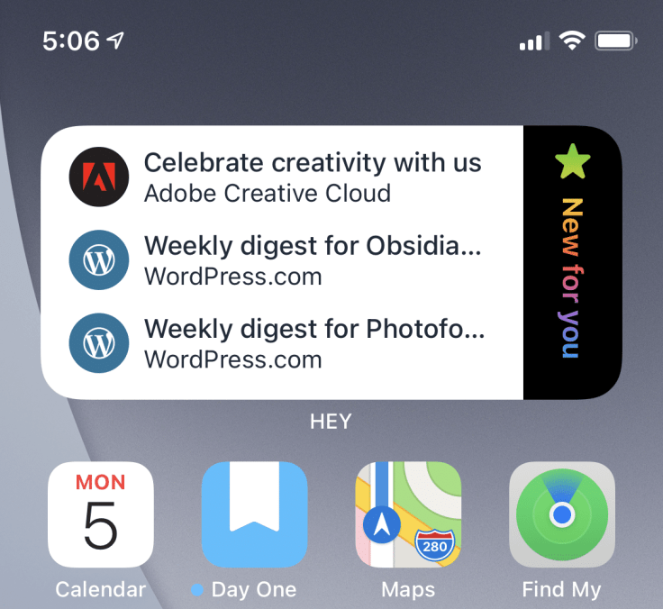
The popular and controversial email service, Hey, now supports iOS 14 widgets and I couldn’t be happier. The design is great and useful and in line with Hey’s Imbox, The Feed and Paper Trail. I’m a happy camper. It is my preferred one.
WeatherLine
The weather app called, WeatherLine, is the second runner-up. For weather enthusiasts, it is one of the best widget out there. I’m not a fan of CarrotWeather.
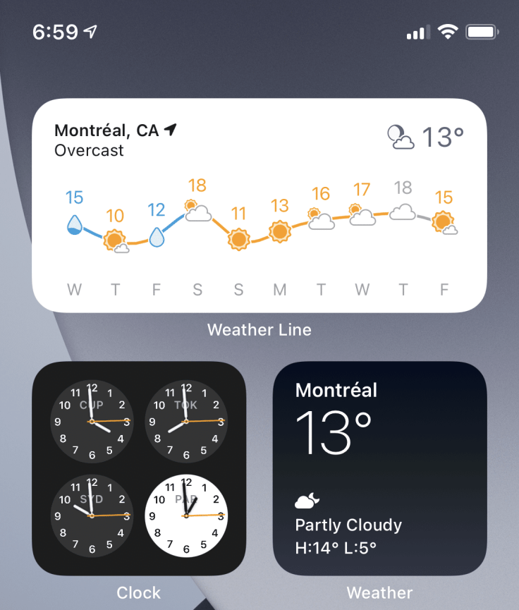
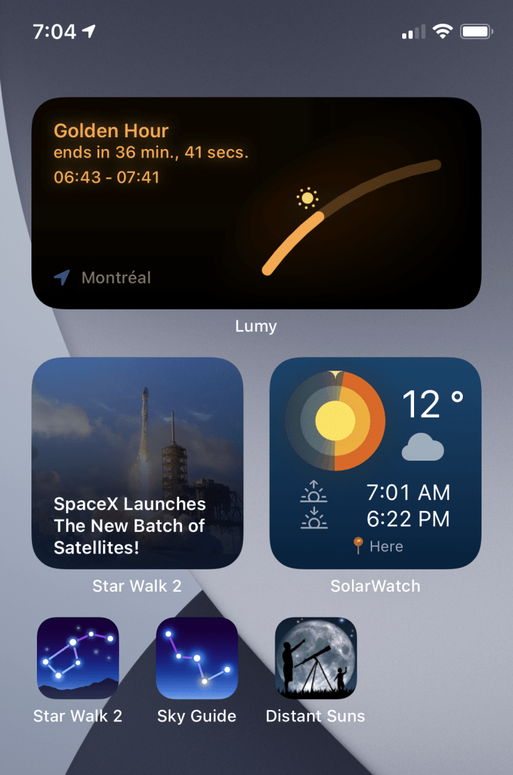
Lumy
Lumy is another great one which displays golden hour. The three basic widget sizes are supported. This app also offers an Apple Watch complication which is also very well-designed.
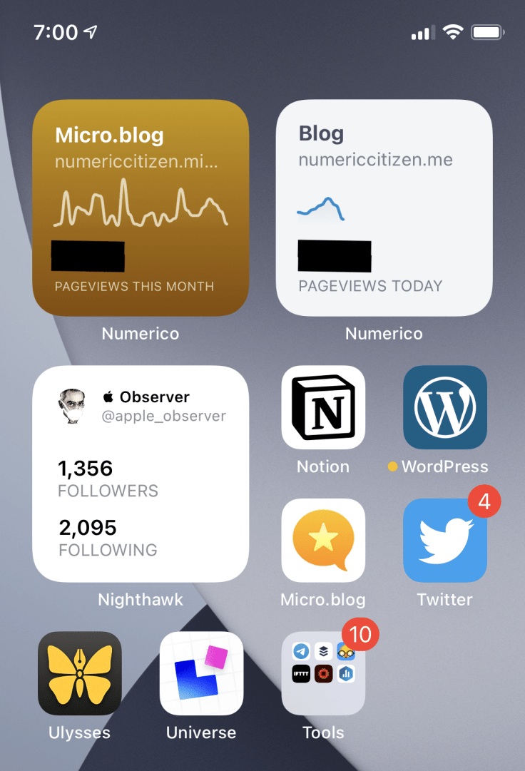
Numerico — a Google Analytics data visualizer
Previously known as GAdget for Google Analytics, this nice little app was completely redesigned for iOS 14. I’m happy to see widgets supported which are sitting on my blogger home page. That’s exactly what widgets are for.
Buddywatch
Buddywatch is a brilliant app to discover watch faces for Apple Watch. You can search for them, browse them and download them on your Apple Watch. This is something Apple could have done. It’s probably the closest thing you’ll get to a watch face store. It is a really well done application. Oh, and did I say it is free?
Buffer
Finally, Buffer widget was introduced during the writing of this article. I like the end result: simple widget displaying the number of items scheduled in the buffer queues.
What do they have in common?
Now, what is the common denominators to these widgets? Why do they stick to my home screen pages? It comes down to a few, probably obvious, reasons. First, they look great. To be on my home screen page, it needs to be pleasant and well-designed. Second, there are useful. They have to expose useful, obvious and very specific information from their parent application. Third, they support all widget sizes which provide flexibility in their placement on my screen. See? Only three reasons are needed to enable the possibility of finding a precious slot on one of my home screen page: great design, useful and variable in size.
Still missing in action
As much as I do use widgets now, there is a lot going on in the widget space since the release of iOS 14 on September 16th. Yet, at the time of publishing this article, many of my favorite apps still lacked widgets support. Here is a rundown.
- News Explorer. I’d like to have a widget showing recent entries for a specific RSS feed. The idea of using widgets to display recent items from a massive stream of information like “all the feeds” is very questionable as I wrote on Micro.blog: that’s not a great use case for widgets.
- MyRadar. Another one that could make good use of widgets with the most recent radar image for a specific region or for my current location. Hope they provide that option.
- Twitter. How about a widget showing current stats like followers and following count? There is not many use cases for widgets for Twitter. Aviary, another Twitter client, supports widgets that I find cute but not very useful.
- Notion. How about a widget showing the most recent notifications or the most recent pages that I worked on?
- App Store. How about displaying the most recent application updates available, something along the line of what Apple TV app already do? That could be useful.
- Unsplash. Having a widget showing pictures from people you follow or from a specific theme would be really nice on my home screen. Can’t wait for that one. I would pay for this!
- 500px. Again, just like Unsplash, having a way to see pictures of photographers of your choice could be a nice way to personalize the home screen. What are they waiting for?
- Local news app. Many of the local news apps that I use are still lacking widget support and that’s a shame.
- WordPress. WordPress currently supports widgets in the Today view and there are quite useful. Would like to see them ported to iOS 14 widgets format. Moreover, what about a widget showing current posts in draft status, number of followers, scheduled posts queue?
- Medium. I would love to see the most recent article headlines from people and publications I follow and the most recent bookmarked articles. Medium is currently in beta for the redesigned application but as of this writing, widgets are still not supported. Also, another widgets showing followers count, reading statistics would be a useful addition.
- Deliveries. The recently released version 9 of Deliveries finally brought dark mode support but is still lacking widgets support. That’s another no-brainer feature to add to this venerable utility. Speaking of Deliveries, you can read my recent comments on this version here.
- Ulysses. I would like to see a widget showing current drafts in the works. The latest release (v21) did bring a refreshed look to better support iOS 14 but did not add any widgets. Or what about a widget showing the progress of the most recently edited article?
- Living earth. This excellent earth cloud imagery could benefit from adding a widget showing a user-defined area on the 3D globe.
- Adobe Creative Cloud. Recently edited photos thumbnails, available storage, recent tutorial additions are all examples of things that could be part of any new widget.
- Adobe Lightroom. Again, recently edited or imported photos could be shown as small thumbnails. User could also be offered to select a specific album as the source for shown pictures.
- Currency conversion apps. Another no-brainer, which I’m still waiting for my preferred currency converter app to support.
- Castro. This excellent podcast player and management still lacks widgets support which is a bit of a shame if you’re considering the iPad is still not supported either. You see, subscription model doesn’t always equate to basic operating system features support.
This list was way too long, I know, but these are the most obvious cases for widgets support that I’d like to see.
A widget construction kit
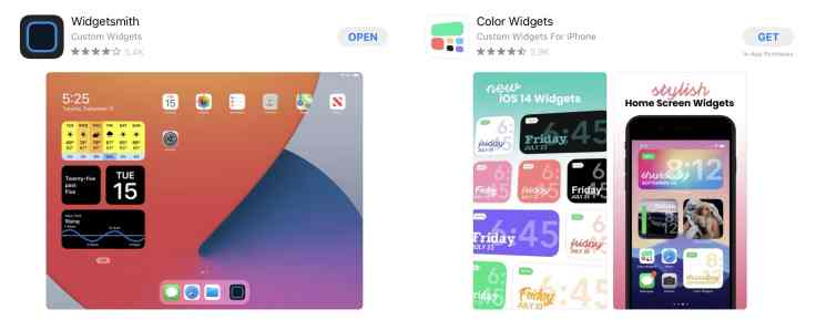
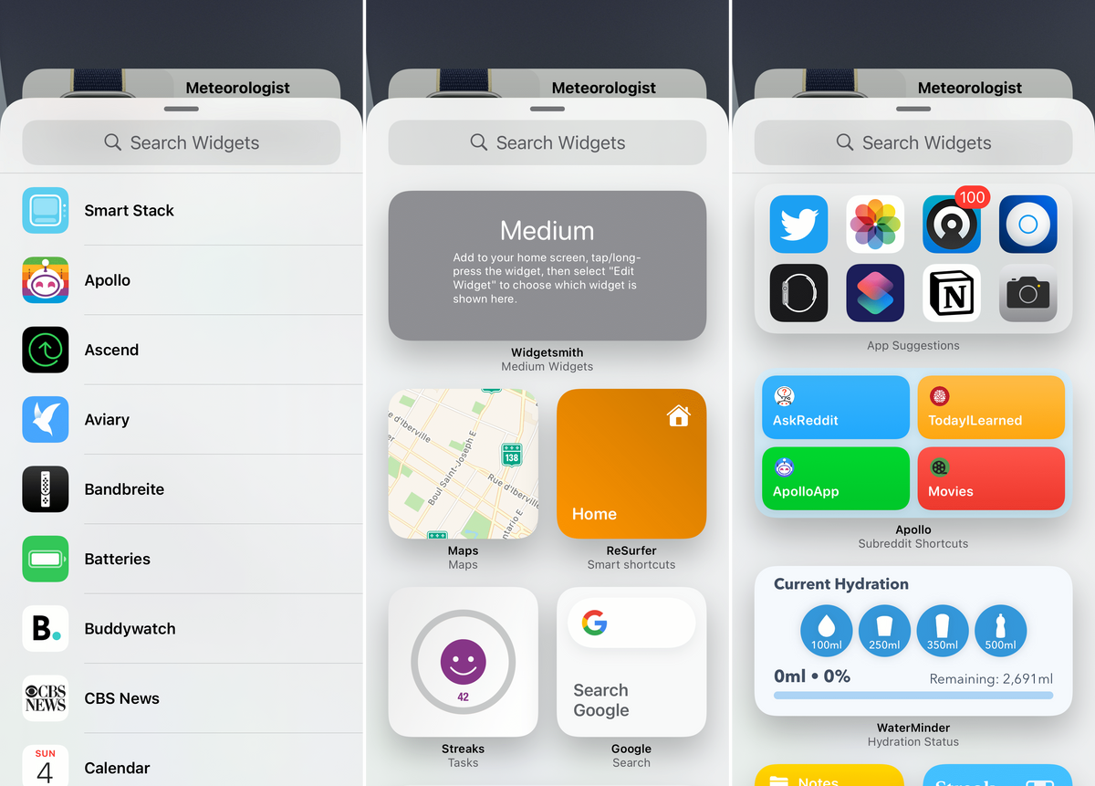
As I wrote in a recent blog post on Micro.blog: I think those who will come up with a fully featured widget construction kit, something along the line of the Widgetsmith or Widgeridoo app, will make a lot of money. The sooner the better. Make no mistake, Widgetsmith is a pretty cool concept with a few rough edges, and a lot of untapped potential.
In the future, I see a world where I should be able to design a widget pretty much the same way we design a newsletter: setting the frame size, adding text, images, live data from different sources like RSS, websites, weather, etc. I would pay to have this on my iPad or iPhone. I’m patient and willing to pay for that.
Some (free) widget ideas
Besides the imagined widget construction kit, here are other obvious ideas of widgets for which I would pay for. Here is a short list.
RSS. Display content from a single RSS feed.
Web pages. Display the content of a single web page.
Search.– Display a Search field for on-device searching with option to branch out a search on the web.
Strange widgets ideas are also starting to emerge like a collaborative widget content in Magnets.
On iPadOS 14 widgets
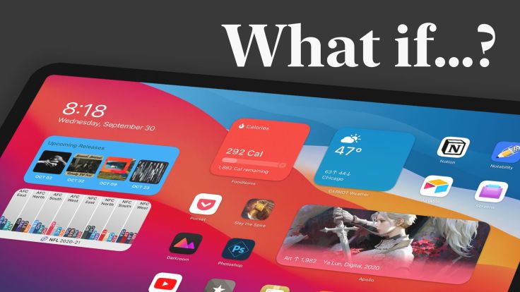
I’ve been thinking about the lack of the full widget experience on the iPad lately. Many are frustrated by Apple still holding back the iPad as shown in this Twitter thread. Why Apple did not enable widgets placement anywhere on the home screen? Let’s try to figure this out.
Lack of resources on the springboard team at Apple.
Apple’s resources are not infinite. Introducing widgets support is something that probably wasn’t trivial to add to the iPhone. Maybe Apple chose to concentrate on this device first and introduce the full experience in a forthcoming update to iPadOS.
The importance of the Today view
Contrary to the iPhone, the today view on the iPad can be more prominent to the user. It’s plays a distinctive role to make the iPadOS experience different compared to the iPhone where the Today view is always hidden from the user until it is brought into view with a swipe gesture. One could argue: to add the full widget experience on the iPad, Apple has to reconsider the existence of today view. I think it could be replaced with widgets only in the future.
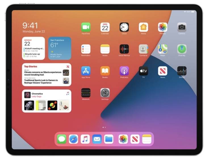
As I wrote on Micro.blog following an interesting article from Matt Birchler, Apple is not obligated to keep the Today view around on the iPad when they introduce full widgets support. This view could easily be recreated by placing widgets on the left of the screen in landscape view. Device rotation would not affect widgets placement.
Too much strength on system resources
There is so much more space on the iPad home screen that maybe having too many widgets would cause a lack of system resources? Widgets in iOS14 are not interactive like they were on iOS 13 which required more advanced runtime environment to support them. Yet, we should not forget about the fact that iPads do have less system memory than a laptop.
Are resizable widgets needed?
If Apple wants to keep the current icon spacing on the home screen as it is on each current iPad models, this mean a widget would need to be resizable to support device rotation. This feature is not yet available. Resizable widgets are certainly something that would be useful. To change the widget size, users have to remove the widget and add the same from a different size. It’s not the best user experience. As it is now, the standard widget sizes were designed with the iPhone home screen in mind, this doesn’t transpose well on the iPad as the icon screen spacing changes depending on the iPad model.
iPadOS update cycle
What if Apple chose a different update cycle to the iPadOS experience? Maybe it is based on a two-years cycle, who knows? This could mean that the full widget experience could come with iPadOS 15 next year. My gut feeling is that Apple would do more than just completing the widget experience. I think this explains why we don’t have as much flexibility on widgets usage on the iPad, for now.
Nothing new for widgets in iOS 14.2 beta
Today, there are many areas open for improvements regarding widgets, especially regarding their management. The upcoming iOS 14.2 is out (in beta form), but doesn’t contain any widget-related and user-facing improvements. My guess is that Apple is content with the current state of widgets implementation. That being said, looking ahead, here is a list of things I’d like to see improved.
Editing widgets stacks
Once a widget stack is added on the home screen, we cannot add other widgets in the stack. Only widgets deletion and reordering are allowed. Adding widgets should be possible.
Merging two stacks in one
It will be useful in the future to allow users to merge two stacks by dragging one on top of another. Right now, we need to rebuild the stacks from scratch which, again, imposes too much management burden on users.
Fragile home screen layout
While adding a widget on the home screen, the layout of icons and widgets already in place is fragile and prone to be broken. This is particularly true when the home page if already full of icons and widgets. Fixing these induced layout issues takes many manipulations.
Siri suggestions widget lacks a visual cue
The Siri suggestions widget should come with a small outline to help differentiate this bunch of dynamically placed icons from those individually placed by the user. An option to add such an outline should be provided at the very least.
One-by-four
A one-by-four widget size should be introduced. The batteries widgets would benefit from it. A more flexible widget placements possibilities would be a welcomed addition.
What the future holds?
We will have to look beyond iOS 14 to get any meaningful changes or improvements regarding widgets. But, One person did have a look and created an animated mockup of what could lie ahead. It is a short clip but it shows where Apple should be heading and It is very cool.
Still unsettled
I’ve been playing with widgets since the first beta of iOS 14 came out this summer. I’m still searching for the best home screen pages configuration. I spent countless hours trying to figure out the best setup. And just like for the Apple Watch, I’m never satisfied. Is this supposed to tell something about me, my personality or about Apple’s new iPhone experience? Apparently, I like to have widgets on the top half of each home screen pages and I do use stacks a lot.
There is still a lot of experimentation going on in the widgets space right now. I’m not sure all widgets are useful, many are gimmicky and show a lack of fundamental understanding of what a widget should provide to the users. There is a lot of room for improvement and there are many low-hanging fruits. The coming months will be interesting to watch.
