Tips & Tricks & Utilities for Boosting Your Productivity with Apple’s macOS Big Sur and Monterey
Apple’s macOS Big Sur is a turning point for the Mac from its foundations to its visual appearance. You like it or hate it. This article is about exposing my tweaks and utilities toolbox that I use to make it the best end-user computing desktop.
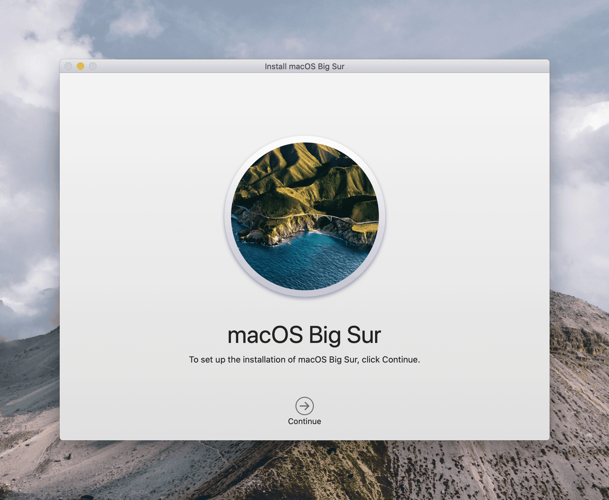
The macOS releases Big Sur and Monterey, are major overhauls of Apple’s oldest operating system platform. They represent a turning point for the Mac (see “My Top 5 iPadOS & iOS Apps for macOS Big Sur”). When running on Apple Silicon-powered machines, with a few tweaks and the use of third-party utilities, you’ve got a much improved productivity-friendly desktop experience. Here is my setup.
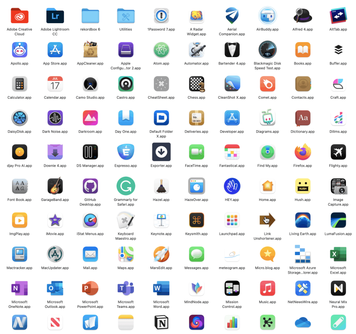
Apple’s macOS Big Sur came pre-installed on my M1 powered Mac mini last fall. I did not restore from a backup to set it up, instead, I chose to re-install all the applications, one by one. I wanted to start fresh on this machine. It was the right time to decide which application actually sitting on my iMac would be re-installed on my new Mac mini. Many didn’t make the cut but quite a few made a first-time appearance.
“An enjoyable thing about setting up a new computer from scratch is that I’m forced to decide which apps and settings and utilities I’m going to install. I tell myself I don’t need much, so it starts out with the basics. But it quickly becomes apparent that my “basics” aren’t really that basic.”Jack Baty on Substack
Let me tell you that I’ve never been a big fan of third-party utilities. Up to the Mac mini’s arrival, my love affair with macOS was one based on a relatively plain experience. One reason for this is the apparently slowly decreasing speed of the Mac while using too many system utilities. With an M1-powered Mac, it’s no longer an issue, thanks to the M1 chip. As you’ll see later, the list of third-party utilities and extensions is quite long, and I have yet to see any slowing signs. Without further due, let’s start with some visual tweaks.
macOS Big Sur and Monterey visual tweaks
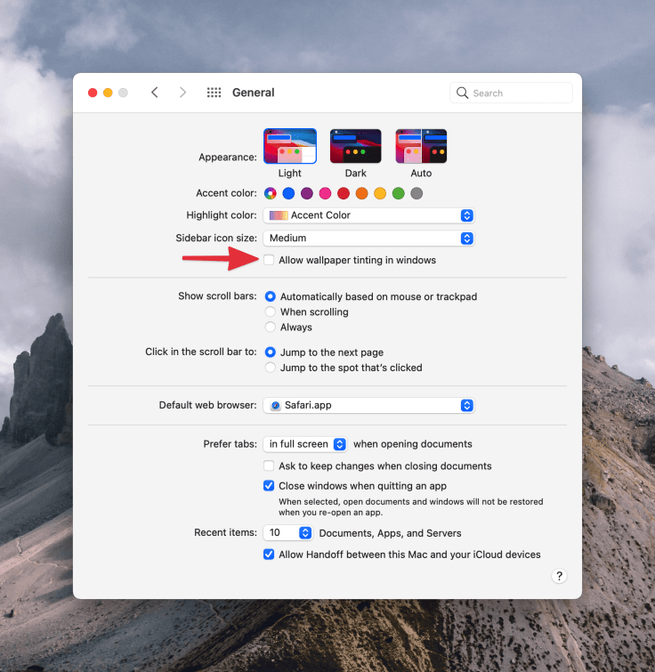
My first moments with macOS Big Sur were more or less positive. I do like the idea of visual unification between the Mac and the iPad. I like the more rounded windows, the new dock. I’m still undecided if I prefer the new toolbar look, the design and the spacing of the drop-down menu. What I don’t like is the general “too white user interface” feel of macOS, Big Sur appearance. I think Apple isn’t showing us its best work here and broke basic design guidelines (Read “UX Lessons from Big Sur”). Big Sur lacks contrast. After spending a few hours with it, I had to make three must-have visual tweaks. The first thing was to reduce transparency. Next up was to turn off wallpaper tinting in windows. Next, I made the cursor bigger to make it easier to locate on my 4K screen.
Not everyone is happy with Apple’s design choices for macOS Big Sur:
” I’m reminded of all the UI and interaction designs and changes in iOS and MacOS that are just bad. There’s a real sense that Apple’s current HI team, under Alan Dye, is a “design is what it looks like” group, not a “design is how it works” group. Exhibit A: What MacOS 11 Big Sur has done to document proxy icons. Arguably it looks better to hide them. (I disagree, but I can see the counterargument.) Inarguably, they work far worse now — harder to use for people who use them, and much harder to discover for people who don’t yet know about them.” — John GruberJohn Gruber
With those tweaks, macOS Big Sur started to grow on me. But, it wasn’t enough to undo Apple’s decisions. Now, let’s dig into my long list of third-party utilities that make a real difference.
Third-party utilities galore to the rescue
For each utility in the following list, I’ll tag what areas and improvements are targeted.
One of the first utilities that I bought is HazeOver. This utility automatically highlights the frontmost window by fading the ones in the background. It is super easy to configure. Thanks to HazeOver, macOS Big Sur is even more pleasing to my eyes. (#userinterface)
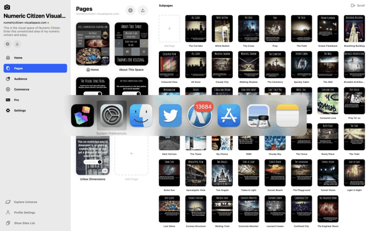
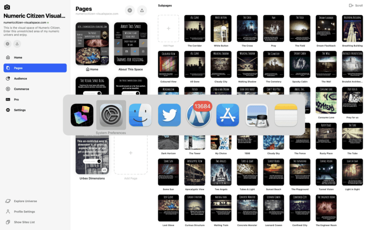
AltTab is a recent addition to my utility arsenal, which brings the power of Windows “alt-tab” switcher to macOS. That’s the only place where Windows get something better than macOS. I prefer windows miniatures over the big icons bar in the task switcher. (#operatingsystem)
Another utility added to my toolset is Unclutter which brings a handy place for storing notes, files, and text clips. To access these objects, I place the mouse cursor on the menu bar, and then I scroll down, which will bring up a drawer. Once displayed, I can click and drag a file and drop it in another application’s window like Ulysses. URLs to my different websites are stored in the clips space. Unclutter includes a clipboard management feature and replaces Pastebot from Tapbots. (#functionality)
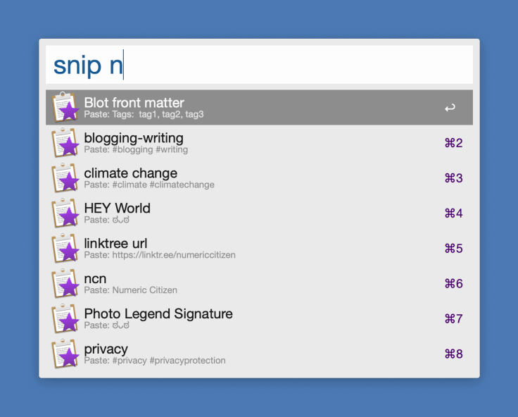
Another well-known utility that I bought is Alfred. This multipurpose utility complement Apple’s Spotlight in many different ways. Alfred’s powerful search bar is like Spotlight but on steroids. I use Alfred for searching on the Mac, on the web, and bringing text snippets while editing blog posts. I’m sure not using Alfred’s full potential. (#functionality)
DefaultFolder is another addition to the long list of power-ups utilities. This venerable utility1 augments the open and save dialogue boxes with all kinds of features like frequently used folders, rich metadata display, hierarchical menus to drill down in folders, recent files, recent folders, etc. As its name implies, the basic idea of this utility was to bring the open and save dialogue box to a default place to make it quicker to find or save files on the Mac. (#operatingsystem)
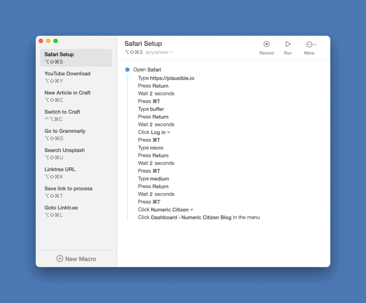
To automate certain tasks, I bought Keysmith, a macro editor. It is a very basic automation tool, much less sophisticated than Keyboard Maestro that I find intimidating. I have a few macros defined to automate things like setting up my Safari tabs to open a series of specific websites, all at once. Pretty handy. Keysmith is not perfect and will sometimes crash while executing a macro, or one macro will stop working for hard-to-know reasons. Updates are frequent and already addressed a few crashes for me. I may reconsider my choice of Keysmith depending on my future automation needs. I find it hard to make it work in certain scenarios, which makes me reconsider my choice. The jury is still out on that one. (#operatingsystem #automation)
Another useful utility that I bought and use every day is PopClip. This utility enters into action when selecting text by showing a pop-up menu close to the selected text with all different kinds of actions. Besides the basic copy & paste, there’s a word and characters count action, copy as Markdown, create a new inbox item in Ulysses, etc. PopClip is based on extensions for additional features. There are more than 180 of them available for download. It’s another simple but handy utility that gets me more productive on the Mac. (#userinterface #feature)
Bartender 4 is another addition to my third-party utility list. This utility helps me manage the menu bar’s content, which tends to be filled with many icons. Each of them represents all the utility helper services to make it easy to access actions. I use it to keep the most frequently used utilities and hide those that don’t need frequent access via their menu icon. Also of interest, Bartender will let me set the spacing of the icons in the menu bar to what it was like before Big Sur, which was better IMHO. (#userinterface #operatingsystem)
Next up, CheatSheet is a utility that brings a summary of all the shortcuts available on the frontmost application, just like on the iPad while holding down for a while the “command” key. Very handy. (#operatingsystem)
To help me manage and process some files automatically, I bought Hazel. This file processing utility uses rules for processing files in specific folders. For example, when I take a screenshot with CleanShot, the file is saved into a specific folder using a naming pattern. Hazel keeps an eye on this folder, and as soon as it sees the new file, it moves it into a folder accessible from Unclutter. Another automation is to process files downloaded from Unsplash. Hazel looks for files containing “Unsplash” in its name in the Download folder. When it sees one, it moves it into a specific folder accessible from Unclutter then creates a lower resolution version of the file2. All this is happening automatically and takes a few seconds each time. It’s a handy utility. (#operatingsystem #functionality #automation)
On the text manipulation side, I recently started using Textcraft. This text utility offers a plethora of text transformation actions like turning a phrase into a blog title with the Title case transformation3. Textcraft helped me create the following text snippet that I use in my HEY World feed. Thanks to Apple’s Catalyst development framework, Textcraft is available on macOS, iPad, and the iPhone, which is really nice4. (#functionality)

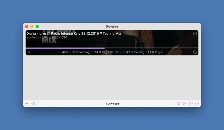
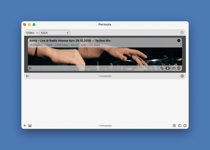
The next two other utilities are super useful for getting stuff from the internet and processing it afterward: Downie to download videos from YouTube and many other sources and Permute to transcode those downloaded files in different formats. I use Downie to download training videos from YouTube for my job or electronic music videos more recently. Some videos are in .webm, a Google format, so I use Permute to transcode them in .mp4 instead. Permute allows for the conversion of video and audio files. Furthermore, useful is the ability to extract the audio-only portion of any video files. For both of these macOS native apps, the design is simple yet superb. Oh, and transcoding on my M1 machine is fast, thanks to Permute for being native. (#functionality #apps)
Speaking of file conversion, I recently downloaded a free utility from the Mac App Store called WebP Converter. As its name implies, this utility will convert Google’s webp file into a .png or .jpg or vice versa. I don’t like to use Google’s file formats. This utility will prove to be valuable. The app is still not native and its icon is kind of ugly, though, but is free. You get what you pay for, I guess. (#functionality #apps)
I recently wrote an article about how much I love and depend on Cleanshot for all my screen capture needs. The developers behind it keep improving the application with each release. It is THE most useful and well-thought utility on the Mac. (#functionality #apps)
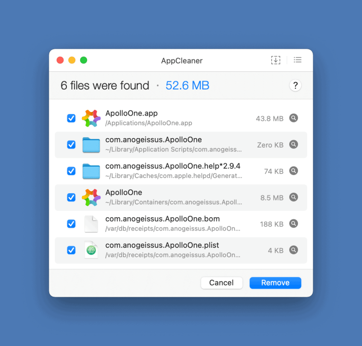
In recent months, I tried quite a few applications. Each time, when an application wasn’t needed, AppCleaner was used to remove it from my machine. I didn’t pay attention in the past. Putting an app in the trash isn’t enough in most cases: many applications will leave things behind. Well, no more. (#operatingsystem)
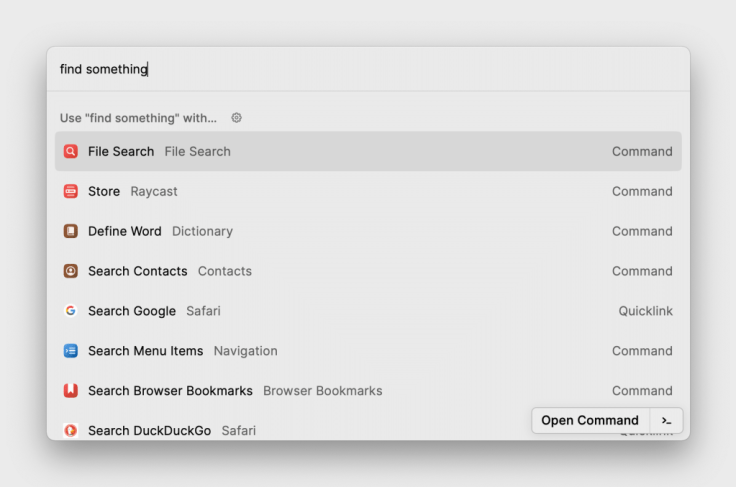
Raycast is another wonderful and hyper useful utility that found its way on my Mac. There are many similarities with Alfred but Raycast is simpler while sporting a better design. Think of Raycast as a command bar utility. The command bar is where you can start typing the first few letters of a command and Raycast will complete it with corresponding commands. Raycast extensible architecture makes it even more adaptable and powerful. There are as many as 700 extensions that can be downloaded and installed. Matt Birchler created a quick video showing Raycast in action. Don’t miss it.
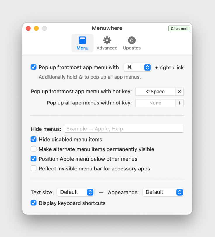
Another great addition is MenuWhere. This utility will display a popup with all the menus from the menu bar with a keyboard combination. I set up a Command+Right Click to bring up the popup. It’s nice to reduce mousing around the screen to reach certain actions within an application where no keyboard equivalent is available. Very handy.
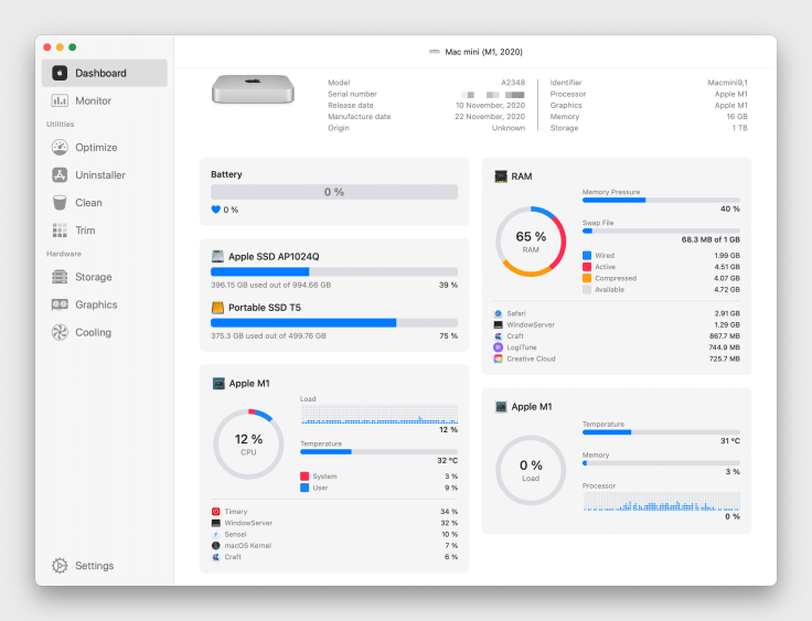
Now, for the more techy people out there, iStats Menu is another mandatory utility that I use every day. It provides an inner look at the computer and presents usage statistics as well as useful information like its IP address, free space on attached volumes, etc. All this information is made available in a highly configurable menu bar format. In the same category, Sensei add another way of showing this information, in the form of a dashboard (in addition to a menu bar item). There is another utility that strangely looks like iStats Menu and is called iStatistica Pro. Since I’m unable to choose between them, I use iStats Menu on my Mac mini, iStatistica Pro on my MacBook Air. From time to time I’ll open Sensei on my Mac mini. These are great utilities.
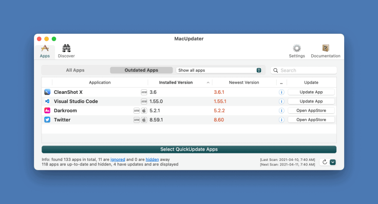
Finally, to keep all those wonderful third-party utilities up-to-date, I bought MacUpdate. It provides a centralized view of applications with pending updates. I was using the free version on my Intel iMac, but I wanted to get the paid version to get all the features for the Mac mini. MacUpdate not only scans for updates to side-loaded applications but also for updates available on the Mac App Store. Scanning is lighting fast, and updating applications is dumb simple. As macOS Big Sur on Apple Silicon is a new platform, developers are actively releasing frequent updates; MacUpdate helps keep my Mac up to date effortlessly. It’s a must. (#operatingsystem)
A few Safari Extensions to the rescue
With Safari, macOS Big Sur introduced support for standard browser extensions. They are hard to come by as Apple requires an application to be downloaded from the Mac App Store for the installation process. This seems to put off many developers. There are two extensions from the same developer that help me be more efficient by staying true to the original web experience. One of them is StopTheMadness the other is Link Unshortener. According to the developer’s website:
StopTheMadness is a web browser extension for macOS that stops websites from making your browser harder to use. And it protects your privacy on the web! Many websites disable user interface features in your browser that you normally expect to work. StopTheMadness ensures that those features continue to work for you in your browser: ⌘-click to open a link in a new tab, ⌘-key keyboard shortcuts, opening contextual menus, selecting, copying, cutting, and pasting of text, drag and drop and AutoFill/autocomplete of passwords, emails.
Link Unshortener will expand a short URL (like the ones from Twitter) to reveal its final destination while removing tracking stuff. It’s simple and handy for using URLs in my articles.
MarkdownLinker is another Safari Extension that I sometimes use to copy URL on a web page and paste it in Nova as a markdown URL when writing an article for https://numericcitizien.io. Very handy.
A few things still under consideration
A few more utilities are still under consideration for addition to my toolbox. One of them is TextBuddy, another text manipulation utility. Freezeframe is another one that could help me organize workspaces-like screen setup. This utility is still in development (it’s been a long time since the website has been updated, I’m wondering if the development is still going on), but the website shows promising progress. Magnet is another utility that I bought that helps me organize windows on the desktop. Also under consideration is a firewall app called Little Snicth. This application exposes all internet connections that your Mac is doing while using it. It’s something Apple should provide in some simplified form to the user like it’s available on the iPhone and iPad, in the Privacy Report section in Settings. While waiting for this to happen, Little Snitch might be a good option. CustomShortcuts enables adding keyboard shortcuts to any application. It works in pair with CheatSheet. This utility could remove the need for some features in Keysmith or Keyboard Maestro.
I’m still not fully satisfied with my Big Sur visual setup; I have to consider using icons from https://macosicons.com. Many awe-inspiring icon designs could be used to replace some default icons that Apple is providing.
Big Sur’s big quirks

This article is not meant to be a review of macOS Big Sur. That being said, some observations are in order. After months of using macOS Big Sur, there are still numerous quirks hindering the user experience. The most frustrating thing is the Bluetooth instabilities. Bluetooth devices on the Mac are Apple’s Achille heel. In the first few weeks of using the Mac mini, the mouse became unusable after a few hours following a reboot. Version 11.2 of Big Sur improved things a bit, but apparently, Apple chose to do some Bluetooth stack reset when things start to go bad. Hence, the numerous “Connection lost” followed by “Connected” messages, many times a day, until I decide to reboot the machine. Under macOS Monterey, the issue is mostly gone but sometimes the mouse cursor shows some lag when I connect my AirPods Max or switch to my AirPods Pro? 5.
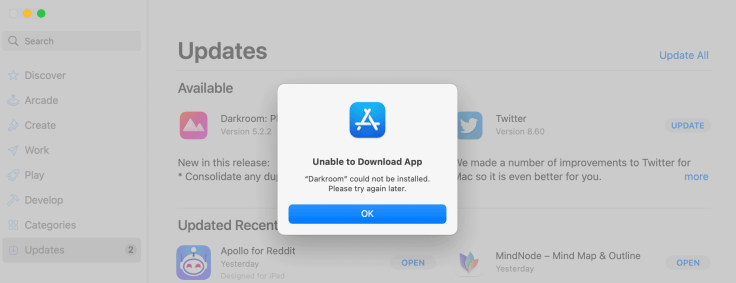
Next, the installation of application updates from the Mac App Store is buggy. Half of the time, Big Sur is unable to install the update. I have to repeatedly hit the update button the restart the process which eventually works. Still happening under macOS Monterey but less frequently.
The other area in need of improvement is the Notifications Center. Apple must redo its homework here. For some reason, my use of it is dramatically less than on macOS Catalina. Invoking the Notifications Center is tricky and managing or dismissing them is even trickier (On this subject, Read “240 Invisible Pixels”). The release of macOS Monterey brought some visual tweaks to be more in line with iOS 15, still not perfect.
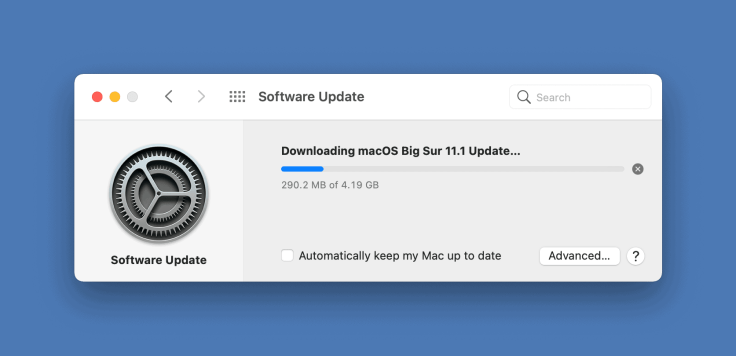
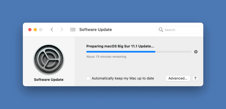
Updates of macOS are still big in size and take a long time to install, even on Apple Silicon Macs.
Finally, macOS Big Sur has a tendency to forget about widgets placements and configuration after a while. For some reason, third-party widgets disappear and have to be reconfigured constantly. I think it is related to the application update which removes the widgets. I did not verify this, though.
Final words
I have yet to decide when I’ll upgrade my Intel-based iMac to macOS Big Sur. Version 11.3 is around the corner. I think it will be safe to upgrade to macOS Big Sur then, provided a few work-related apps are updated prior to that. To me, one thing is clear, macOS Big was created for the Apple Silicon Macs in mind. The arrival of iPadOS apps on the Mac is cool. I do use many of them on the Mac regularly. Things like resizing windows is fluid, which has never been the case previously.
Apple’s design decisions for macOS Big Sur are certainly controversial but at least, when they decide to redo a design, contrary to Microsoft with Windows where they do it on the surface only (no pun intended), they do it at all levels. There is no way out or no escape.
By tweaking a few things and using the right set of third-party utilities, the Mac platform is versatile, powerful, productivity-friendly and still a joy to experience.
- DefaultFolder is one of the oldest utility still available on the Mac; I remember using DefaultFolder when I was on MacOS 7. ↩
- Unsplash files are quite heavy. By reducing their size, it is easier to add them in blog post. ↩
- PopClip does that too via an extension. ↩
- I should write a blog post about how Catalyst is really beneficial to the Mac experience. ↩
- Bluetooth issues on my 2017 iMac are a thing too since forever. Apple’s bluetooth drivers and bluetooth chipset are flaky, at best. ↩

