Substack vs Buttondown — Who’s Better? — My Observations
On the surface, Buttondown looks promising and a great competitor to Substack, but after spending some time testing the service, a few things about it made me pause.

Substack is getting a lot of attention, in good and bad ways. They are attracting journalists and great writers, but they also take controversial positions. Is Buttondown a good alternative? As a Substack user, with a few things that I don’t like about it, it’s time for me to look at alternatives, just in case something goes really bad. In recent weeks, I’ve been testing Buttondown, another newsletter hosting service.
Buttondown competes against Substack, Mailchimp, Tinyletter, just to name a few1. As a Substack user, I wanted to give a shot at this alternative because, from a distance, it looked better, more professional. Here are my observations gathered during my experimentation with the service.
Buttondown looks better but…
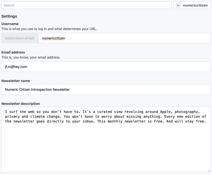
From the outside, Buttondown looks very professional, better than Substack in fact. But, consider the fact that, according to the website, Buttondown is a one-guy type service. Sure it gives a more human side to the service, but that makes me pause. I’m not convinced that I want to risk investing myself in a one-person show thing. Big corporations are not a guarantee of service continuity yet; I have to think twice.
Buttondown provides a much more powerful and beautiful analytics dashboard than Substack. It’s quite impressive. Maybe a bit too much. You can opt-out of user tracking, something not possible on Substack. Also of interest, Buttondown can be connected to Plausible analytics, which I love! But, I’m not looking into a Substack alternative because of a lack of analytics.
The design of Buttondown’s editor is, on the surface, really nice compared to Substack’s, but only when doing simple things. Adding a photo to the newsletter is less intuitive than on Substack. Inserting photos is probably the editing part with the most friction. After dragging and dropping a file, HTML tags are required to create the caption. Substack is way easier in that respect. Insertion of photo caption is not possible either. A complete rewrite of the editor is on the list of things to do, according to Buttondown’s website (which is, in fact, a Notion-based web page2). Let’s hope this gets fixed3.
From a reader’s perspective, Buttondown’s main page is an excerpt of each newsletter (see my home page). Here is an example for Quill. The “home page” on Substack is way better because it’s really a website when you can browse previous newsletter issues and discussions. Substack is clearly winning here.
Contrary to Substack, it is easier to build a new newsletter issue by reusing a previously sent one. Buttondown is winning here. It is enough to win me over? Nope.
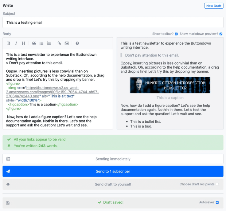
While editing a newsletter, there is a side-by-side view that can be enabled with Markdown preview, which is nice4. It’s somewhat mandatory when composing in Markdown. On Substack, WYSIWYG, a preview pane is therefore not needed. There is less friction on Substack5—another win here for me.
The Buttondown editor doesn’t support Grammarly with Safari. Here is one deal-breaker for me. I didn’t check the payment processing portion of the service as my newsletter plan is free. I didn’t build a complete newsletter example either. I don’t think it would have made me change my perception of the service.
Like Substack, sending a test version of the newsletter is easy and allows for the newsletter’s pre-visualization. I spotted problems with images being broken in HEY’s client. The URL to the image is fine, but HEY couldn’t display the picture. I suspect an issue with the image’s resolution and size being too big.
Finally, there is a comparison table available on Buttondown’s website comparing it to Substack. Besides some false claims6, you’ll get a good idea where Buttondown shines.
In summary, a one-person service offering a better-designed website on the surface but many lacking features while editing a newsletter makes Buttondown a no-go for me. I cannot consider a switch from Substack.
When evaluating Buttondown, you better not fall in the trap of judging it by the look because not everything looks as good as it actually is.
- Even Facebook is considering to enter this space and compete. ↩
- The guy behind Buttondown is very open and transparent by publishing the roadmap openly. Service’s running costs is even published. ↩
- I do include a lot of pictures in my newsletter. ↩
- Buttondown editor fully support Markdown, that’s not the case with Substack. ↩
- Writing a newsletter in Buttondown feels geeky as it is a real markdown editor as opposed to the WYSIWYG editor of Substack. ↩
- One example is the supposedly autosave feature of Buttondown which is not available on Substack. That’s not true. It is. The table states there is no analytics on Substack which is not true either. ↩
