WWDC2020 — My Observations and a Survey of Comments
This year’s WWDC conference was doomed to be special. Apple had a lot on its plate: deliver a successful digital-only experience, move all software platforms forward and keep the developers community happy. Did they deliver? Read more to find out.
This year’s WWDC conference was a great demonstration of a balancing act by Apple. In its first-ever digital-only version of the venerable WWDC conference, Apple delivered an outstanding and high pace keynote. While this year’s platforms advances are not as feature-packed as last’s year versions on the surface, Apple is delivering many turning point changes to its platforms. More than ever, I’m enthusiastic about Apple technologies. Let’s dig in.
On the digital-only version of WWDC
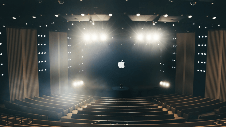
Before WWDC, many people, including me, were wary about a digital-only version of the keynote. But, Apple delivered one of the best experiences in recent years. The general look and delivery of the keynote were top-notch. I watched the keynote using my Apple TV and the picture quality was so good. Apple Park is such a nice environment for filming and Apple took advantage of the situation to show what it is like to be there. I don’t think the keynote had any live parts. They were all pre-recorded segments for sure. The pace was high as transitions were succinct. It felt a bit jam-packed but I liked it. Not only the keynote was great but the whole week was highly regarded by well-known developers like Marco Arment. Finally, an online-only WWDC allows for a much wider audience.
After the keynote, Apple’s website was updated to reflect the announcements. After spending quite some time glancing at the new content, I had this feeling of the lack of details about the new features on each platform. I realized this year’s platform advances were not as big and spread all over the place as last year. And you know what? I think this is for the better. Apple’s ecosystem needs a small pause to fix things. According to comments like this one or this one on Twitter, Beta 1 of iOS/iPadOS is surprisingly stable which is a good sign.
What others are saying?
- Keep the online version of WWDC but also come back to a live version — Joe Cieplinski on his blog.
- Apple is on top for the production quality of keynotes — Tyler Stalman on Twitter.
- Best WWDC conference ever — David Smith on Twitter
- Sundell LOVES the WWDC format this year — John Sundell on Twitter.
- Terrific Keynote — Guy English on Twitter
- What are analysts saying following the Apple keynote? Vastly positive comments but Philip Elmer-DeWitt has it all on his excellent website.
Software — iOS & iPadOS 14
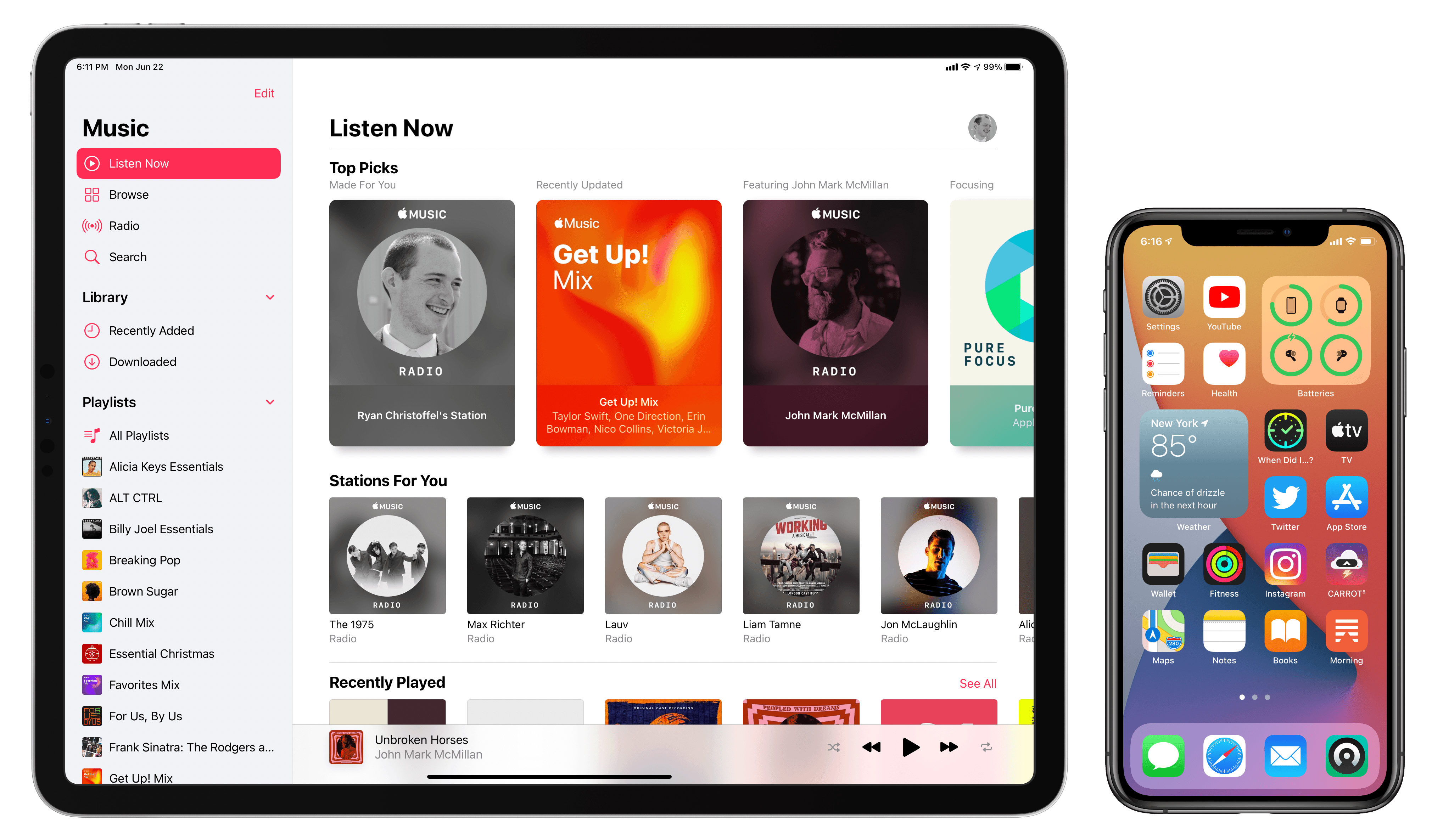
The mother of all software platforms at Apple is iOS. iOS 14 is probably not the biggest release in terms of new features, but one feature that was shown during the keynote will make history. I’m thinking about the introduction of the long-awaited widgets. Users will love them but developers too it seems. Widgets and App Library are adding complexity to the iPhone experience but under the surface only. People looking at an iPhone running iOS 14 won’t be able to notice the difference from the get-go. The complexity is available to the power user yet the novice user sees the basic iPhone experience that seems unchanged. I like that a lot, but it also means that iOS 14 requires more management of the experience than before. I’m still undecided about how I’ll manage my home screens. I think it will, in part, depends on the developer’s adoption of the new technology.
But, on the iPadOS side, Apple is again holding it back. Things like the decision to exclude the iPad from supporting widgets anywhere on the home screen, just like for the iPhone. Also, untouched is the multitasking general behaviour. Nonetheless, there are many enhancements that are welcomed for me. Here is a not too long rundown of them, in no particular order.
- The new search bar on iPadOS is much better and is closer to the macOS version.
- Handwriting translation was long overdue knowing Newton came from Apple. From what I’m seeing it seems to perform really well.
- Apple keeps updating the Notes app with automatic forms recognition, refreshed design.
- The redesigned image picker is so much better than the previous one.
- The introduction of a Sidebar design on iPadOS is a welcomed refinement that allows for a more immersive experience when it is hidden.
- The iPad didn’t get as much love as the iPhone regarding the use of widgets. Apparently, on iPadOS, you have much less flexibility in placing your widgets on the screen. Is this only for beta 1? We’ll see, but I don’t hold my breath. What is weird is that I think widgets on iPad would better fit the available screen space. On the iPhone, I find it hard to select a good home screen configuration to satisfy my widgets needs.
- There are a few optimizations in camera operation speed which is always welcomed. But, now in Photos, you can add a caption to photos, just like on the desktop version.
- Widgets are no longer interactive. They look like being an app launcher now. It means that Streaks or WaterMinder apps will have to be updated or even drop their respective widgets. Not cool at all.
What others are saying?
- Apple opening up to allow charging default applications, but why only for Mail and Browser is asking The Verge.
- Many interesting comments by Matt Birchler on Twitter.
- Apple Music gets a well-received design tweak as documented by 9To5Mac.
By definition, these features make the iPhone home screen more complicated, but there’s no downside to this added complexity because they’re all optional. Typical users don’t need to be aware of them. They’re traditional “power user” features that reward exploration.John Gruber
Software — macOS 11 (not 10.16)
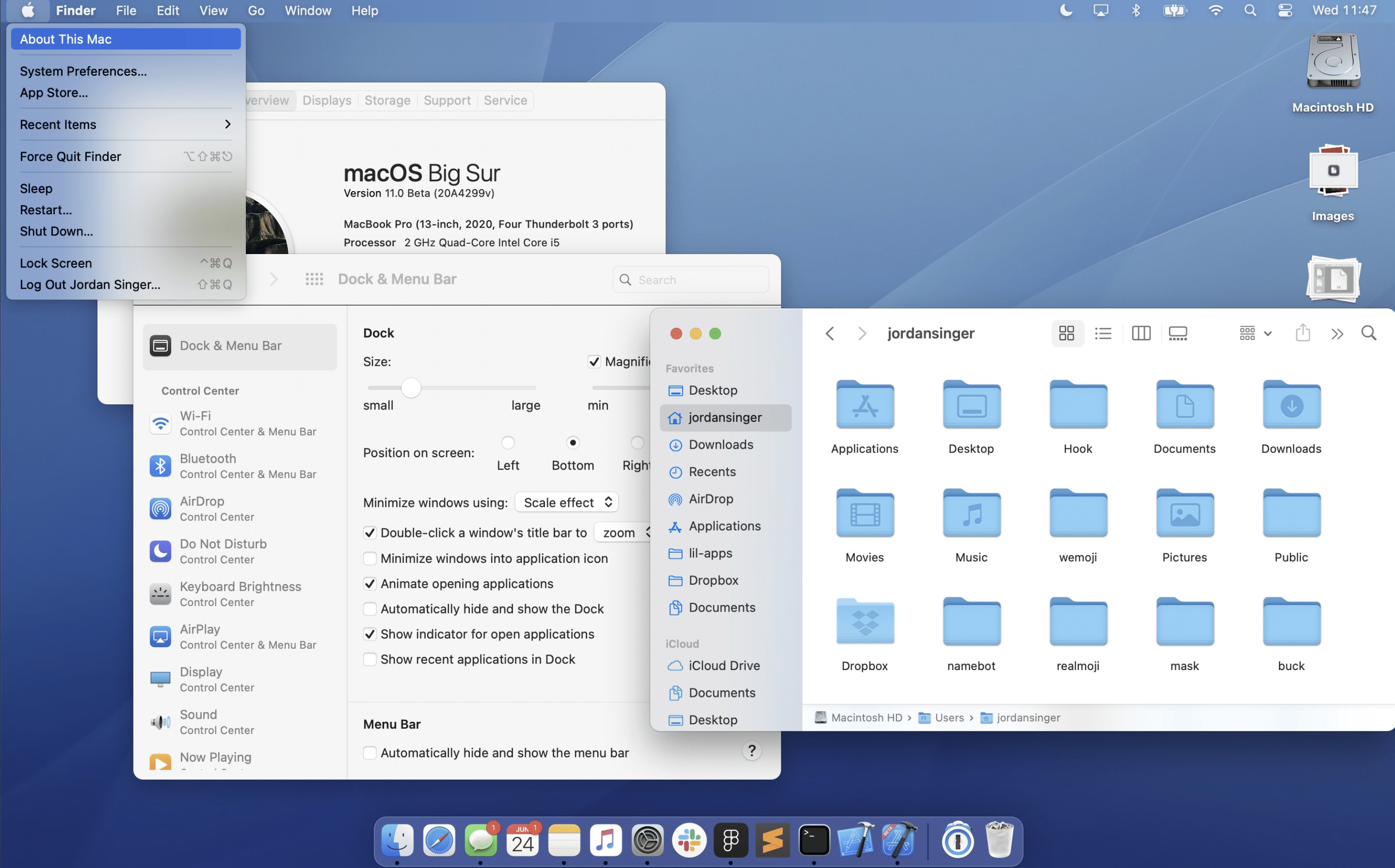
Remember “Back to the Mac” special Apple event in 2010? Well, WWDC2020 is certainly proof that Apple is back to the Mac and for a very long time. Let’s talk about the user interface redesign. At first, while watching the segment on the introduction of the redesign, I thought they were going the same way they went with iOS 7. But after a while, I realized they were moving the macOS experience closer to iPadOS. Some will hate this change, but I don’t. I like the way Apple is creating a unique visual spectrum across its platforms. I prefer visual consistency. I’m not against the cross-pollination of iPadOS and macOS. Here is a list of comments, in no particular order.
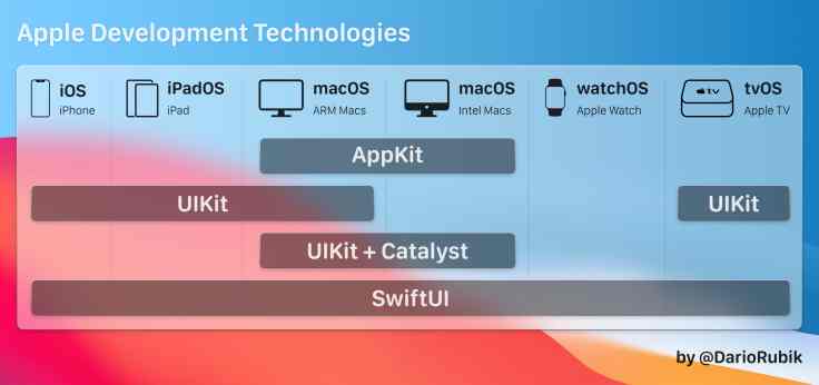
- Developers are facing a plethora of options to develop for the Mac. Depending on where they come from, they will find the right tool to create or port their existing apps to the Mac. We are the winners here.
- Catalyst has received a significant update, making Catalyst-based applications look much better now and Mac-like.
- The dark mode looks better on Big Sur than on Catalina. Is it only an illusion or is there any difference? I’ll have to see it myself, I guess.
- I don’t like “macOS Big Sur”. What about “macOS Golden Gate”? It would have been way more evocative to what this release of macOS is in the grand scheme of things.
- The new design of macOS will probably please the younger generation more than the older one who grew up with the Mac.
- How many times people are asking for macOS to come on the iPad. Well, it is more the opposite that is happening, slowly and furtively.
- The redesigned icons lack consistency, as many don’t have the 3D effects.
- I don’t like the new transparency of the dropdown menus. What is happening here? Is Apple trying to diminish its importance and getting ready for another UI shift?
- Toolbars now contain icons without boundaries, just like on the iPad. Do I like it? I’m still undecided.
- Maps and iMessage are the latest Catalyst applications from Apple landing on the Mac. Again, it makes me think that Apple wrote Catalyst for themselves first, for developers, second.
What others are saying?
- macOS: iOS with toolbars — M. G. Siegler on Twitter.
- macOS to get more like iOS — Steve Troughton-Smith on Twitter
- macOS is iOS now — Owen Williams on Twitter
- Touch-input is coming to the Mac — Quinn Nelson on Twitter
Hardware — Apple Silicon
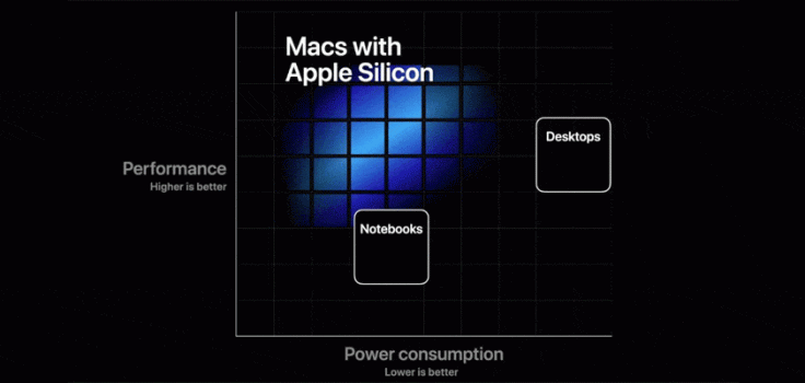
This year’s announcement of the transition to Apple Silicon1 is another game-changer moment for the platform. Yes, it is cool to expect better and cooler Mac in the future, probably discounted2. The prospect of a higher performance GPU subsystem is also super exciting for photographers like me. But, there is more to this. In the grand scheme of things, Apple is preparing something special and unexpected on the Mac: the introduction of another input method, exclusive to ARM-based Mac: touch input. It is written on the walls. Here is why. I don’t think the Apple Silicon is the real enabler here but it is mandatory for helping bring two million iPhone applications to the Mac. A big portion of these apps relies on multi-touch. This is where touch support on ARM-based Mac comes into play. But, as of today, there is no touch support on macOS. Well, Apple’s answer for this is macOS Big Sur3. The redesign of the user interface brings it closer to iPadOS for sure but not only visually. Apple is paving the way for a usable macOS interface in the context of touch inputs. Clever.
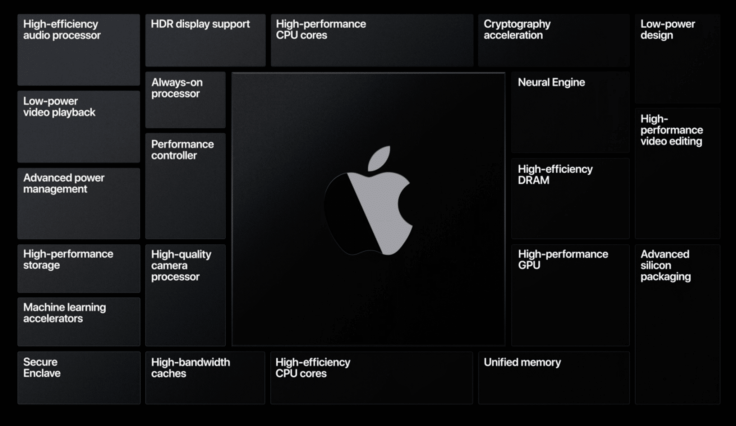
I can’t wait to see how well the transition will play out. It seems déjà vu all over again. I went through the PowerPC to Intel transition in 2005-2006. The success of the transition doesn’t rely only on Apple’s shoulders but on third-party software developers like Adobe. For those who won’t care to put the efforts to re-compile their software, Rosetta 2 will take it from there. Looking at Apple’s message on it, it looks like they are very confident about it. We’ll see. Meanwhile, let’s review some of my comments about macOS Big Fur and the Mac in general following the WWDC conference.
- By transitioning to ARM-based Mac, Apple is closing the circle of application runtime unification across all its product lines. This is quite a feat.
- Bye bye bootcamp. If Apple wants Windows on the Mac, they will have to work with Microsoft to think of a solution. Windows not supporting 16K pages seems at the center of the problem. It won’t be an easy one, but does it really matters now?
- Catalyst is a way to extend life to existing Intel-based Mac, they will come through Catalyst. The other way around will be possible with iPadOS apps running unmodified on ARM-Based Mac and with a more mature SwitftUI.
- In a subscription-based software world, I expect users will demand companies to quickly move their software to Apple Silicon, or they risk losing subscription revenues.
- I think Apple is better prepared for this transition than the one to Intel in 2005.
What others are saying?
- Apple Silicon Inside — Ben Bajarin on Tech.pinions
I think people will find the Mac runs awfully nice on that system DTK… it gives you a sense of what our silicon team can do when they are not even trying.Craig Federighi
Software — watchOS 7
The still-maturing watchOS platform is probably where a few big deceptions lie for this year’s WWDC. watchOS 7 didn’t bring the watch face App store that I was wished for. Instead, Apple decided to introduce watch face sharing. Looking at demos, it certainly looks cool and useful to enable discovery. But all is not lost, I think watch face sharing is another piece of the puzzle that will be at the center of a future watch face App Store. Apple is moving slowly, but they stay focused on their long-term objective only. I’ll be patient.
Another deception is about the sleep tracking feature. Apple doesn’t go really far in this area as explained in “A First Night with Apple’s New Sleep Tracking Feature”, but I think I know why. What if the full sleep tracking experience is only possible with specialized hardware that is waiting to be introduced with the upcoming Series 6. It is where I want to place my bet. We’ll see. While waiting for the story to unfold, here are a few other comments about watchOS 7, in no particular order.
- Gone is Force Touch. Too bad. Apple is replacing it with the long-press gesture. Again, the lack of discoverability is causing Apple to step back. Apple is focusing on providing better consistency across its platforms. Because of the loss of Force Touch, I’m not sure if the new way to customize watch face is an improvement over the older way. Time will tell.
- The tracking of handwashing is absolutely cool, and useful. Very nice design and clever use of technology.
- Multiple complications from the same app on the same watch face is a game-changer. I can imagine a weather-oriented or activity watch face.
- Another interesting addition: including the Shortcuts app. Not only you can start a shortcut from the watch but you can also trigger watch face change via shortcuts automation. Can’t wait for that one.
What others are saying?
- The removal of Force Touch could help Apple fit more hardware features in the next generation of Apple Watch according to MacRumors.
- A First Night with Apple’s New Sleep Tracking Feature — DC Rainmaker.
- watchOS 7 feels much faster, thanks to a simple tweak by Apple — Felix Lapalme on Twitter
Software — tvOS 14
I didn’t have many expectations for the tvOS platform. But, being able to share audio with two pairs if AirPods Pro is damn cool. I hope that we can experience the spacial audio with movies with surround sound.
What others are saying?
Crickets. Do we care? Is Apple TV still a hobby for Apple?
Cross-platforms features
Apple’s strength lies in its ecosystem and the numerous cross-platform services and features. Apple’s Siri, iMessage or Maps are critical services for Apple. They all received important enhancements. But there is something else that keeps improving: privacy protection. Apple keeps pushing the envelope here, and we can give them a big round of applause for that. Who else, in today’s world, is positioning its business mission on top of privacy protection? Of special interest for me, here are a few comments on cross-platforms features improvements, again, in no particular order.
- The App Store will now show what data an application is collecting about us.
- Sharing our position on Maps will let us specific how precise we want this to be.
- Safari will enable website surveillance and expose what tracking features are enabled on each website.
- Sharing of subscriptions among iTunes Family members is a welcomed addition. Is that on an opt-in or opt-out option?
- Siri interface redesign is interesting but this big moving sphere appearing at the bottom of the screen on the iPhone invites for interaction with the rest of the UI which is currently not the case. By placing the Siri animated sphere in the middle of the screen instead, maybe it would better indicate that no interaction is possible.
- Is Siri smarter? According to Apple, yes. We’ll see.
- iMessage is receiving a big upgrade this year. Pinned conversations, better group conversation handling, a real iMessage client on macOS Big Fur, iMessage is a serious and secure messaging platform for Apple. They took care of it.
- Canada will see the expansion of detailed maps, which is nice for me as a Canadian.
- Speaking of Safari, WebExtensions are now supported, and we can expect many more extensions to come to Safari. I’ll be happy to get Notion, Grammarly for Safari.
- We will be able to search for emojis instead of endless scrolling. Finally.
- On-device translation is making its first appearance. It will work both online and offline. Online experience should prove to give a better translation, but online will work too. Welcome in 2018, Apple.
- I expect some confusion in the coming months in the developer’s community. Selecting the right language and tools to build apps for the Mac is certainly requiring careful thinking.
What others are saying?
- Apple is covering all the bases with Catalyst according to Steve Troughton-Smith on Twitter.
- Many technologies here with us for a long time according to Steve Troughton-Smith on Twitter
- A round-up of photo features and updates in iOS 14, iPadOS 14 and macOS Big Sur by DPReview
- Why Macs in the future?
What about the developers?
With the recent debacle surrounding the launch of the already popular and controversial HEY email service, Apple is pressured to open up its walled garden. A few moves from Apple are obviously directed at easing the pressure but also are preemptive strikes at keeping regulators at bay. I’m thinking of the FindMy app which will allow third-party developers to use it4. Will this be enough? Time will tell. Meanwhile, a few more things are worth noting.
- Apple’s DTK was announced and will be available to select developers who apply for it. Cost: $500. Seems reasonable. Based on a Mac mini.
- Developers will be able to appeal decisions and even challenge App Store guidelines which is another step in the right direction for Apple to keep developers (mostly) happy.
Things that didn’t happen
Each year, Apple brings excitement in the room but also some deception. As recently published in “WWDC2020 — Checking my Wish List“, I came back to my wish list and reviewed everything I wished for. In summary, Apple didn’t score well. Does it mean Apple is doomed? Is this a bad year for Apple? Absolutely not, but, I want to point out specific things that didn’t happen and are worth mentioning.
- There is nothing new in regard to helping people work from home or cope with the current pandemic. FaceTime is mostly unchanged. You cannot use your iPhone as a better webcam on the Mac. You still can’t support an iPad user remotely like we can on macOS via iMessage.
- There is no word of Apple reverting the loss of the loupe while doing text selection not any words if Apple improved text selection in general or autocorrect performance.
- Xcode for iPad will have to wait. Could this be when SwiftUI is complete and mature so Xcode for iPad only creates SwiftUI apps, leaving all the legacy stuff behind like ObjC and AppKit?
- Big deception the lack of better support for external monitors on the iPad. My gut feeling is that Apple wants to keep this flexibility to the Mac platform.
- The iPad multitasking didn’t get any improvements like a better focus on which app is receiving keyboard inputs. It’s a bit baffling IMHO.
- Being able to set new default apps for Mail and browser is a sign of Apple opening up but why stop there? What about maps or music?
Concluding words
For this year’s WWDC conference, Apple demonstrated its ability to pivot and adapt rapidly without sacrificing quality and relevancy. By staying focused on their long-term objectives and goals, they managed to up the game and consolidate their platforms to allow a near-perfect universal application runtime environment across a large technological spectrum. This feat represents a unique position for Apple where no other companies could achieve in the modern tech world. The next few years will be even more interesting for all Apple enthusiasts like me.
- I don’t think this is the final marketing name. Apple Silicon could just be a placeholder. ↩
- I don’t think we will see a big pricing difference. Apple likes to push specs and keep its margin intact, if possible. ↩
- macOS Big Sur: I hate this name but I’m willing to trade this with a stable macOS release. ↩
- Great way to respond to Tyle’s claim of Apple’s monopolistic behaviors. ↩

