The iPad Main Menu concept: the Next Game Changer?
I rarely write about mockups of potential new user interfaces or new devices. But when I see something that is profoundly good, I have to pass it along. Yesterday I came across the release of a study made by Alexander Käßner, a young UI/UX and digital product designer based in Berlin, Germany (it is
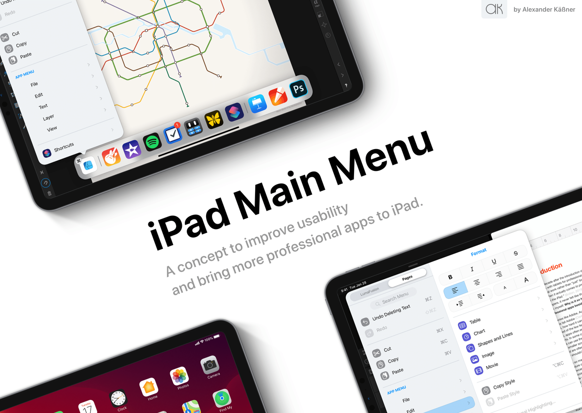
I rarely write about mockups of potential new user interfaces or new devices. But when I see something that is profoundly good, I have to pass it along. Yesterday I came across the release of a study made by Alexander Käßner, a young UI/UX and digital product designer based in Berlin, Germany (it is one of the guys behind the excellent diagramming application: Diagrams). The thesis subject: an iPad main menu concept. Think of it as a reimagined menubar but for iPadOS. Let’s dig in a bit more.
Why a menu on iPadOS?
Well, if we look at macOS, a menubar is a quick way to access an application feature. By sitting there, unobstructedly, a menubar helps a user to discover the application’s features. Discoverability is one of the major problems with iPadOS since day one of the iPad. The iPad Main menu concept is an excellent answer to this problem.
A deeply thought out concept
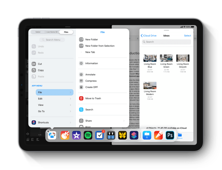
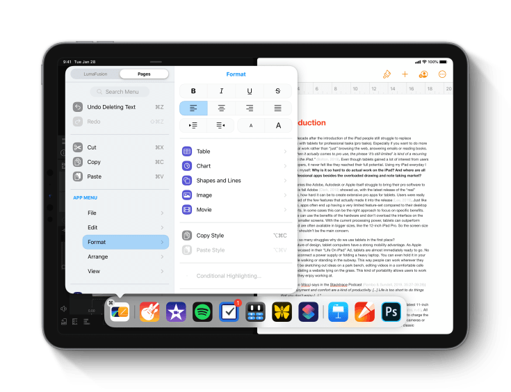
The iPad main menu concept covers many usage contexts: from being available as a system menu to the split-screen use case. The latter is particularly smart, as shown in the following example. While using two applications side-by-side, the iPad main menu supports a dual view by proposing a segmented control so the user can select which menu to use for which application.
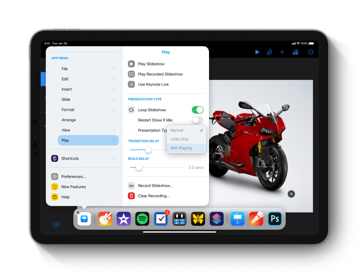
The iPad’s main menu is available from the dock or with a three fingers gesture. It can be invoked at any time. The beauty of this concept is to keep iPadOS simple and mainly unchanged. The iPad dock gets a new icon on the left; that is it. For keyboard users, menu items come with shortcuts, just like on macOS. Each menu items come with colour-coded mini-icons on the left of menu items, which make it more user-friendly, an important attribute of the iPad.
Other notes of interest are the support of the slide-over, draggable portion of the menu and the support for sub-menus. To get the full experience, head to the website to see clips and videos.
Is Apple listening?
I hope that Apple finds this concept and take it as is. Period. It could mark another milestone in the long journey of the iPad becoming a mature computing device. iPadOS 13.4 with mouse support is one of those turning points. The iPad main menu concept is another. I’m crossing my fingers.
