WWDC 2023 — My Notes & Observations
WWDC 23 keynote brought great updates to most of Apple’s operating systems and development tools and answered many questions but also ignited new questions about the spatial computing platform, where the first product is the Apple Vision Pro.
Right after the WWDC keynote, for about 36 hours, I purposely held back from reading too much social media and tried to stay on the official source: Apple’s website, to learn more about the announced products and software. It was only early Wednesday that I opened up my news and commentary horizon and looked at what others had to say. So, let’s get started with Apple’s OS platforms and share what I have to say about these. Spoiler alert: mostly quality of life updates, but…
macOS
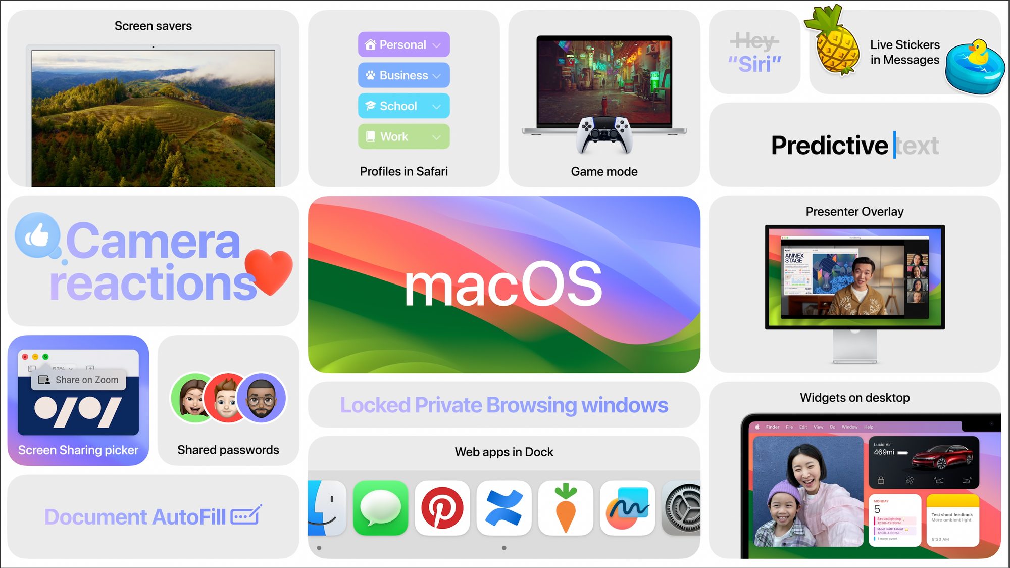
I’m happy to see many things coming to macOS that were originally available on other Apple platforms. Login screensavers are an example (such screensavers were on the Apple TV only). Apple finally liberated widgets on the Mac. They can be placed anywhere on the desktop, where an invisible grid helps the user for more precise placement. It’s not what the Dashboard used to be in its layer, but it is what it is. Widgets coming from the iPhone, without having to have the corresponding apps installed on the Mac, are so cool and unexpected. This is Apple ecosystem integration at work.
Videoconferencing with FaceTime gets an update for macOS Sonoma. I find the FaceTime Ventura edition hard to use sometimes; the interface is not intuitive enough. Zoom integration looks promising for those, not in hybrid computing work, which is pretty much everyone in business these days. Camera reactions and presenter overlay are examples of applied machine learning. Safari keeps improving too, and welcome to web apps on the Mac! Safari Profiles will be a boon for switching between my work and personal land YouTube workflows. They look like first-class citizens.
Sharing passwords with trusted contacts? M’ok. I can see a few use cases like Netflix. PDF also gets some love, with easier data entry in forms and better handling in Notes. Linking notes is another welcomed addition. It’s interesting to see Apple investing in Notes. It become a powerful note-taking app over the years. All in all, macOS Sonoma seems like a solid upgrade.
iOS
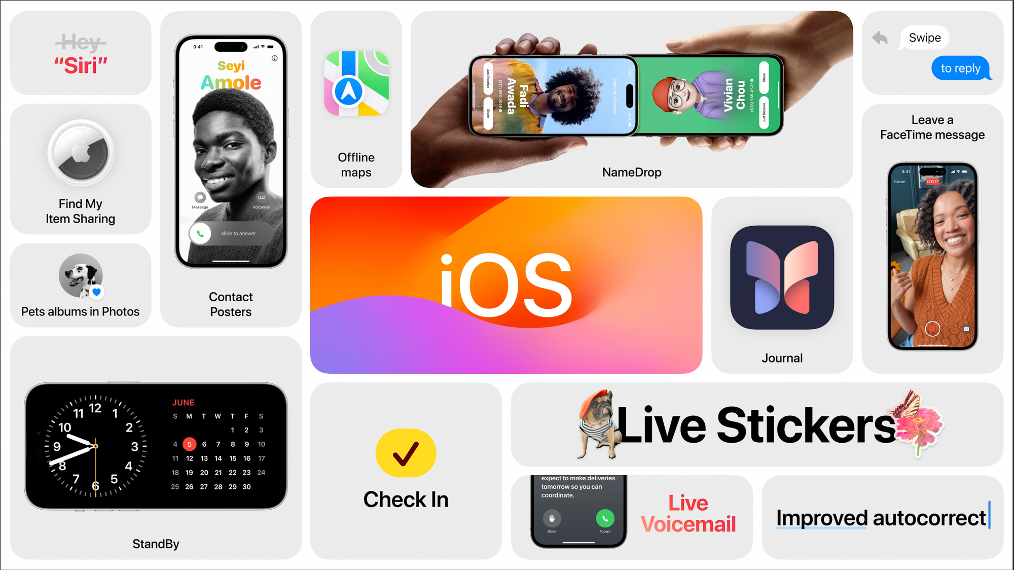
The iOS update is more exciting than I originally thought it would be. Autocorrect gets a correction, finally! I’ll wait to see when I’ll be using it for a final judgment. iMessage keyboard tweaks make the UI less clunky with more space for the content. I like that. Interactive widgets are now available, and the examples look useful but obvious additions (Apple Music player).
The StandBy mode is cool but will require a physical stand to make it look nice on my table beside my bed. I guess this is something I’ll have to buy sooner than later. Does this mean Apple won’t release a dedicated device for the home like rumors are pointing to? StandBy will probably come to the iPad next year.
The iPhone auto-transcription of incoming calls certainly looks quite useful, and I’m curious if it will be available in Canada, especially for French Canadian users like me. Apple is not the first to offer that, right? Stickers get a major upgrade and make iMessage look like WhatsApp or other advantaged messaging solutions.
Journal is coming to the iPhone, but I don’t see that as a killer of DayOne. Yet. Nonetheless, the app looks to be a solid start in the journalling space. It will be more than enough for most people, especially with data integration with other on-device apps. I’ll probably use it because I like documenting my personal life. The Phone app will allow people to decide how they want to look on the iPhone they call, something like our avatar in iMessage as seen by others, provided that you send an update to their contact. Using your iPhone as the camera with an Apple TV during a FaceTime call merits a big FINALLY!
The NameDrop contact exchange feature and execution are soooo cool to see in action! Can’t wait to try that one. AirPlay, coupled with on-device intelligence, should improve our experience of the feature usage. Offline maps are also welcomed for those travelling in places with no wireless network coverage. AirDrop gets more intelligent, allowing the transfer of information tidbits by bringing devices close together, and the transfer can finish while being out of range. That’s clever.
Nothing is earth-chattering here, but those additions and tweaks make the iPhone experience better, more complete and supportive of more use cases. It’s a quality-of-life-type upgrade. Don’t miss the following video with over 140 new features and changes exposed.
iPadOS
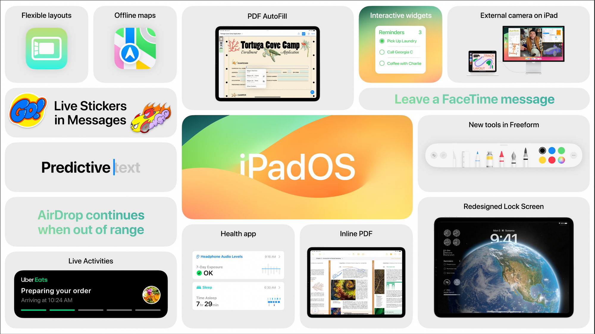
The home screen gets the widgets and the customization capabilities that first appeared on the iPhone two years ago! Yes! That is cool. Stage manager gets a tweak or two with more freedom for windows management, but I fear that won’t be seen as enough, except for this well-known guy who seems to welcome the changes. Freeform will get new tools in the drawing palette and forms recognition, which brings it closer to what we can do with Notes. Health comes to the iPad is a great addition and is a great way to browse health data on a bigger screen. I always thought it was weird that health data be only on the iPhone, especially knowing the data was backed up in the cloud. Oh, and I expect the StandBy mode to come on the iPad next year or the year after. This is how Apple rolls. iPadOS 17 is a solid upgrade too. My iPad is still supported with all the features.
watchOS
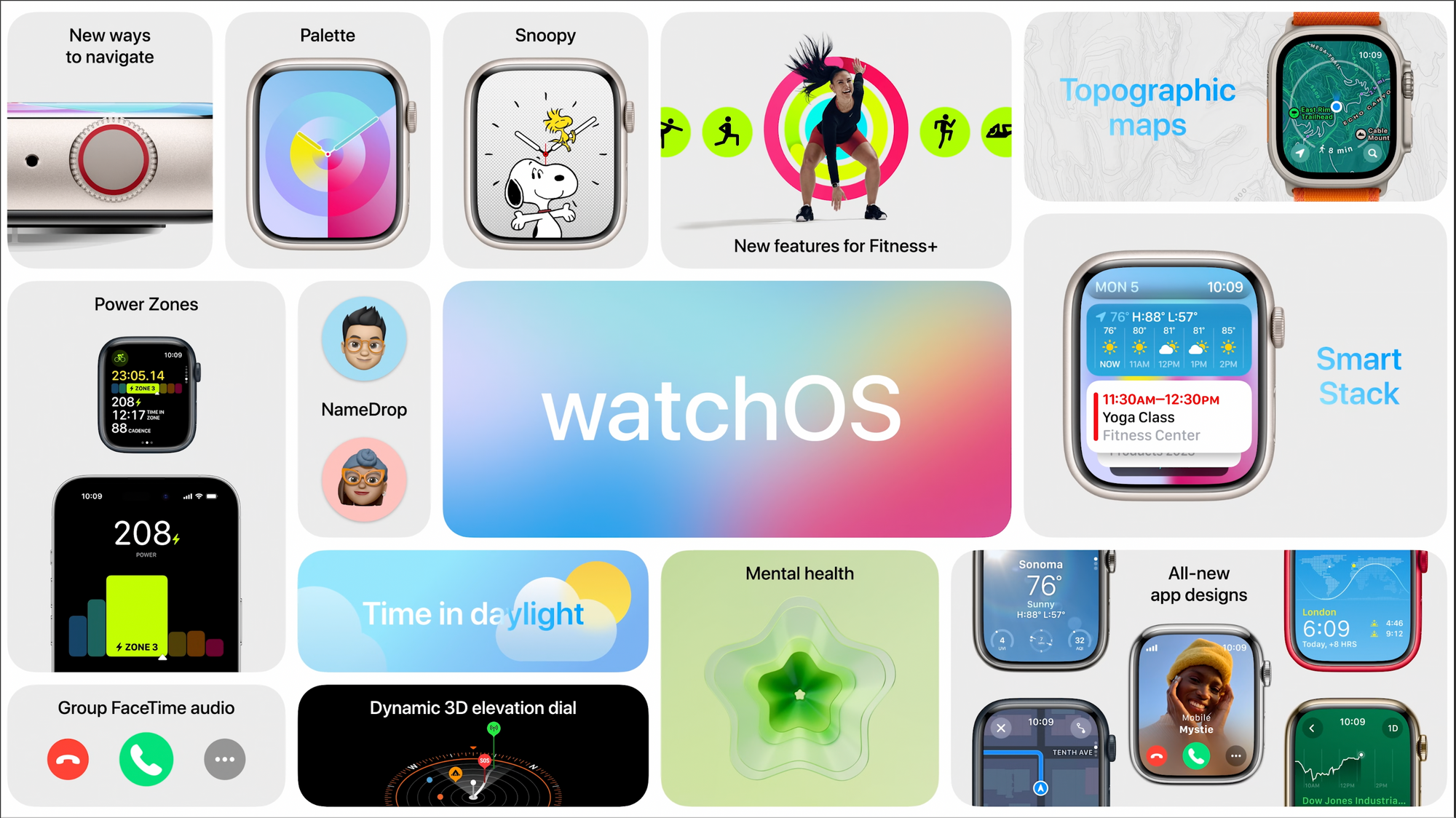
It’s close to being an entirely new experience, in my opinion. WatchOS is probably the least mature OS platform from Apple, and this partial redesign is a turning point. Is this the iOS 7 moment for the Apple Watch, as some are calling it? I wouldn’t say so because iOS 7 was a redesign nightmare, and watchOS 10 is not; it looks like improvements everywhere. The dynamic stack is probably what was referred to as the return of the Glances. I like what I saw, and I think it makes the watch less of a watch and more of an information appliance. I’m ok with that because I’m not a watch guy. Is the Siri watch face still available? What happens in a watch face that used to react where numbers would get bigger while scrolling the Digital Crown up? Is it still possible?
A video is worth many thousand words. Don’t miss the following one to see all the major changes in action and coming to the watch this fall.
AirPods
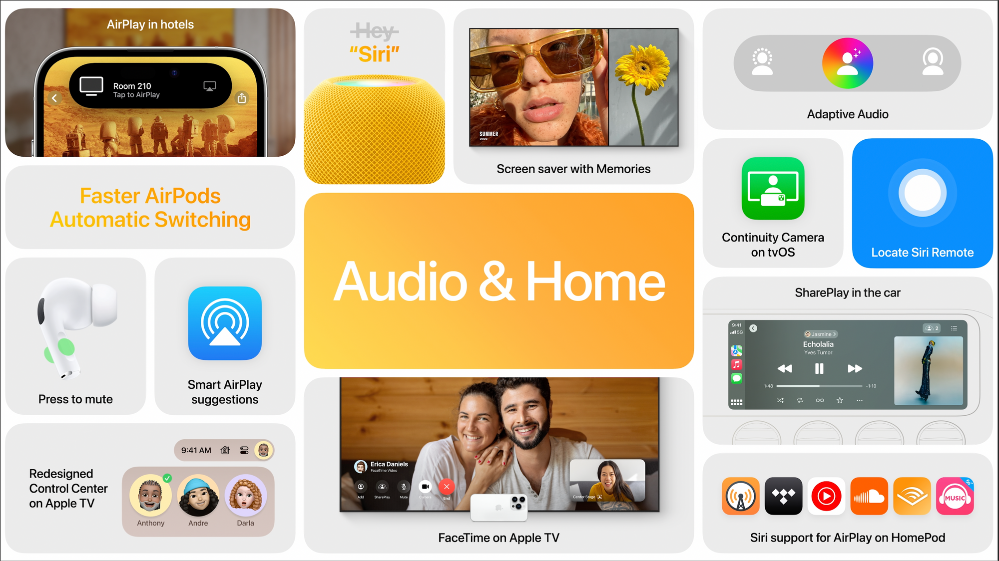
These mighty little devices still have room for improvement. Adaptive audio, if used in busy cities, could be a game changer for many. I didn’t expect Apple to continuously update and add features to the AirPods as they do. AirPods are becoming much more than a simple device for listening to music with good quality. Adaptive audio is cool, and I can’t wait to experience it. The way adaptive audio is described makes me think about how the Apple Vision Pro reacts when people around the headset user come into view or get closer, which brings me to the next section.
The One More Thing… thing
Before going into the “thing”, why did Apple choose not to show the live audience in the Steve Jobs theatre so we could hear the “ooohhhh” and “aaaaws”? This is where I feel that this keynote was a bit too much sanitized.
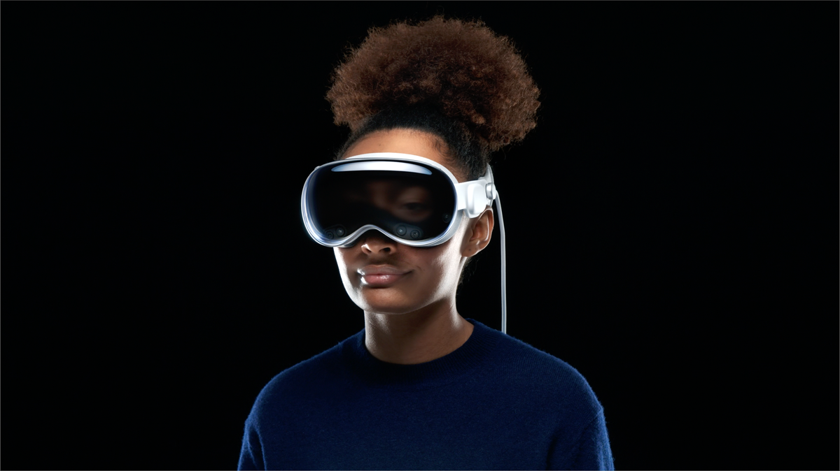
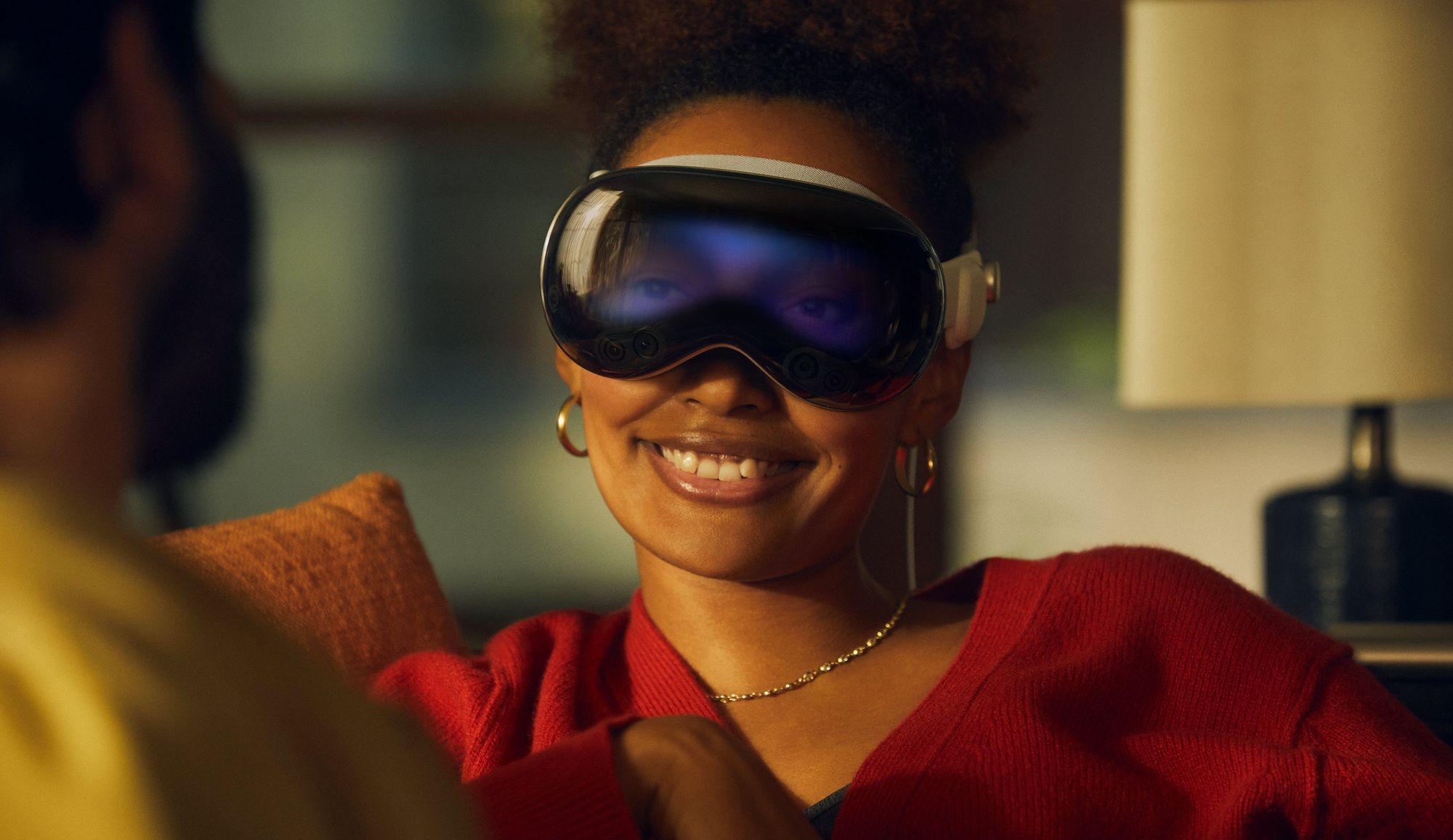
The Apple Vision. Such a better naming than Apple Reality. In fact, I find this to be a clever name. The Apple Vision is now becoming clearer (pun intended here). This thing has been in the making for the last ten years. It will be a long journey that started maybe ten years ago at Apple. There is too much to wrap my mind around about this thing. All the pieces of the puzzle are now being put in place. And then more. Much more, in fact. The Apple Vision Pro is the Apple vision in its clearest incarnation.
Apple is the master of integration. 1 + 1 = 10. Simple as that. The Apple Vision Pro looks weird on the face, just like the AirPods first looked weird in the ears. And the original Mac, too, with a mouse. It all looked weird at first, then eventually became part of our daily, hourly life. No, I’m not sure I’ll pay for this thing. But I’ll never say never. This is how Apple rolls. This is how we roll (most of us, anyway).
Is the Apple headset iconic? It certainly looks as good as you could possibly imagine. They look like Apple in every way. From hardware to software up to the intentions behind it. Apple is starting with the Pro tier because there will be a non-Pro version in the future. It should be crystal clear. This is how Apple rolls.
Spatial computing > Metaverse. Much less pretentious. During the presentation, I couldn’t help but think about Hu.ma.ne’s recent conference, where they introduced another computing paradigm. I’m unsure how well it will fare, but Apple’s vision certainly looks much less timid. Maybe Hu.ma.ne is skating where the puck is going, and Apple is skating where the puck currently is. I'm not sure. Anyway.
Apps like Maps, Flighty, Skyline, and NightSky could be impressive when used with the Apple headset. Gestures seem to be natural instead of caricatural, not exaggerated. This was first developed for the Apple Watch. The Apple headset will replace the TV in the living room for the next generations. We are already transitioning to this future because more and more the young generation is less and less watching TV, the big screen. The next big screen is the one that you put on your head. I'm not sure I’ll use Microsoft Word or Teams or Keynote on the Apple Vision, but watching a movie or browsing my photos, you bet, especially if image quality is up to Apple's claims.
I'm mind blown by how Apple could show and portray the 3D experience as it could be seen by the headset user. They clearly achieved their goals here. The general design is so futuristic, singular, and unique. Apple's take on security and privacy is notable here too. Using the headset capabilities to show the user's eyes expression while using the device is certainly a mandatory touch to help keep the user connected with their surroundings and for people around.
Of course, seeing people walking into the office with the headset on is ridiculous and probably looks like troubling behaviour from a psychological perspective. I believe that in a few years from now, it will become a "normal" thing to do. Just give us some time to get used to it, just like we had for these AirPods in our ears. EyeSight is a good idea, but it makes people look strange. It's definitively something making the Apple Vision Pro apart from the others. The amount of engineering Apple has put into this thing is mind-blowing.
Interesting fact: the idea of using the digital crown to go from AR to VR and back was developed by a guy who worked at a company based in Montreal, Canada. The company was bought by Apple in 2017 for 30 millions$.
Of course, wearing the headset at a family reunion to take a spatial photo or video does look strange. Ten years from now, I’m not so sure about that. Perception changes over time, especially if the device finds great use cases. Younger generations are born with touch screens worldwide; this generation could be more open than us to accept these “requirements”.
Other thoughts
After watching the keynote, not only I couldn’t remember what came first, but I found my Mac mini with macOS Ventura to be a bit depressing to look at and to work with. Kind of the same experience when using Windows 3.11 after coming from the Mac. Apple didn’t refer to AI or ChatGPT-like technologies during the week. I think they carefully select their words. I applaud this deliberate move. I will take applied machine learning and non-generative AI anytime if it creates better and more immersive user experiences on my devices. Anyway, as someone wrote it, nobody seemed to care.
The keynote was a bit more than two hours long. Not what many expected. Where is the new CarPlay experience? Still scheduled for much later this year. What about the AirPlay or the Control Center Redesign (only for the ATV)? I won’t upgrade to any beta until later in the summer, after my trip to the Canary Islands and after switching to the 15-inch MacBook Air.
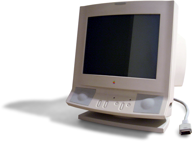
The old AppleVision display (without a space). Nothing to do with Apple Vision (with a space).
The short-term winner this week is the Mac (well said, Jason!) My short-term Apple upgrade plan is confirmed: I’ll move from my M1 MacBook Air to the 15-inch version when I come back from my trip to Morocco and after reading a few reviews or, even better, after paying a visit to an Apple Store to play with it! Here are links to interesting content and articles published while writing my notes and observations. Most articles are, in my opinion, honest and balanced comments.
Introducing MacBook Air 15” | Apple
My ten takeaways from WWDC 2023
Hands on With Apple’s Vision Pro: The Opposite of Disappearing
12 Compelling Features Coming to Apple’s Operating Systems in 2023 - TidBITS
Apple announces robust new privacy and security features
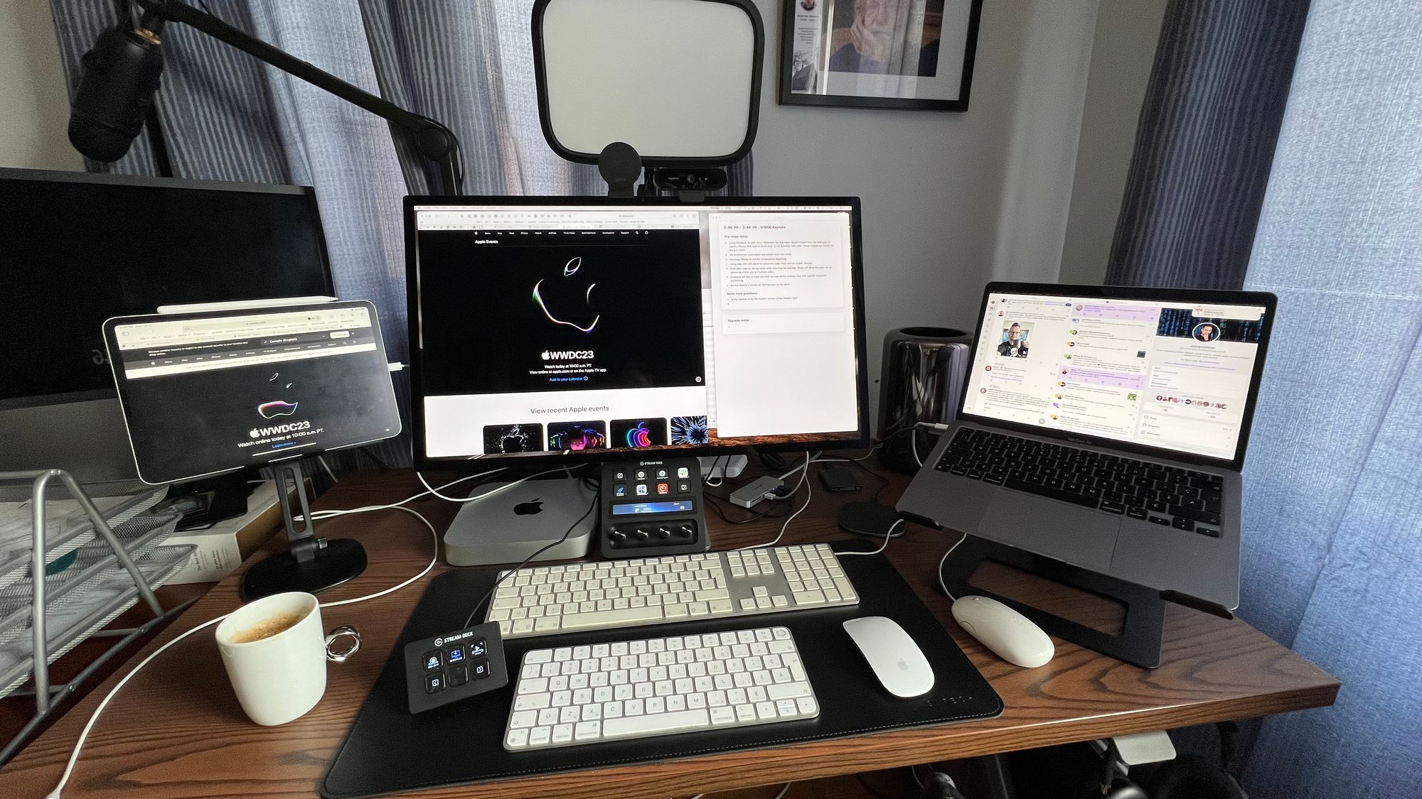
My watching setup
To watch the keynote, this is what I did to get ready and efficient.
- M1 MacBook Air setup with Ivory / Mastodon for “live feed”. Saved images from the feed go to Apple’s Photos. I had to move them to my Synology NAS after the keynote. Those images are mainly for the pre-event. After half an hour, more than 3000 posts were filling up my Mastodon feed. Hard to follow.
- My screenshots automation was tested more than once and worked perfectly.
- The Synology Photos webpage was opened in the browser to monitor screenshot importing.
- Using a Mac mini with Safari to watch the video feed, not in full screen, though.
- Safari on my iPad was open to apple.com, so I could refresh the page as soon as needed.
- Craft daily notes for taking notes while watching the keynote (to serve as the basis for writing this article).
- Inoreader played a significant role later in tracking all the coming news with specific keyword monitoring.
- Do not Disturb was turned on. AirPods Max on my ears!
- I enjoyed the show!
