Thoughts and observations from my experience with Glass
If you are tired of Instagram’s bloated features or are looking for a photography-focused service for sharing your photos, with no ads, you might want to consider Glass. Here are a few thoughts and observations on the recently launched service.
There is a newcomer in the space of photo-sharing services, and it is called Glass (I’m still waiting for Bokeh, though). I’ve been waiting for the service launch since September of last year. Following its debut, Glass gathered a lot of comments and quick reviews, mostly positive. Here are a few thoughts and observations about Glass after a few days of use.
- From the first few minutes of interaction with the application, what I’m seeing is a simple and clean user interface enabling simple micro-interactions. It is refreshing when compared to Instagram which feels to sit on the opposite side.
- Glass is a simple photo sharing application, so basic that it may feel simplistic because we have Instagram or Flickr as our reference frame. Don’t be fooled. Simplicity will be rewarded.
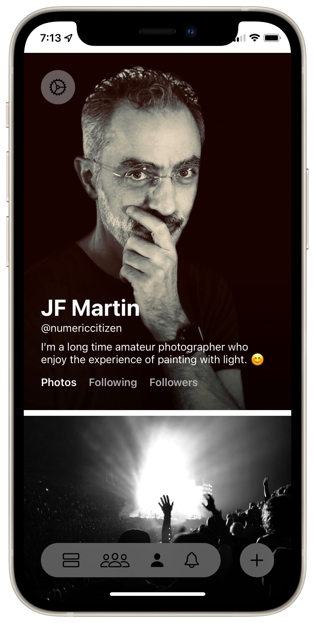
- Glass is not promoting photographers stardom. Profile pages are simple and lack the usual followers count. How can this be possible in 2021? I think this is a brave decision from Glass founders, which makes me feel that all photographers start on the same starting line. That being said, there are a few notable users of Glass: Phil Schiller, Om Malik just to name a few.
- By skipping the like feature, at least for the time being, engagement happens only by writing a comment on a photo post. It’s a great way to slow things down in a world of digital fast foods where we hit the like button too easily for too many reasons. It reminds me of the slow food movement.
- Thanks to users who engage with comments, there is a sense of community even without group discussions, something that is still a thing on Flickr.
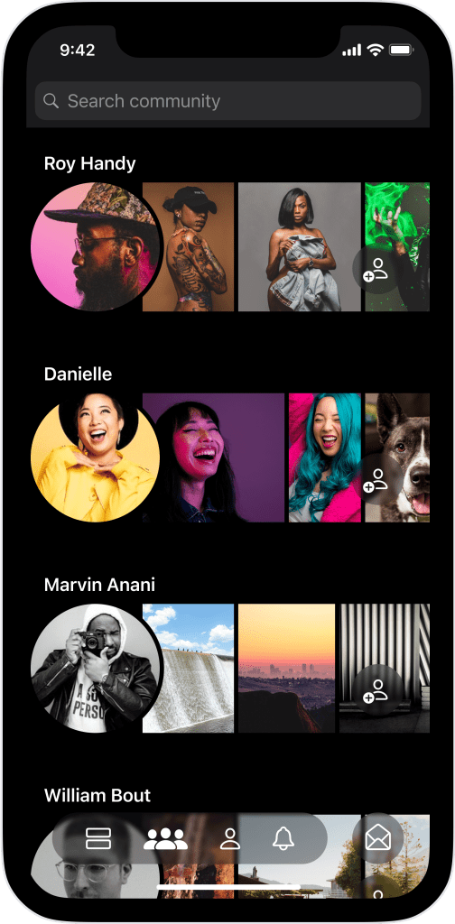
- Discovering new photographers is easy with the community tab. How is these suggestions list built? I couldn’t find a word about it. Is there some sort of algorithm at play here, or is it curated by humans?
- From what I am seeing, many photographers are publishing photos taken with their iPhone. Just like at the beginning of Instagram.
- By being a paid service, only willing users will come to the platform. I like this. You can call me an elitist.
- Micro.blog supports sharing photos from Glass in a recent update (version 2.2 and up). Glass doesn’t have APIs, but sharing a photo on Glass creates a web page that Micro.blog can ingest and copy the photo to its servers for sharing purposes.
- Pictures quality is high as I don’t feel any visual compression. One thing that I don’t like is when tapping on a picture, the zoomed view requires scrolling to see the whole picture. There has to be a better experience.
- Somehow, Glass reminds me of Micro.blog. They both share attributes like being paid services, without ads, no timeline manipulation, no followers counts or likes.
We want you to adore Glass, not become addicted to it. We’ve created a distraction-free app focused on one thing — your photos.Glass founders
What’s not there, yet
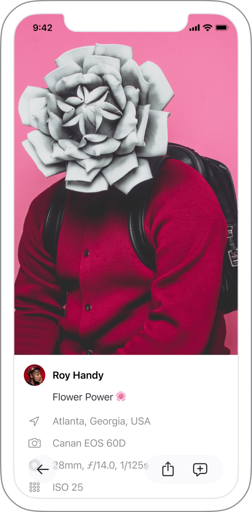
There is room for improvement with Glass, but many missing things aren’t signs of weakness. Here is a list of missing things or things that could be improved or added.
- No ads. Thanks.
- No algorithms to trick the timeline. Thanks again.
- No likes, nor followers or following counts. We’ll see if these things will ever be added.
- No iPad app or web app yet. We’re still waiting for Instagram to build one, maybe Glass will beat them on this. I certainly hope so.
- No APIs. That’s probably the last thing that will happen with Glass.
- While browsing a photographer’s profile, there are no thumbnails to view yet, except when in the discovery (community?) tab where up to three pictures can be glanced at. Consider this added to my wish list.
- No filters yet. I’m not convinced if this will ever come to Glass.
- Editing photo description after posting is not yet possible. A must.
- Can’t share a photographer’s profile URL. A must. Eventually.
- No long-press support on photos to bring a pop-over with actions. A must.
It’s like a Glass of cold water in hell
Looking ahead
There is room for a service like Glass. It has to be that way. Yet, there is a limit to how I spend time in photo-sharing activities.
- I decided to go all in with Smugmug a few months ago. I have to decide how Glass will fit the picture (pun intended).
- It will be interesting to see Glass evolve while staying true to its core values.
- I want to give Glass a chance. For one year. I subscribed. It’s another experiment of mine. This should be enough to see where the service will be going in the future and for me to find a niche in my digital landscape. Maybe.
From what I am seeing, many photographers are publishing photos taken with their iPhone.
A few burning questions
Glass is certainly a welcomed addition to the landscape of photo-sharing services, but Glass triggers many important questions for me.
- Why use Glass if I’m already using Smugmug?
- Can Glass be considered a social network? Does it even matter?
- Why do we share photos online? Why should we?
- How much time am I willing to divert to Glass instead of writing or even taking photos?
- Is there time left in my numeric life to spend on another photo-sharing service?
- For those on Flickr or Smugmug, what is the role of Glass? Should they switch to Glass? Does Glass have to compete against these services?
- Is it possible for a small newcomer like Glass to break the big player’s apparent monopoly of the social networking or photo sharing services space? It’s far too early to tell, but I dearly hope so.
- Does Glass have to become addictive to create a dent in the universe of photo-sharing platforms?
I don’t know.
I’m enjoying Glass and looking for a place in my digital life for it to stay. So I’m giving myself one year for this while looking at Glass’s evolution. It will be an interesting journey.
