Reviewing Apple Journal: A Summer Experiment
Putting Apple’s Journal app to the test. Is Apple’s Journal more of the same?
This past summer, I gave Apple’s Journal app a real-world test drive. For two months, I documented my stay in a lakeside chalet, exploring its strengths and weaknesses. For context, I’ve been using the third-party app Day One for many years, although not primarily for journaling purposes. In my case, Day One serves as an automatic repository for my published content, which shaped my expectations for Apple’s offering.
Why This Experiment Mattered
For nearly two years, Apple Journal existed as an iPhone-only app, which felt odd for a tool meant for writing. With macOS Tahoe and iPadOS 26, the app finally expanded to the Mac and iPad. This long delay raised questions about why Apple kept it limited for so long. During my experiment, I skipped Apple’s suggested prompts and wrote freely, capturing my own reflections. The promise of Journal is straightforward: a lightweight, Apple-native journaling tool designed for those already invested in the ecosystem.
Where Journal Shines
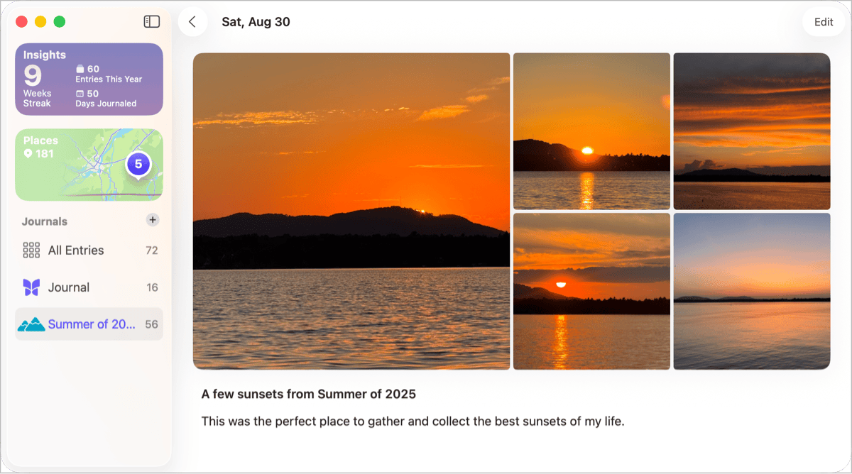
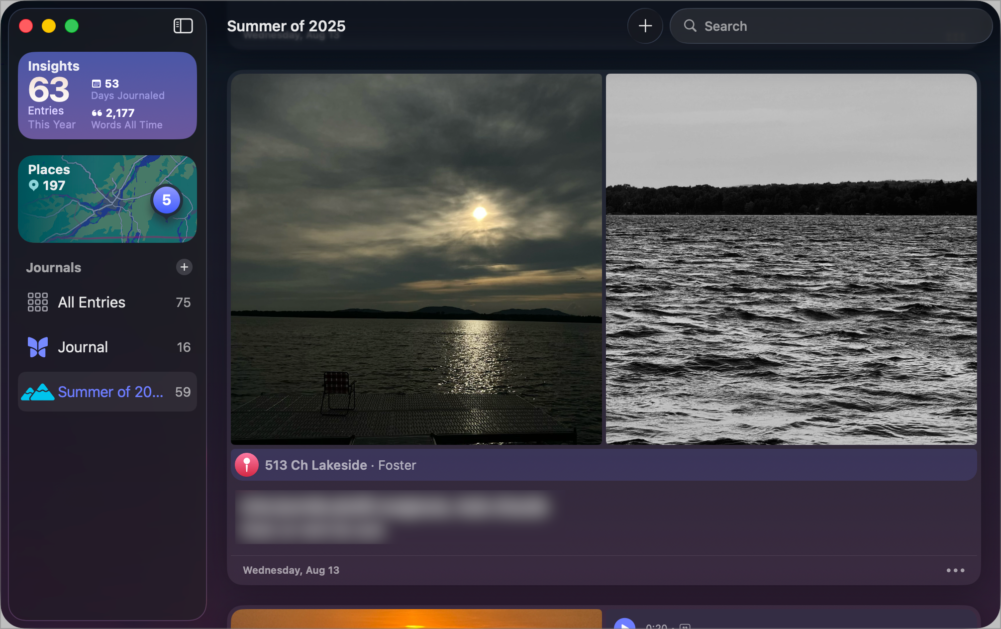
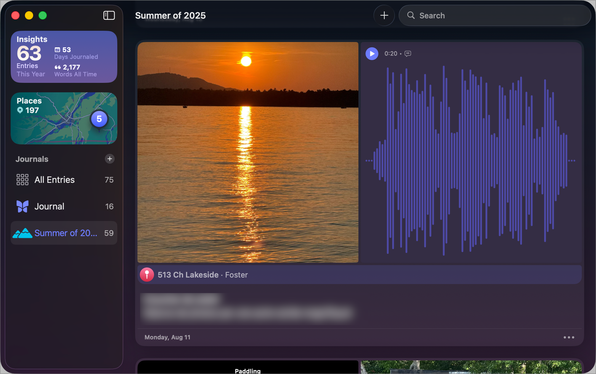
Apple Journal’s most appealing quality is its ability to enrich entries with digital artifacts. Photos, audio snippets, and GPS coordinates can all be woven into a single note, turning entries into miniature multimedia capsules. During my stay, I recorded many audio clips of natural sounds to preserve magical moments, which became one of the app’s most enjoyable features. I also appreciated being able to assign an entry to more than one journal at once. Overall, the concept is inviting: a minimal, approachable journaling space with just enough flexibility to capture moments quickly.
Where It Falls Short
The limitations became obvious just as quickly. Setting a location for an entry felt unnecessarily cumbersome, and the lack of organizational tools, such as tags, left me wanting more structure. Export options are minimal, making archiving or migrating entries difficult. Even the sharing extension from Photos.app seems half-finished—I could add an image and a short note, but I couldn’t pick which journal to save it to, adjust the entry date, or set the location without later editing in Journal. Simple tasks, like setting the location, required too many clicks.
There are also peculiar restrictions. Each entry allows only thirteen images, with little control over how they appear in the mosaic. On the Mac and iPad, Journal looks and behaves like a stretched iPhone app, ignoring the design conventions of those platforms. Built with SwiftUI, it resembles Apple’s Passwords app: functional but uninspiring. It feels more like a prototype promoted to a product than a tool carefully designed from the ground up.
The Bigger Picture
Journal also highlights a broader trend in Apple’s recent software. Many of the company’s new cross-platform apps are built with the same design language, which often strips them of personality. Whether on iPhone, iPad, or Mac, they tend to look and behave in nearly identical ways. This uniformity makes them predictable but also bland, as if individuality and platform-specific strengths were sacrificed for the sake of consistency.
It’s a striking contrast with Apple’s earlier era, when apps like iPhoto or GarageBand felt unmistakably tailored to the Mac, and Notes or Messages carried design touches unique to iOS. Those differences once gave each platform its own character. Today, that sense of distinct identity has been smoothed out, leaving Journal to feel competent but visually and experientially indistinguishable from Apple’s other recent apps.
A Paradoxical Verdict
Ultimately, Apple Journal is suitable for lightweight use cases and will appeal to those who are firmly within Apple’s ecosystem. It delivers a taste of multimedia journaling with minimal effort, but its shortcomings are difficult to overlook. Journaling is an intensely personal act, and yet Journal feels oddly impersonal and underdeveloped, more like a summer side project than a finished creative tool. For newcomers, it might be enough. For those who depend on richer features or structured content archives, it will likely remain a curiosity rather than a serious option.
In my own case, I may be spoiled by years of using Day One, which I’ll probably continue to rely on as my central archive. Yet I can imagine returning to Journal during another trip, drawn by its simplicity. That paradox—balancing the pull of a powerful archive against the charm of a lightweight companion—captures the strange, in-between space Apple Journal occupies today.