New Lightroom for iPad Update
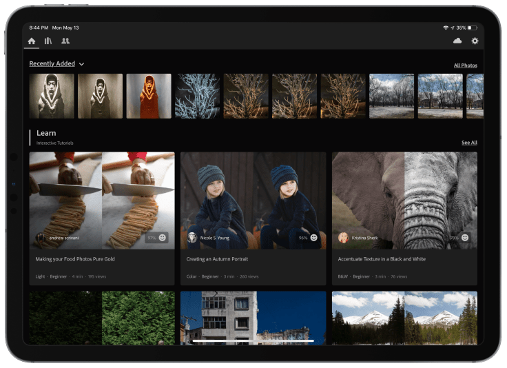
A new Lightroom for iPad update brings learning tools and more. First, a new home view makes its debut. From there, the user sees his or her recent photos at the top. But what is more interesting are two new learning tools. For new Lightroom users, the latest update will help them learn how to… Cont
A new Lightroom for iPad update brings learning tools and more. First, a new home view makes its debut. From there, the user sees his or her recent photos at the top. But what is more interesting are two new learning tools.

For new Lightroom users, the latest update will help them learn how to use the application to do very common tasks. Adobe proposes two different ways to help learn Lightroom. The first is by way of interactive tutorials. The second is through short inspiring edits clips. Let’s see each of them in more details.
Interactive Tutorials
Interactive tutorials start by loading a sample image into Lightroom in a special presentation mode. The user is then invited to follow the interactive guide with steps to follow. Lightroom highlights where the user should tap in order to advance in the process. This is very clever as this immerse the user right into the application instead of showing a simple non interactive video. This is not new. But this provides a real interactive experience. For each step, a simple instruction explains what has to be done. From what I’m seeing, these tutorials are very informative. I’m sure I’ll learn a few new tricks. Lightroom for iPad is quite a complete photo processing application.

Once the tutorial is completed, the user can give his or her appreciation to the author with a smiling or a sad face. It is not clear how tutorials are created and published and at what pace they will be added to the library. For now, I like what I see. But there is more.
Inspiring Edits
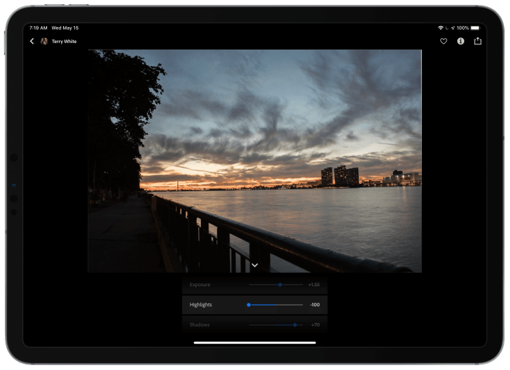
Inspiring edits are quite different while being similar. These are small edit movies showing how a photo has been processed. While the clip is playing, you can tap the “Edits” button at the bottom and see the different steps involved bo going directly at this point in the processing. You can stop at each one of them. You can even scroll through them in a rapid pace. Very cool.

These inspirational edits are grouped into themes like portraits, color, travel, composition, etc. There are many more. This is a great way to add value to the offering for paying members like me.
Other new features are part of this update. One of them is a new texture option. And the other one is for chromatic abberation removal with better and more refined controls. I like this too. Finally, Adobe keeps adding more features to web publishing. Users can now publish albums to the web and invite other people to contribute by email. I did not test this feature in this release but I still do offer this album where you can upload new stuff. Try it!. All in all, this latest update to Lightroom for iPad is a solid one that should help keep paying members on board for a bit longer.
If the iPad is part of your photography workflow like it is for me, please, do yourself a favor and have a look.


