Craft vs Notion From a Blogger’s Perspective
Craft is a serious newcomer to an already crowded space of note taking apps. After a few months of use, Craft is now at the center of my blogger workflow, alongside Notion. Find out why in this article.
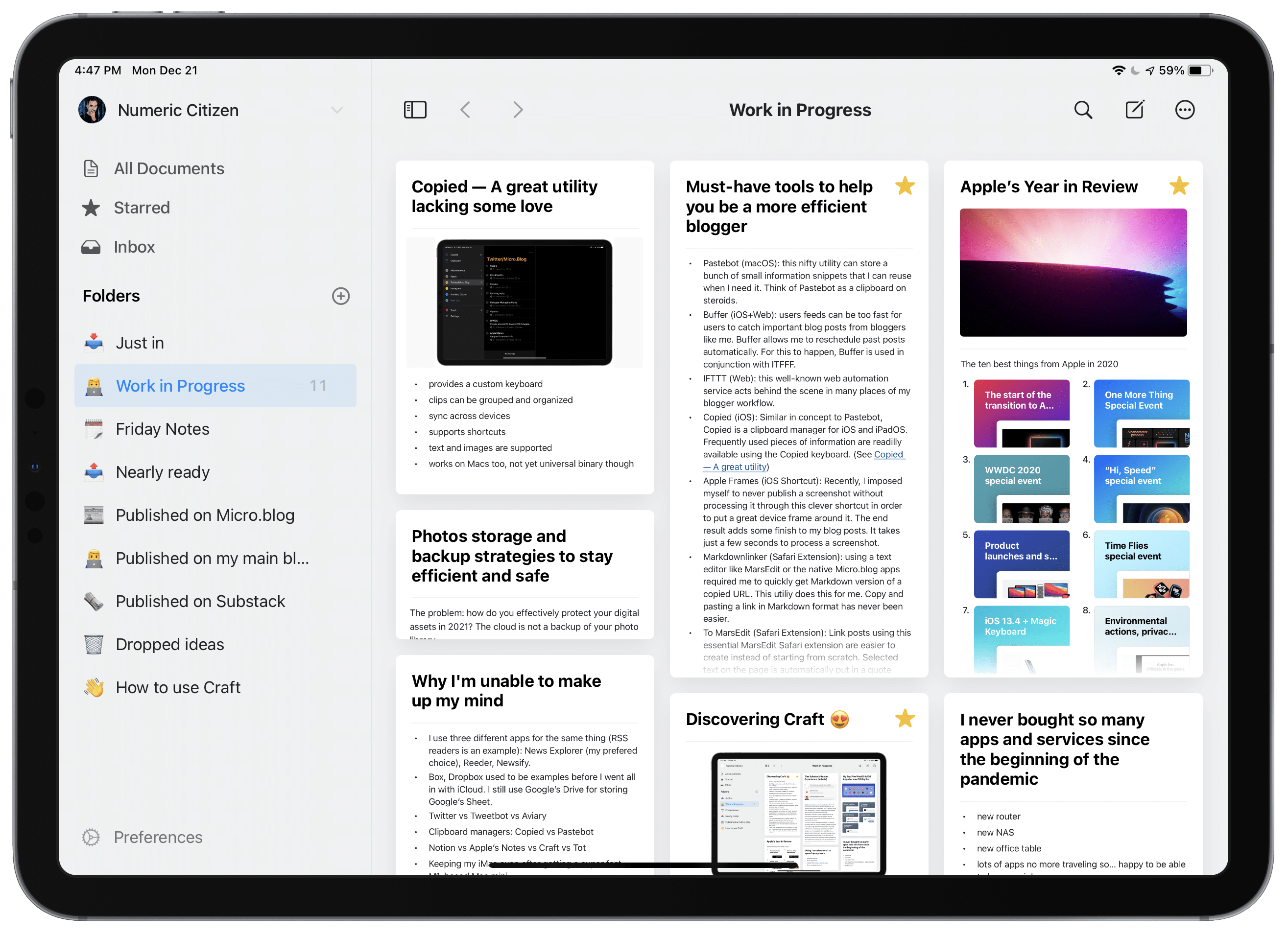
Craft is a relatively recent addition to the world of note-taking applications. I’ve been using Craft in the last few years, and my verdict is clear: it is the best new application to come to the Apple ecosystem in a long time1. As a blogger and writer, just like Notion when it came into my numeric life more than a year ago, Craft is at the center of my blogger workflow.
“Craft, a note-taking app for iPhone, iPad, and Mac, is the kind of new experience that not only singlehandedly redefines a category, but it’s so exquisitely well-thought-out, so elegantly designed, it pushed me to reconsider the very basics of my note-taking workflow.” — MacStories
Speaking of Notion, I’ve been using Notion for more than a year now. Notion (my review here) was central to my blogger workflow (more workflow details here). That was true until I read “MacStories Selects 2020: Recognizing the Best Apps of the Year”. The best new app designation went to Craft (MacStories’ Craft review here). After all my readings, I gave it a try. At the very first contact with Craft, I knew it would be a keeper. I didn’t know how Craft would fit my current blogger workflow. The only problem was to find a good use for it. And boy it became obvious after a few hours using it. Craft is a revelation for me and is what software carefully crafted (pun intended) should be.
This article isn’t intended to be a thorough review of Craft or a detailed comparison with Notion2. It is a collection of thoughts and observations gathered while using Craft in recent months. If you’re contemplating using Craft, I think this article is a must-read.
Craft basics
The starting point of using Craft is a blank page. Then, using the Slash menu, you can insert blocks onto the page. A block can be text, an image, a snippet of code, a bookmark, etc. You can change the block’s formatting attributes. The slash menu works wonderfully on the iPad using the Magic Keyboard. On the Mac, using Keysmith, I automated the creation of an article template3.
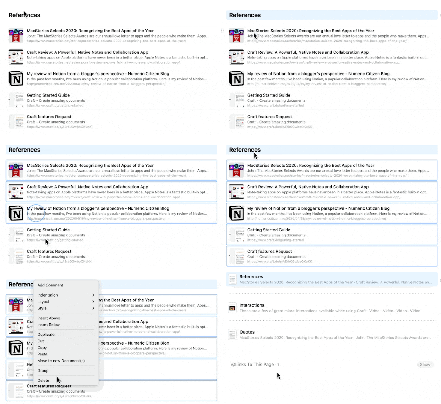
Tapping the circled arrow on the right of a text block will convert it to a page. From there, you keep using Craft the same way, either by typing or using the slash menu. Craft supports nested pages. Writers can insert links between pages by typing the “@“ symbol.
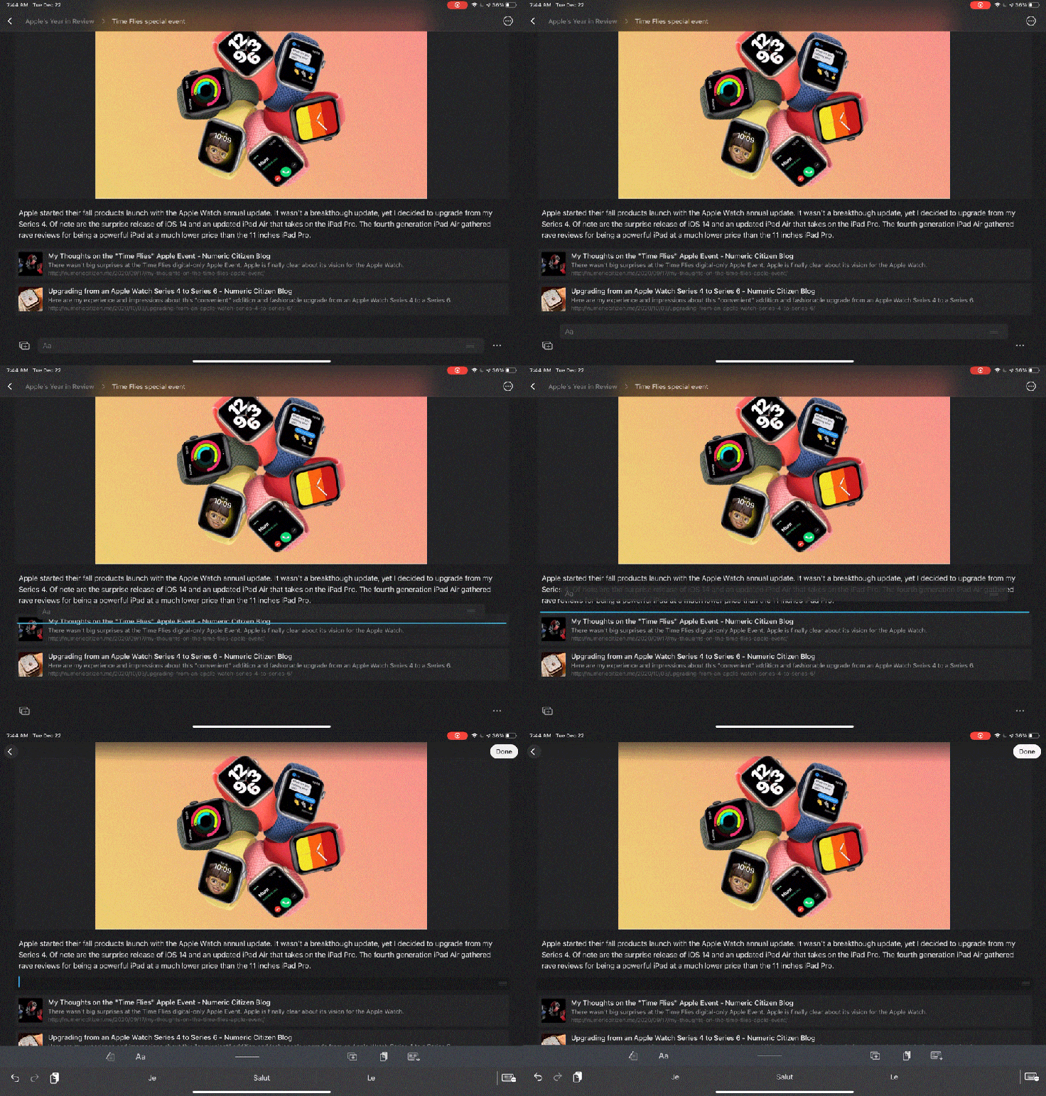
Craft is for writers and it shows. Most of the interaction can be done without touching the touchpad or the screen. Keyboard support on the iPad is impressive. Craft is a joy to use with the keyboard. Craft also supports split-screen mode which works well and drag and drop between two apps. All in all, on the iPad, Craft offers a better experience than Notion.
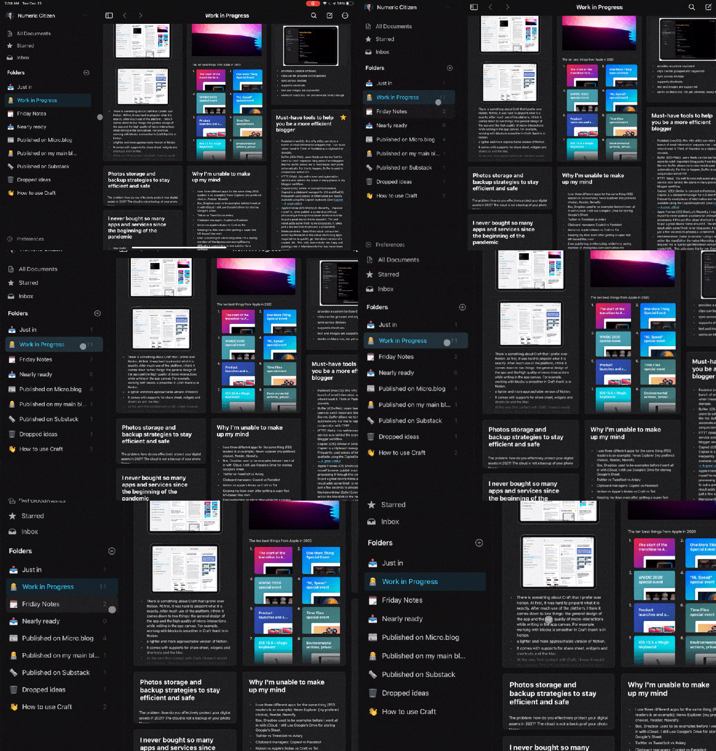
Operating system features like share sheets, widgets, and shortcuts are supported, as they should be by any serious application. On the Mac, Craft is the best Catalyst app I’ve ever used: it sits on the list of My Top Five iPadOS & iOS Apps for macOS Big Sur. It’s that good.
Beyond traditional note-taking apps
Craft is much more than a note-taking application. Sure, it is great at notes taking, but once you begin to take advantage of its many features, it becomes something different, more profound. Page linking and backlinks support, numerous formatting options, importing and exporting features all contribute to this evolving perception.
The ability to go from a page to a static website, directly within Craft, with just a few clicks gives me many ideas that go beyond note-taking. More on this later.
Craft is a 1.x application with a lot of potential for feature growth, but the foundations are solid, both from a design perspective and from the data portability point of view. By reading discussions on Slack, my impressions are that the makers of Craft will make it more powerful without trying to duplicate Notion’s complexities. It’s the right thing to do.
Craft vs Notion
There is something about Craft that I prefer over Notion4. At first, It was hard to put my finger on it. After spending quite some time with Craft to write many blog posts, I think it comes down to two things: the clean design and the high quality of micro-interactions in the user interface (go to my Vimeo page to see examples). Working with blocks is much smoother in Craft than it is in Notion. It makes a big difference in how smooth the experience is. Craft seems to disappear, leaving more space for the creative process. Craft has a lighter feel to it which makes it a more approachable version of Notion.
There are many similarities with Notion: the “slash” shortcut, hyperlinks, link previews, backlinks, but there are no complex objects like tables (yet), something that is central to many Notion features6. I know for a fact that tables are coming. I do use tables in Notion but in a simple way. I’m willing to wait for Craft to support them.
As a said earlier, from the Mac perspective, Craft really looks like a native Mac app. It is a much better Mac citizen than Notion.
Spell checking is available in many languages, which is not the case with Notion7. That’s an important feature for writers. I would say I’m doing more work in Craft while preparing blog posts than I used to do in Notion, just because of this simple feature. But overall, my usage of Craft as a knowledge base is pretty much the same as it is with Notion.
Quick comparison summary
So, how does Craft compare to Notion? Here is a quick rundown of things that I care about and which application is faring better.
- Data types supported for import: Notion
- Different Object types supported: Notion
- Native OS Support: Craft
- Share sheet general design and features: Notion
- iPad keyboard support: Craft
- iPad multitasking support: Craft
- Mouse support on the iPad: Craft
- Export options: Craft
- Formatting options: Craft
- Spell check: Craft
- Searching: Notion
- Collaboration: Tie
- Browser extension: Notion8
- Widgets support: Notion 9
- Offline work: Craft10
- General speed: Craft11
Clearly, Craft is winning on me. Does that make it better than Notion? For me, yes. There are many things Notion supports that are not yet available in Craft, but none of this is a dealbreaker. My gut feeling is that eventually, Craft will come close in feature parity but not at the cost of making Craft become a clone of Notion.
From Craft to the World
Craft is a note-taking application. It’s currently not yet possible to publish to platforms like Micro.blog or WordPress, which would extend its reach. I think the possibility is coming down the line. But there is another way to put things out there with Craft: by creating a small website from within Craft itself 12. It’s quite easy: using the page sharing option, Craft will generate a private link that you can share publicly. Layout options in Craft are flexible enough to create great-looking websites. Page sharing alone sparks ideas to explore soon, like The Numeric Citizen Digital Garden that I started putting together recently. Other users also take advantage of the page sharing feature in this example and this other example of a personal resume (the links might not stay available forever, though). I find this to be pretty cool.
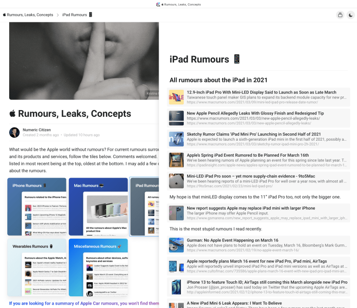
In the same vein, it is not hard to imagine Craft offering a web editor13. Being able to open a browser and edit your Craft content would be a real deal, getting Craft even closer to Notion14.
What’s missing from Craft?
Craft is great but not perfect. For example, I’d like to be able to change the page display on a per-folder basis. For example, in a certain folder, pages could be displayed as a list of documents, while in another folder, it could be displayed like cards.
I’d like to see a “Publish to” feature. Publishing directly from Craft to Micro.blog for example would be really cool. My request has already been filed for that one.
There is no provision to see if a page is shared as a webpage. There should be a dynamic category on the left sidebar where I can see at a glance all shared pages. For now, I’m using the ability to start a document. Not really convenient.
Craft updates are quick to come by as it is a 1.x product compared to Notion, a more mature platform. It will be interesting to see how Craft will evolve in 2021. The start was stellar, for a 1.x product, nonetheless.
Craft’s data portability
Let face it, Craft is new and a small team is behind it. After all, Craft is a brand-new player in the field; it was released in November 2020. I always wonder about the viability of a new platform or service. A cautious approach is mandatory when deciding to invest content into a new service like Craft. It is good to know that Craft has many export options; I don’t feel my data is locked-in. The richness of export options sends a clear message for current and potential users of Craft.
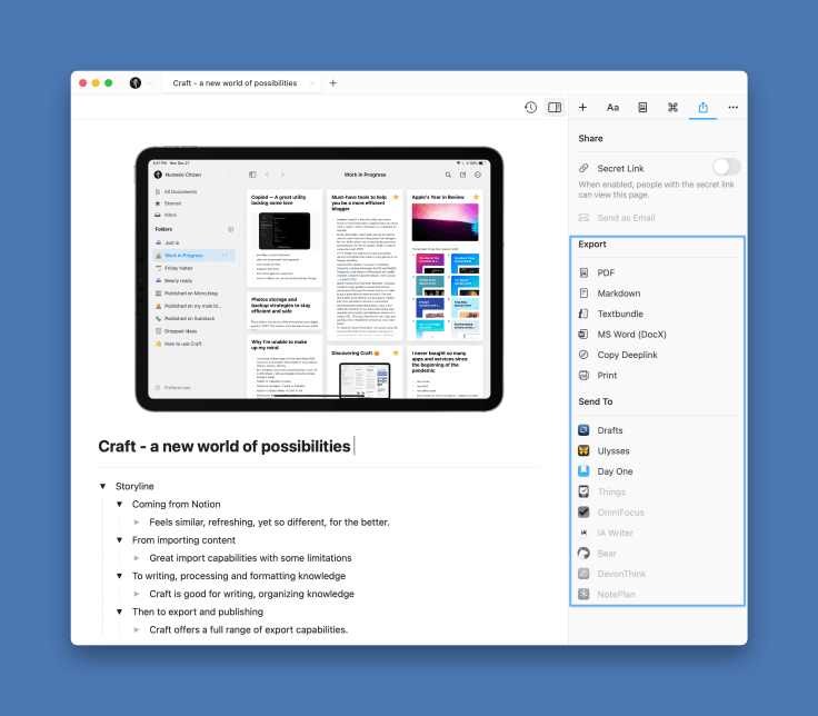
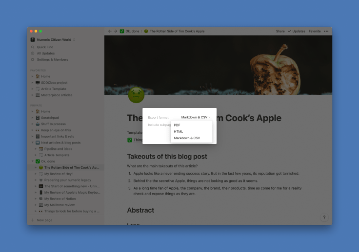
Now, for those like me who poured content in Notion: How do you quit a platform like Notion without losing your content? Importing data from Notion is a bit challenging. Maybe this will change when Notion’s APIs are officially out. Notion’s export feature is limited to Markdown and PDF. I’m looking forward to their upcoming public APIs to find an answer.
Closing remarks
Craft is now at the center of my blogger workflow, side-by-side with Notion, for now. Eventually, I’ll need to move my content from Notion when APIs are ready. Even with APIs, the migration process effectiveness is still unknown at this time.
Is it possible for Craft to replace Ulysses eventually? Who knows. If there is a way to publish from within the application to WordPress, Micro.blog and Medium, probably. Imagine if I could do all the writing and researching in one app and publish from the very same app would simplify my workflow, something I always strive to optimize.
Craft frequently receives updates. I expect the makers behind Craft to fill any void pretty quickly. So far, there is no dealbreaker, that’s why Craft is part of my numeric life.
Now, the big question: if you are a Notion user, like I was, should you switch to Craft? My short answer: it depends. The longer one is: if your use of Notion doesn’t depend on tables, chances are that you could switch to Craft pretty easily. Beware that exporting your data to Craft could prove to be a challenge.
Update 2022-6-29: Don’t miss my YouTube Video on Why Craft doesn’t need to become Notion.
- Craft is only getting started. ↩
- Craft falls in the same category of apps like Notion, Roam, Obsidian and DEVONthink, just to name a few. ↩
- Support for templates are coming to a future version of Craft, though. ↩
- Craft reminds me of Noto, an elegant note taking application. ↩
- Notion is not a native Mac application, it is based on Electron. It is a big webview; it is closer to being a website than being an application. ↩
- In Notion, tables are databases that enable all kind of data visualization like views, filtering, sorting, links between tables, calendaring, etc. Many users depends on these when using Notion. I don’t expect Notion to support that many options in the near future. ↩
- Selecting the spell checking language is a global setting, not a per-page one. This can be problematic for multi-language writers like me. ↩
- Available only for Chrome & Firefox. ↩
- I prefer the design and content of the Notion’s widget. ↩
- Notion is pretty much useless without an internet connection. Be warned, mobile users! ↩
- Speed is something people complain often about Notion. I think, in recent months, Notion saw their customers base outgrow their capacity. This could be one of the reason behind these growing pains. ↩
- I know something like this is possible with Notion but a third-party service is required. One such service is Notelet. ↩
- The good news is: editing Craft content from a browser is in the pipeline. ↩
- Notion first started from the web then eventually came to the desktop and mobile devices. Craft is doing the opposite which gives an important advantage as this approach allows for better native applications. ↩
