iOS 13 Share Sheet Redesign
Benjamin Mayo writing on his personal blog about the expected and rumored iOS 13 Share sheet redesign: I’ve never been particularly thrilled by how the share sheet looks or works. Since iOS 7, the panel is split up into three sections; AirDrop, Share and Action. AirDrop is handy but doesn’t justify
Benjamin Mayo writing on his personal blog about the expected and rumored iOS 13 Share sheet redesign:
I’ve never been particularly thrilled by how the share sheet looks or works. Since iOS 7, the panel is split up into three sections; AirDrop, Share and Action. AirDrop is handy but doesn’t justify a row to itself. Really, AirDrop should be an option in the Share section. Nobody can adequately nail down whether an operation should be catalogued under the Share bucket or the Action bucket. The concepts are too closely intertwined.
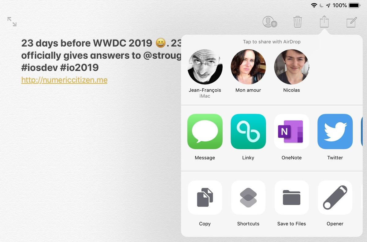
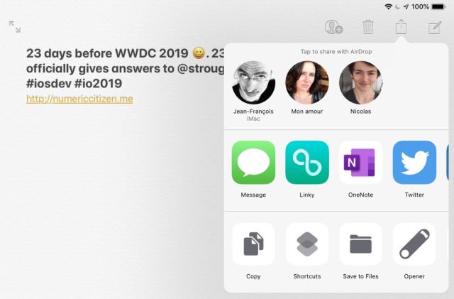
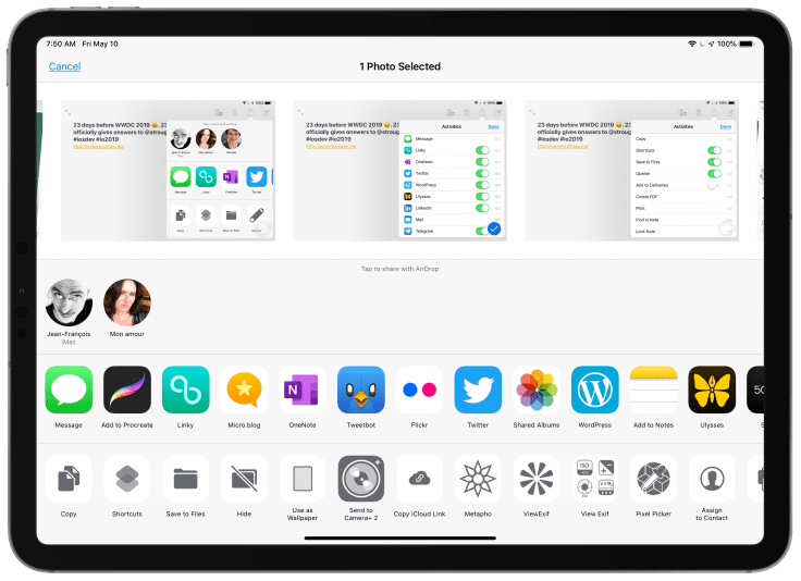
The following pictures are examples of the share sheet in action on my iPad. I’m currently in Notes.app.
Trying to understand share sheets
I’m confused by the share sheet in iOS. I never quite understood why this seperation between horizontal and scrollable sections. One is for Sharing with other apps and the other is for actions. If my four years of experience as an indie iOS developer are any indications, it is clear to me this division is based on programatic and internal attributes. It wasn’t designed with the user in mind.
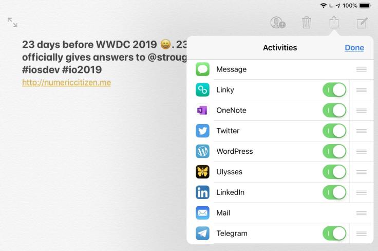
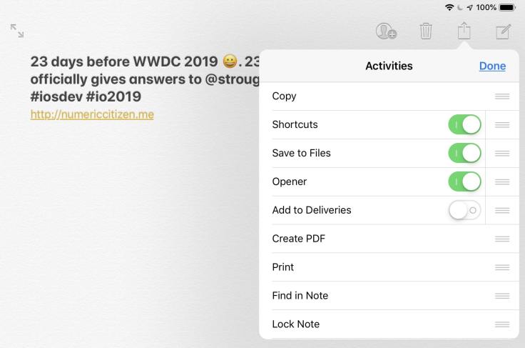
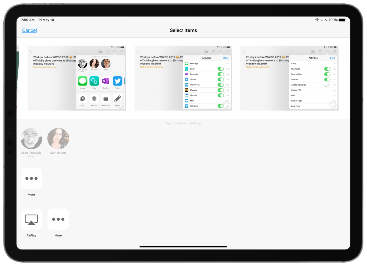
If you look carefully at the two previous screen shots, these are showing the share sheet in edit mode where the user customizes the order of each items. To make things confusing, both are titled “Activities”. Even more confusing to the normal users: why some don’t have toggle switch? Why some are black and white and why some are in full colors? Normal users don’t know why. Just ask around you and you’ll see.
The next two screen shots show the share sheet while in Photos.app. The first one is the layout when at least photo is selected. The second one is when nothing is selected. This state is probably the worst as two rows are showing “More” button. To me, it just look weird, incomplete.
A few improvements suggestions
Here are a few improvements that I’d like to see with iOS 13 share sheet redesign:
- Make the popup scalable when used on the iPad. Currently, scrollable views make it a bad user experience if the user has many applications installed. In other words, this design doesn’t scale well. Icons should be in a grid formation like the home screen.
- The AirDrop portion at the top should be replaced with a simple action icon instead. Taping on it would bring a seperate view with available devices accepting AirDrop transfer. But this suggestion wouldn’t be necessary if the share sheet popup is made much larger on the iPad. It would expand dynamically when available devices are detected.
- The share sheet should be user oriented and task oriented. This one is not an easy thing to address. Many solutions are possible. We can look at sharing photos in the For You tab of the Photos.app to have a better idea where it could lead. And this is probably what is coming in iOS 13.
We will have more answers from Apple in less than a month. I’m sure Apple engineers are working hard to address old issues like this one.